For those of you old enough to remember the days of film, did you ever get someone else's photos after a mix-up in the lab?
That completely unexpected peephole view into someone else's lives became the basis of what was to become our newest "anti-social" photosharing app.
Introducing Rando—an app where serendipity rules the day and users send and receive random photos to and from random people all over the world.
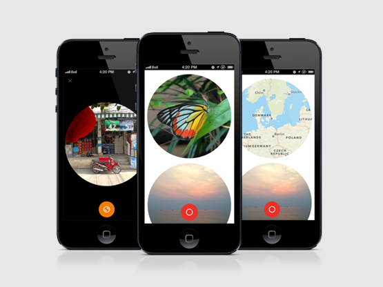
At first, it sounds like just another fun thing to do, another gimmick. But giving it some more thought reveals other opportunities that we thought would be interesting to explore.
For instance, what happens when you cannot communicate between users in this social-media world that we're living in today? Are users still going to be incentivised if they have no way of patting each other on the back with likes? Are you going to be engaged if you can't follow specific users? And what happens when you are producing something but have no control over who will see it?

The premise of Rando raises these questions and more, but most importantly we wanted to make a photo app that was unique and that gave the user something special.
Thus, we made it so that any photo posted with Rando can only be sent to one other user. Think of a Rando as a gift. By uploading a photo with Rando you are essentially giving a piece of your world for someone else, and only them, to keep.
This way every single user gets their own private collection of pieces from other peoples lives. Every user gets their own little peep holes into parts of the world they may never experience.
So with the concept down, we wanted to explore some aspects of our process as well, so we drew up some guidelines to work to.
Process
With this project we wanted to 'just fucking do it'. None of us are strangers to long winded development cycles which are fraught with umms and ahhs and we wanted to prove to ourselves that we were capable of “JFDI”.
This meant we had to work with really small iterations, lots of face to face time and personal communication, but most of all—getting it out there even if it wasn't perfect.
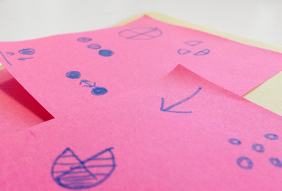
This would give us a way to have a really quick feedback loop with the users and allow us to tweak and add functionality as needed, rather than letting months of guesswork define the feature scope before a first release.
Thus, “JFDI” had implications for both tech and design.
Tech
One big decision when working with tiny deadlines is what to compromise. Obviously we want to stick with what we know best, but in the case of Rando we needed both a server application and the client application for the phone.
We chose Ruby on Rails for the server side as it is very quick to develop simple JSON web services with and because we have had experience with it. We also chose to host it on Heroku as it means minimal server setup and maintenance time for us.
However, this means that we have no file system to store uploads on, but Amazon S3 suits that purpose perfectly, and is a gem for that!
For the iOS client, the biggest decision probably has been what versions and devices to support. We took the quick and easy road of starting with support only for iOS6 and indirectly the devices that can run iOS6. The reasoning behind this is that newer operating systems usually offer updated APIs which lead to the APIs being easier to use, thus saving us time. And really, with the update rate of iOS devices we still have plenty to users to grab a hold of even with only iOS 6 support.
Then of course, we chose established and easy to work with frameworks to help us along the way, for example AFNetworking for communication with the server. On top of that, handling dependencies with Cocoapods makes life so much easier for an iOS developer—which we highly recommend.
Design
So whilst the concept behind Rando threw up some problems for development, it also presented an interesting design challenge.
Rando needed to be different, feel like an experiment and stay true to the concept through its visual design.
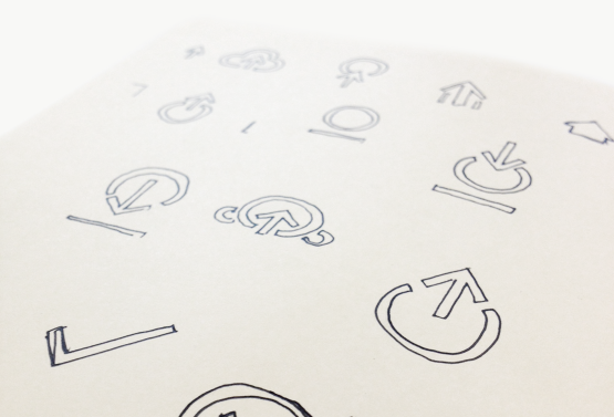
Initial visual directions were varied. We looked into alternative image viewing options, branding, visual style and interaction but we felt these had too much personality. The intent of Rando was to keep user generated imagery the focal point.
As a wild card a super minimal UI was quickly constructed and collectively voted in as the best option.
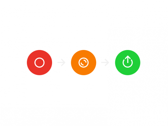
To further highlight the importance on user generated content, we challenged ourselves to not use any words in the app.
Labelling was communicated via simple iconography and universally recognised gestures.
However, due to the unconventional nature of Rando, we had to give a slight prompt in written form, although but this was completely hidden from view, and only displayed after a simple swipe gesture.
Communicating a brand when your emphasis is on content which users generate was another interesting problem to solve.
We wanted a rando to “look like a rando”—a distinctive and ownable branding element.
Thinking back to the meaning behind Rando gave us the concept of a voyeuristic view into another persons world and the peephole concept surfaced.
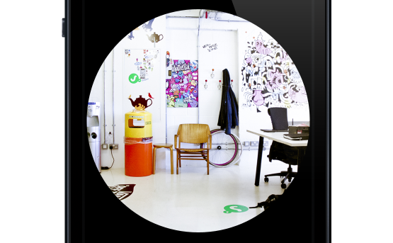
The circle felt right. It tied in with the 'o' in Rando, is a malleable shape in which to use to drive a constant visual language, and most importantly supported the concept.
Keeping in mind that like the development, the design was done with “JFDI” .
It took some sweat, and probably some tears as well, but after two weeks we delivered our first submission to the Apple App Store.
It feels great, that sense of having a working application ready to go out to users, even if it could do with some more polish or some extra feature. That doesn't matter when you can hold it in your hand and play with it. All the extras can and will come later at a steady pace. It's all going to be fine.
