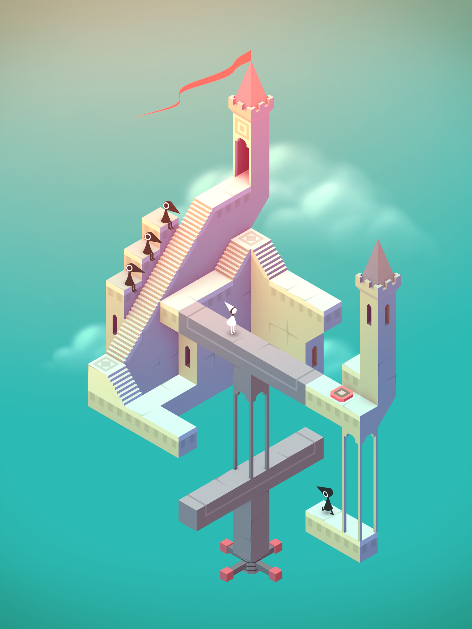
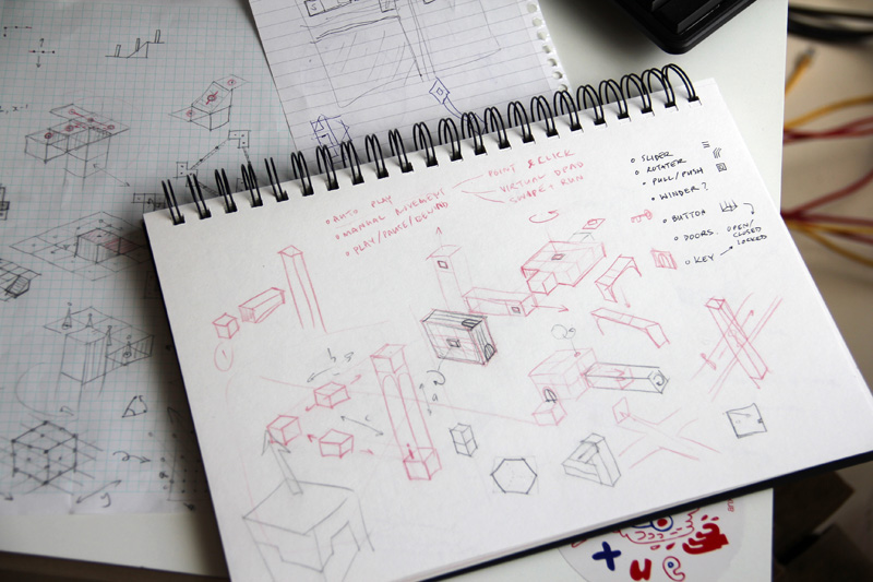
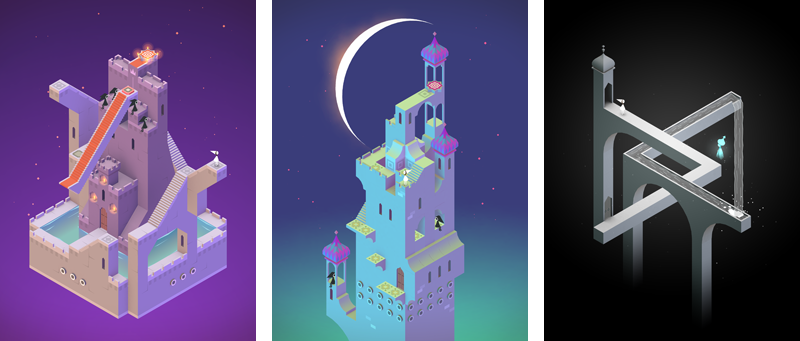
Today ustwo releases Monument Valley, a mobile game unlike any other. Inspired by the work of M.C. Escher, Japanese woodblock prints and architecture from around the world, we set out to create an interactive experience in which every screen is a piece of art worth hanging on a wall. The ten-month long creative journey forced us to rethink what a video game is and why people play them.

Rethinking video games
Our design process has been greatly informed by the games team being part of the larger ustwo family of studios. Our colleagues are (for the most part) smart people and discerning fans of art, culture and design. Why do so few of them play games, even on mobile?
Surrounded by these experts in UX, I realised that designing a game is essentially the same as designing a user experience. Thinking of what we create as ‘experiences’ more than ‘games’, it became clear that there are some popular elements of traditional video games that often frustrate less hardcore players and leave them excluded.

Some games are really difficult, requiring expert reflexes, problem solving skills, or mastery of complex control schemes. Others are incredibly demanding in terms of time, requiring dozens of hours to complete the story, or play sessions of an hour or more, or weeks of practice. Comedian Dara Ó Briain quipped that video games is the only artform that will punish and deny you access to the rest of the work for being bad at it.
Other games exclude large groups of players because of their content or aesthetics. Although some of the finest games ever made include graphic violence, poor gender representation and endless dank corridors of blue and brown metal, their great moments often prove inaccessible to all but the most dedicated gamers.
By considering these factors when we create content and design gameplay, we hoped to connect with a greater variety of players – and perhaps even entice people who don’t usually play games. This approach led to the following design concepts:
- The game would be so simple it needed almost no instruction.
- The game would appear friendly and engaging. If Escher could make artwork that was both beautiful to behold and geometrically fascinating to a wide audience, perhaps we could achieve a similar feat in the interactive medium.
- Players will appreciate quality play time over quantity of play time. Instead of creating as many levels as possible, we would only add levels when we had something new and unique to say. Keeping the experience short would allow more players to see the story through to the end.
- Challenge is not the focus of the game, and difficulty is not the central arc. The feeling of discovery and the joy of exploring a new world can be just as powerful and stimulating.
- We wanted to earn the player’s emotional engagement. The art, sound, text and animation are restrained and subtle, designed to permit empathy, not force it.
Who’s your audience?
Part of what makes Monument Valley resonate with a wide audience is that we didn’t make a game just inspired by other games. M.C.Escher and his incredible studies of impossible geometry have been with us from the start, but we’ve also absorbed everything from the Japanese art of flower arranging to typography posters, from architectural models to Brian Eno.

But Monument Valley is also shaped by people. Like Nick Fury assembling the Avengers, Mills brought together a group of individual talents and told us we had to create something utterly amazing. Surrounding us throughout the whole project was a family of incredibly supportive dreamers and doers, who inspired us to make Monument Valley a game for people.
Download Monument Valley HERE
