We all know the benefits of humour but when using our digital products, we’re prone to experiencing the other side of the emotional spectrum. We get angry and curse, sigh and groan, post ranting reviews online, or destroy our keyboards.

Thanks to more companies embracing user-centred design, these frustrations are becoming rarer but frustration is now being replaced with neutrality and this can manifest in the worst cases as apathy. Without any kind of emotional engagement, positive or negative, people feel detached.
Advertising agencies are very aware of this, and they employ the entire emotive scale to relate to their audiences.
Ads which have the most resonance are often the funny ones and ad agencies often employ comedians and comedy writers to add ‘punch’ to their campaigns.
A good joke is a journey down a logical path, a path embellished with careful attention to phrasing, tone and tempo. This sets up an expectation within the audience…
“The other night I stayed up all night playing poker with Tarot cards...
…which is then usurped, taking the audience to a surreal place and triggering laughter.
…I got a full house and four people died”
Drawing parallels to digital products; our users are also led down logical paths. We can see each user experience as a journey. This journey is not unlike that which a good comedian takes us on and being so, we can play around with or even break the expectation of the journey to create positive emotions, smiles and laughs.
Examples of humour can already be found in digital design but they are often subtle or hidden away as ‘easter eggs’. These might not make you laugh out loud, but their unexpectedness can put a smile on your face.
In an older version of Skype the emoticon would gasp in horror if you started typing in Comic Sans.

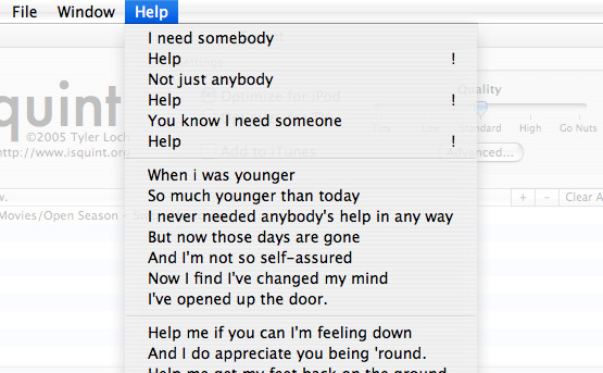
iSquint replaced their Help menu with the lyrics of a popular Beatles track—whether the Beatles lawyers had as much a sense of humour about this is unknown.

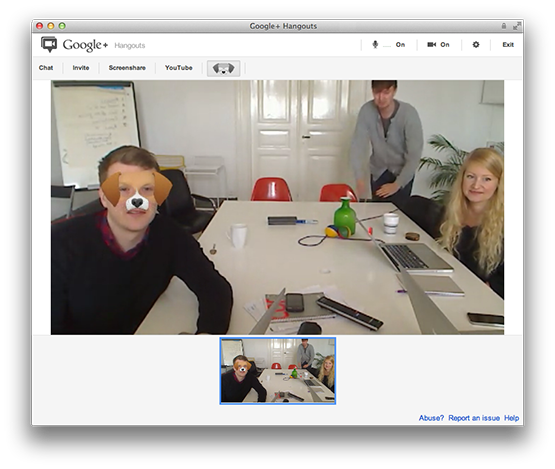
Funny masks in Google Plus Hangouts helped lighten the mood of a client meeting we had recently.

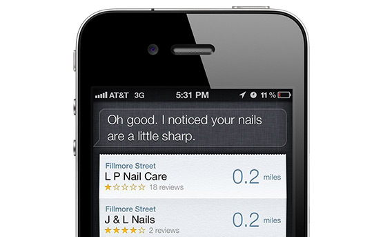
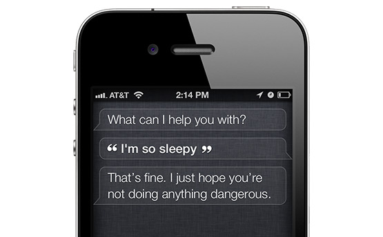
And Apple’s Siri has endeared itself to iPhone users with its passive HAL 9000 sense of humour. Her humorous repsonses have been shared by admirers on shitthatsirisays.tumblr.com.

We’re entering a phase in digital design where it’s becoming clear more focus is needed on the intangible and the unquantifiable—people’s feelings and emotions. Even Donald Norman, who made a name for himself prizing usability above all else in “The Design of Everyday Things” has since revisited his theorem—‘Beauty and brains, pleasure and usability—they should go hand in hand’.
However, like in reality, humour isn’t suited to all situations. Its usage needs careful consideration as to how appropriate it is in context and whether it’s applicable to the brand.
Big banks for example, might not want their customers to think that by employing humour they are being flippant about their money—although Barclays’ recent employment of Stephen Merchant does well by being witty but still serious. Embedded content: http://www.youtube.com/embed/62NE_UBJZoE?rel=0
Merchant’s partner in comedy Ricky Gervais believes you can make a joke about anything. However when speaking on behalf of a product we must ensure the humour is appropriate for the context and the brand.
A misplaced wry joke or confounding sci-fi reference could infuriate rather than endear, and we need to make sure our products are well designed enough so wit comes across as friendly and helpful, rather than seem like it’s laughing at the user.

If humour is used right, users will be able to better relate to the digital products we deliver them. By making them laugh, smile or even to just exhibit a bit of personality, humour and wit could very well lead to the “stickiness” that we’re looking for.
