Last year, we paired up with Alfa Laval, a 100-year old leading Swedish industrial company that was interested in showcasing its newly built facility in Aalborg, Denmark in an innovative way. Within a month, we developed a VR experience that allowed them to do just that.
We strongly believe that this technology has the potential to change the way companies interact with their clients, similar to the way mobile apps have for the past decade. Therefore, we wanted to explore the possibilities of creating meaningful VR experiences that aren’t confined to the entertainment industry. This article describes the design process we followed in order to make a valuable product that both us and the client were very satisfied with.
EXPLORING NAVIGATION AND INTERACTION
A sense of scale
Our hardware target for the prototype was the HTC Vive, which allowed us to focus on learning and trying things out without worrying about performance issues that we could get from mobile VR solutions. We built a simple 3D environment within Unity and set up the navigation within that world. The client sent us an industrial CAD 3D model of one of their biggest machines that we placed in the middle of the building we had created. We also made it possible to stand inside the machine which gives the user a better sense of scale and understanding of how much room you need to fit it in a physical space.
Add a human factor
We explored the idea of having a character as a guide inside the environment to add a human factor to the experience. This character was named “Milla” and was meant to on-board and guide the user through the experience, making sure they understand how to navigate in the world. We weren’t able to achieve full functionality within the short timeframe, but we got to explore some interesting possibilities by placing her inside the world and have her look alive.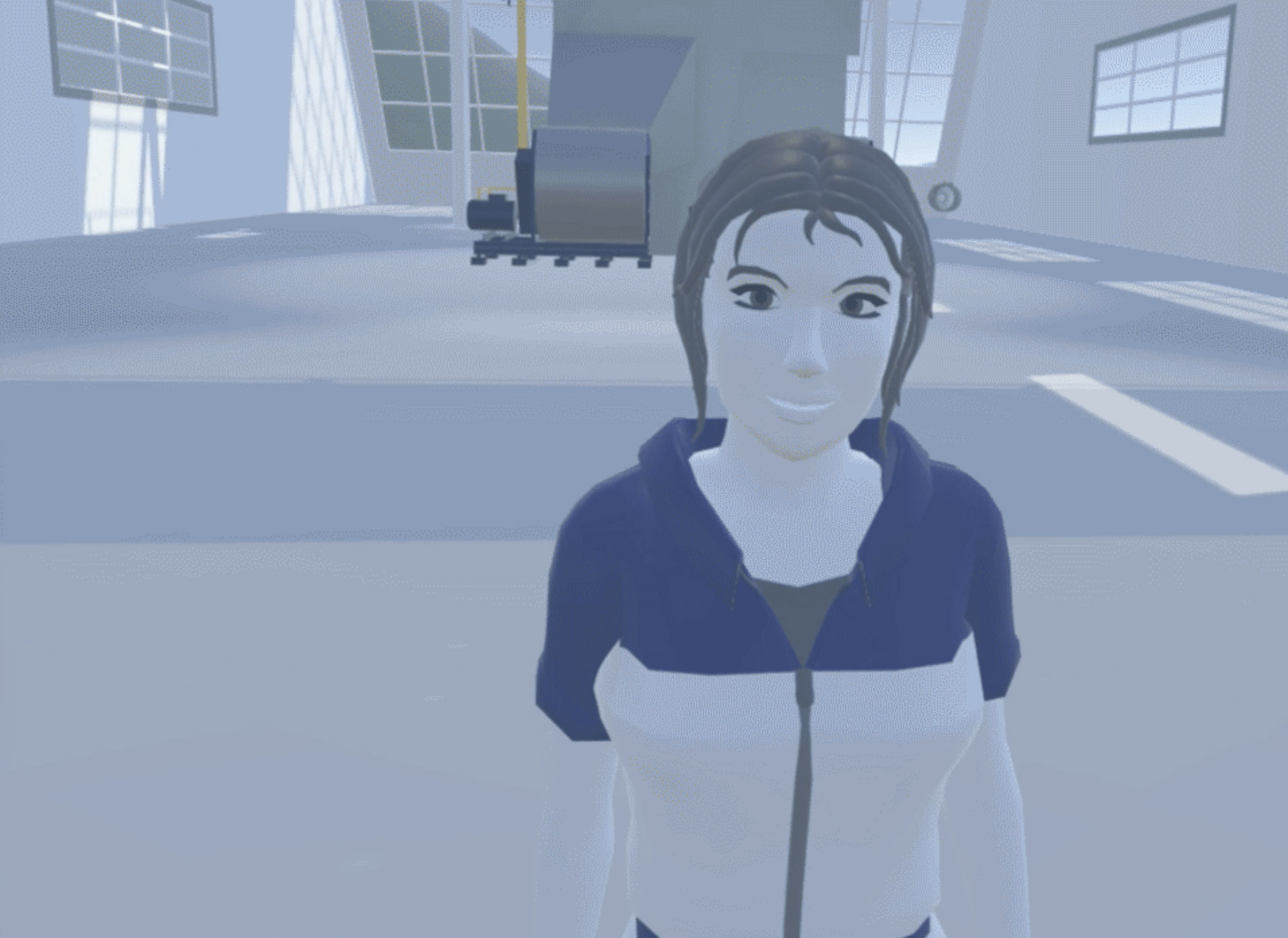
Intuitive navigation
To move around in the virtual world we had a 3×3 meter area where you could physically walk around in and look at things from different angles. To transport yourself in longer distances we used a simple teleportation technique which is now very common within VR. By pressing and holding a button while pointing the controller to wherever you want to go, you are instantly teleported to that location when releasing the button.
Guide the user
After doing a lot of user testing, we realised it’s quite hard to guide users when you only rely on voice. We decided to add a third person camera view on the monitor so that the observers or people standing in the physical world could use it to guide the person inside the experience. We also added a marker that an observer could place anywhere in the environment to point the person inside VR in the right direction.
Use the power of VR
Since we were working with a concept around machines and the different parts of machines, we added a 3D model that the user could approach and with one simple hand movement they were able to see the machine’s components as an exploding drawing. This function led to a lot of other interesting ideas, such as adding information about the part and an option to order replacement parts.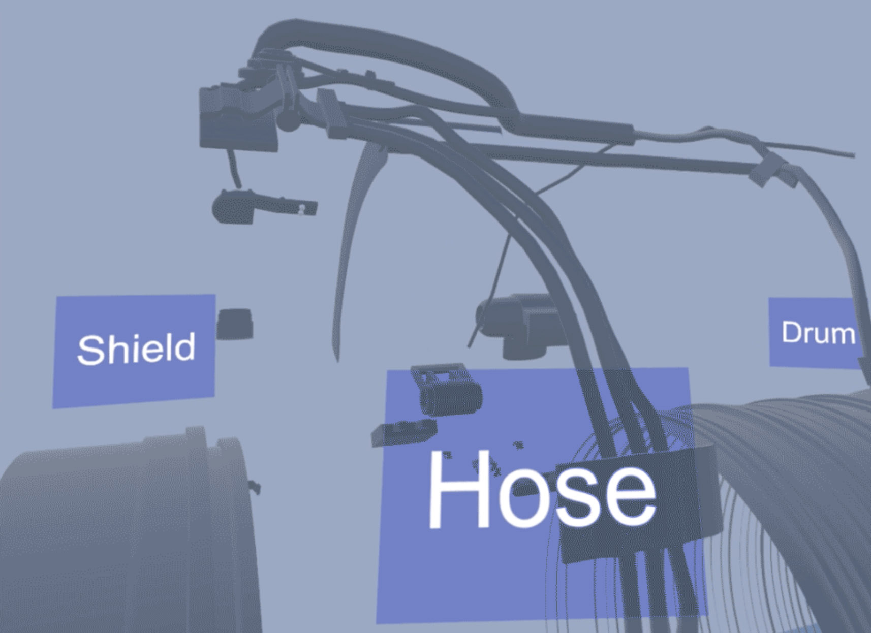
User-controlled movement
In the early prototype we had a second floor in the building. We created a freight elevator which users could step onto and press a button to go up. In the first iteration the animation curve of the elevator movement was very linear and fast which made the some feel very unpleasant. After tweaking the animation curve and length so that it was slower and had a smooth start, linear middle, and smooth ending, we made the elevator ride feel natural and much less frightening for the user. All users have different sensibilities when it comes to motion sickness and this needs to be considered for everything you design for VR.
RESEARCH BEFORE TAKING DECISIONS
The main purpose of the project was to give more people a chance to experience their test and training centre in Aalborg while cutting down on travel time and expenses for both Alfa Laval and their customers.
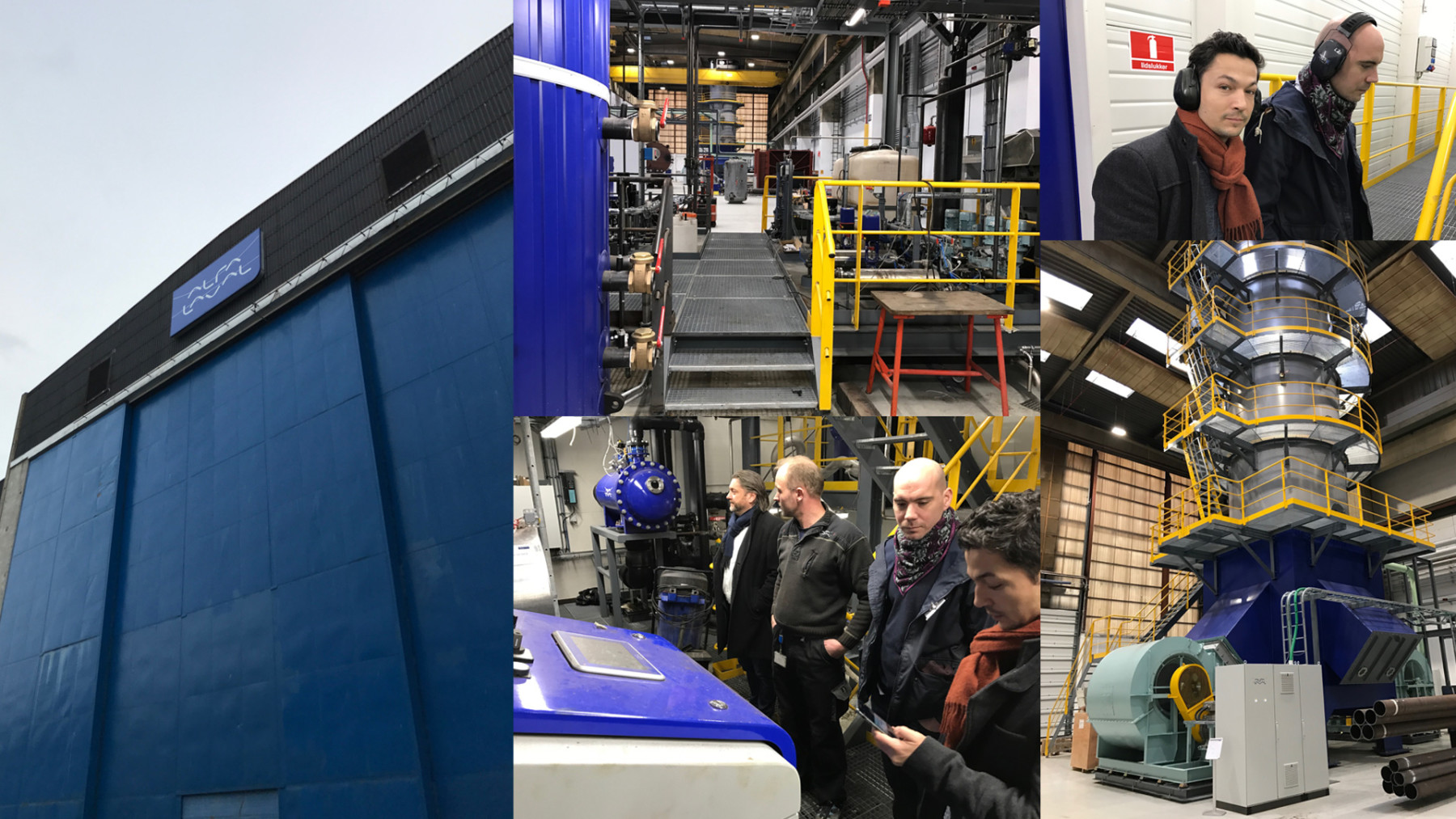
Before we decided which idea to move forward with and which VR platform to use, we wanted to get a better understanding of the clients products and their actual needs. We were invited to the actual test and training centre in Aalborg, Denmark where we got the chance to experience the space and get a better sense of the atmosphere, scale, smell, sound, light, and branding.
After the tour we sat down with the client to discuss our options. We quickly realised that, even with high-end VR equipment like the HTC Vive, we wouldn’t be able to replicate such an extremely detailed environment without having performance issues. The client was also looking for something much more mobile than a PC-bound solution that they could send out to their sales people around the globe. Based on this information, we chose to work with the Samsung Gear VR mobile headset.
This decision made us rethink our ambitions. We decided that we would create a high quality 360° rendering of the test and training centre and use that as the base of the experience. The user would be able to look around and select different hotspots in the building and each hotspot would contain a 360° video of a certain machine. Throughout the experience there would be a speaker voice guiding the user.
NAILING THE CONCEPT
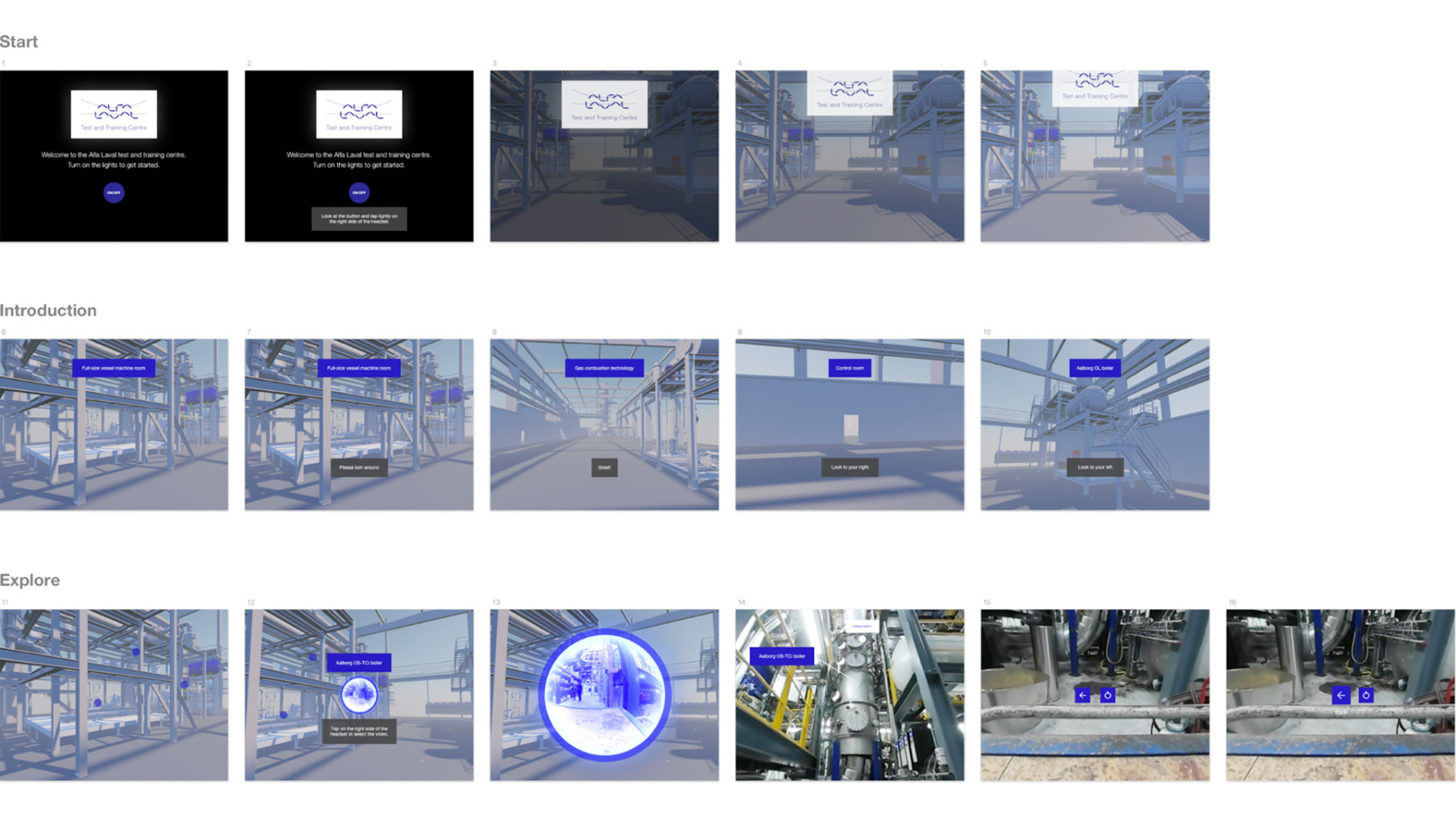
Having a only month for any kind of project is usually pretty intense, so we decided to get a detailed version of our idea down on paper as soon as possible to see which parts were most important. Our first iteration of the concept had a welcome screen, a narrative introducing the user to the experience and a guided tour of all the machines in the test and training centre. When the user had done the full tour they could freely explore the different hotspots in the building.
We presented this rough concept in a UI flow and demoed the first very basic iteration of our prototype to the client. A bunch of questions surfaced like “Do we need to have a full guided tour as opposed to just letting the user explore freely from the beginning?”, “How long can the speaker voice be before it becomes too boring?”, “Do we need to have a VR on-boarding built in for novice users?”, “Can we move some of the machines around so they are closer to the person in the experience?”. All these questions were very valid. Together with the client we decided to cut the scope by skipping the guided tour. This made everything much easier and also better for the end-user. Our assumption was that most people wouldn’t want to look at all machines anyway, especially not in one session.
CREATING THE FINAL PRODUCT
Iterate and test
We believe that by working in short iterations and testing early on, we can reach the desired goals faster and it’s easier to spot potential problems. As soon as we had something nearly done in 3D, we made a quick render and put it into Unity, built it and tried it out on the VR headset. We could easily see if the placement of the machines in the building worked or not and make corrections. If we were to complete the full 3D work with all the polish and make a final render before trying it out, we would have missed a lot of things and lost a lot of valuable time. We used the same iterative approach for the development of a feature or the implementation of UI elements, music/sounds and visual effects.
Involve the client and share builds
Looking at a 2D video of a VR experience is one thing, having the headset on is a totally different experience. In most projects, we try to make high quality prototypes as soon as possible to make clients understand our ideas and get the right feel for the vision. This becomes extra important when designing something for VR. You don’t really get it until you put that headset on. To make sure that we kept the client in the loop and that we were aligned on what we were building, we sent Alfa Laval regular builds of the app.
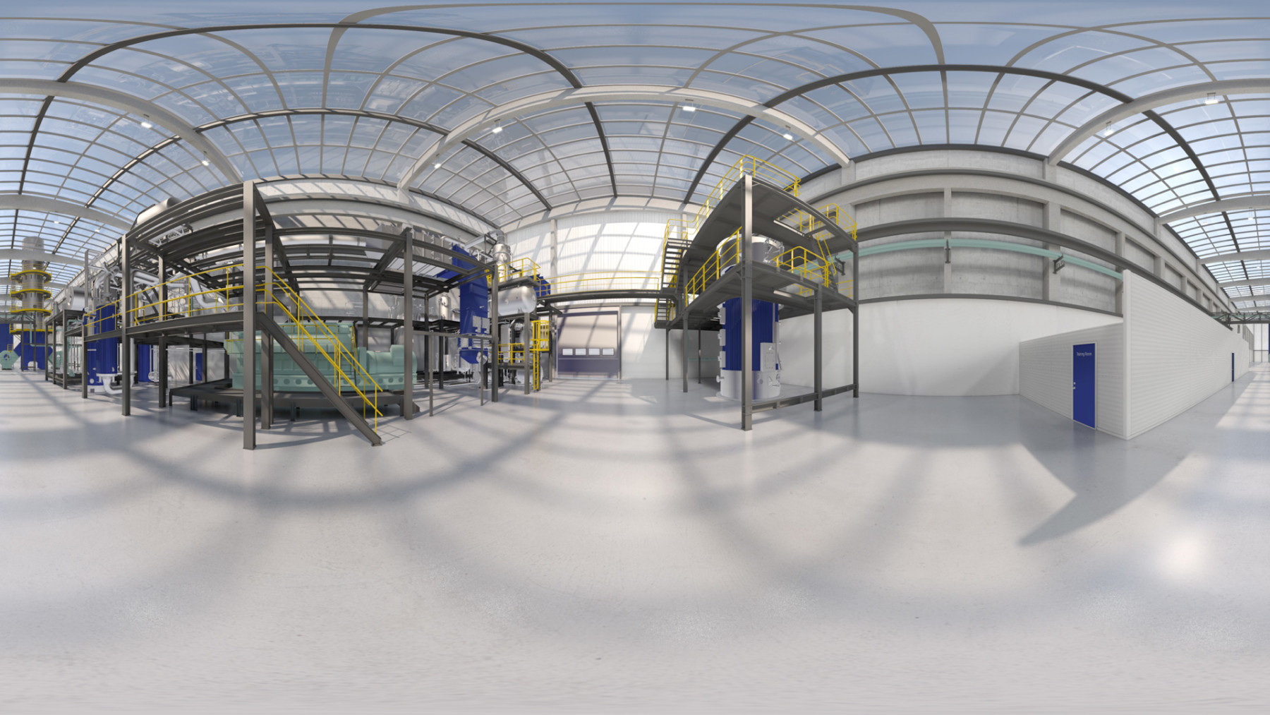
The benefits of 360° renders
A 360° render is basically a high quality, high resolution 3D render that uses 6 different cameras in your 3D scene. The renderer stitches the different camera rendered images together into one big image that you can then use as a cubemap texture in your Unity application. This creates the illusion that you are inside the 3D space and you get a sense of depth even though it’s just a big image wrapped around the user.
Working with 360° videos
Video in VR is quite powerful to help users see things in a whole new perspective. Since we didn’t need them to be able to interact with the world but rather just observe, this was a great route for us to take. We were able to shoot all the videos in just one day and take them back to the studio. We had already made preparations in Unity so we could easily replace the video source files.
Things to consider when working with these videos are performance on different hardware, how it will increase the file size of your application, and long build times. In some cases you can keep the file sizes down by using a short snippet of a video and loop it without the user even noticing.
UI
From a navigational point of view we wanted to simplify elements as much as we could to make it a seamless learning experience without buttons or information getting in the way of the machines. The start screen consisted of a logo, a welcome message, a start button, and some music playing in the background.
Tapping the start button turned on the lights in the building and you could look around in the machine hall while the speaker voice introduced the test and training centre and told you what to expect from the experience. If the user wanted to move on, they had a “Skip introduction” button conveniently visible if they just tilted their head down.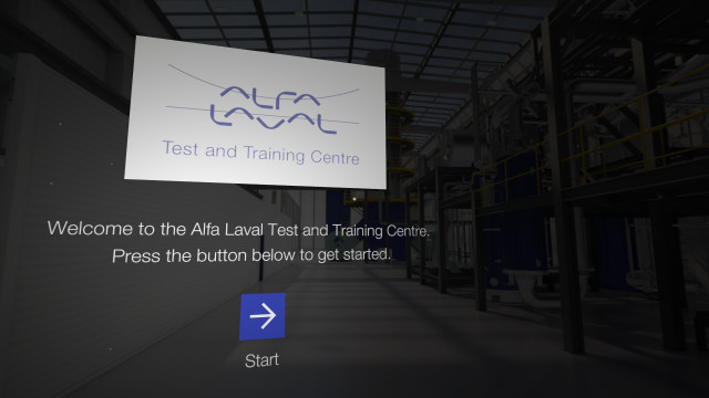
After the introduction, users were presented with a few hotspots throughout the building allowing them to look around and select a machine to view a video about it. If the user looked down they could see a “Restart” button to go back to the start screen again.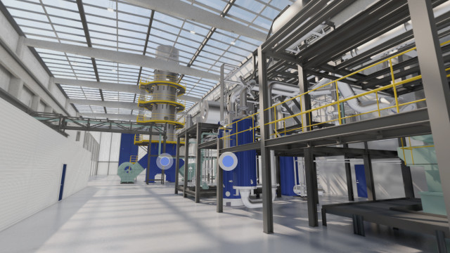
Tapping on a hotspot opened up a 360° video of one or several machines. Some machines needed to be highlighted with text labels to make it easier for the user to see which machines the speaker voice was referring to. 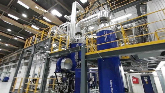
We also used a back button so the user could go back to the hotspot view and a replay video button. 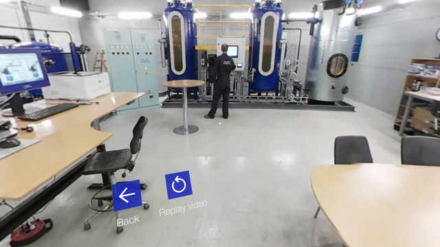
Visual effects
To increase the feeling of depth in the scene, we created a particle effect to simulate the feeling of dust in the air. Making it transparent and subtle while adding some turbulence resulted in the perfect final touch to the look and feel of the experience.
Sound FX and music
When trying out the early prototypes of the app, we quickly felt that there was something missing from the visuals, audio. To make the welcome screen feel more positive and interesting, we created an upbeat music piece. When the user started the experience and the lights in the building went on, we added a light switch sound and had a machine noise starting up and running subtly in the background, strengthening the illusion of being inside the machine hall building. We also created hover sounds and selection sounds for the buttons in the UI. On top of this we added the speaker voice.
LOOKING INTO THE FUTURE
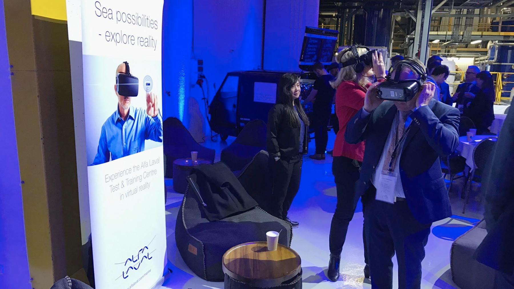
At Alfa Laval’s 100-year celebration, we got the chance to showcase our creation to a larger audience, which was a great opportunity to get some new insights. The people attending the event were different from the target group we had tested on. Most were between 40-60 years old and about half of them had never tried VR before. Initially, there was some hesitance to try it but after the first tester lots of people followed. The majority of users enjoyed the experience and understood the purpose and value of the product.
Conclusions
We had a lot of fun in the brainstorming sessions discussing where and how we could bring value to other parts of the client’s organisation. The possibilities within AR were something that the client was very excited about. For example, there were ideas about remote maintenance assistance. For example, a crew member on a ship get quick guidance through their AR headset on repairing something in a cruise ship engine room. They could see an overlay UI with information and guides to what parts to replace or interact with. The remote assistant could then easily point the crew member in the right direction.
Working with VR demands a lot of different skills and attention to details from designers and developers. We need the same skill sets as in the gaming industry but change the way we think when designing user experiences. We need to consider things you normally wouldn’t, like motion sickness, fear of height, sense of balance, and all the psychological and physical effects that a VR experience could possibly have on people. Experiences within VR are automatically much stronger than traditional digital experiences on flat 2D surfaces like smartphones or TV screens.
Most of the time in our user tests, people left with a smile on their face when taking off the headset and saying “Wow!”. VR is a great medium to make people feel something special and get more invested in whatever it is you want them to experience. We are super excited to see what we will do next.
