At ustwo, we believe that today’s valuable brands are built from the product out. Classic brand thinking, from propositions to visual language, is based on the era of commodity products. But digital products are inherently different, when developed with user-centric methodologies. We expect coherence between all aspects of a brand – from the product itself to its packaging and marketing messages. Too often, however, client services projects are constructed in a waterfall-esque fashion, from research study, to brand partners and then over to product team to build out the proposition.
Like many startups would, we approached Hudl as one team, with all specialisms and disciplines working together – a deep and true collaboration. This allowed us to create a more coherent and appropriate visual language and experience for our users, through testing and feedback, as well as the product offering itself, by keeping it aligned with the proposition at every touchpoint.

The nature of developing a product, particularly when embracing Lean methodologies, means there are a lot of moving parts, and it’s only right that the visual language runs in parallel and adapts responsively. This allows us to consider the traits of multiple touchpoints through learning and iteration, driven by genuine user insight rather than proxy and post-rationalisation. In this approach the whole team and all the moving parts tighten and align sprint by sprint, day by day.
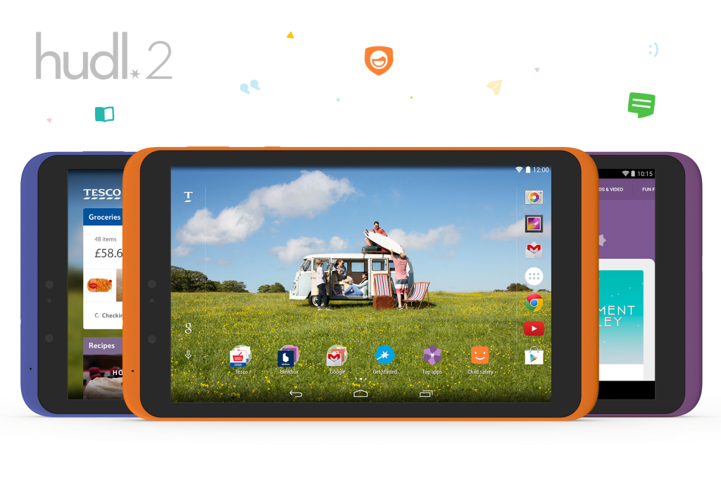
When we delivered the project, ustwo had spent nine months designing four native apps (Top Apps, Get Started, Child Safety and a child-safe internet browser), a launcher app we call ‘My Tesco’ including a redesign of the homescreen environment, and various other touchpoints throughout the operating system as well as the in-store demo mode.
The hudl2 project began with a fresh look at the brand, retaining only the name and logomark. As a result of this, the product team at ustwo helped lay new foundations through the interface and experience, which developed into the visual language of the brand through work with The Chase.
Various factors informed our development of the hudl2 design work: usage data, demographic analysis, industrial design, legacy brand design, how this sat alongside the mother brand Tesco and the Android Operating System (pre-material design). Harnessing data and insights gathered through feedback, testing and studies of the hudl1 allowed us to formulate a visual approach which best suited our key personas for the hudl2.
hudl is an emerging brand – we express and celebrate ‘happy technology’ embracing all, from young to old, from tech-savvy to tech-laggard with a light humour. Part of our challenge was to create a unique brand personality whilst retaining vital credibility amongst the larger, more established Silicon Valley giants.
Lets dive-in to uncover some of the details and decisions surrounding this process.
The hudl2 experience is about effortless family entertainment, enjoyment and productivity. We balanced a bold use of bright colour and playful shapes with controlled layout, typography and generous breathing space to achieve this equilibrium between playful and credible.
The industrial design of the device was being developed in parallel with our work. We wanted to complement the industrial design in the elements we were creating for the interface experience, and drew inspiration from certain physical elements, such as the corner radii and colour use, to inform our work. The brand’s Pantone and hex values are an evolution on the eight colour finishes of the product with a few others carefully chosen to build it out into a wider spectrum for flexible use. The process of developing the colour palette was a collaborative effort between ustwo and The Chase to ensure quality with both digital and print, and accessibility considerations for on-screen purposes.
Another example of the contribution towards this balanced look and feel is the use of 'bloated' and curved lines seen on the exterior of the hudl icons (and illustrations) and the smart straight and geometric nature of the interior shapes. The bloating of the iconography actually originated from a cross-studio discussion surrounding the product's physical form. In a discussion with Chauhan’s Creative Director, we discussed how one of our icons was designed to resemble the device’s silhouette. His feedback highlighted a form factor intricacy, which we then took on board and exaggerated to form the basis of the bloated icon style.
![]()
This constant, open and respectful dialogue between the three parties created a strong network dynamic and allowed us to share ideas and solve challenges together. We held workshops between all parties involved to openly discuss work in progress, not only to ensure alignment but also give everyone a voice, feel part of the process and contribute towards our collective direction and vision. You can read more about the collaboration and process in Collin’s post.
As the three core native apps (Get Started, Top Apps and Child Safety) were built alongside each other, we had the opportunity to investigate shared qualities and patterns for consistency and usability. The result was a consistent area for introducing or communicating section-specific content along the top of each home screen, and the provision of an appropriate space in which to reinforce the app’s core colour and illustrative elements. This continued through to the detail pages of the apps, where a larger area is used to surface photography and imagery related to the topic or category in hand.
To prepare and excite the user, the primary uses of the device (ie Watching, Gaming, Reading) were illustrated via a transformational icon animation on boot up and in store (via the demo mode). ustwo also created the first time experience video, the end note of the setup journey signposting the key features and apps.
The Android launcher (Homescreen environment) presents a cluttered and suboptimal grid layout by default on the hudl2, and, as we know, first impressions are vital. For this reason we spent time and effort in crafting a home screen experience that was optimal in terms of content density, clarity, legibility and layout with first time and repeated use in mind. The grid in which the apps sit also has to be able host widgets, for which we designed two, both of which had large image areas designed to contain multiple media types and showcase third party apps effectively. The chromeless widgets are designed to blend in with the necessary furniture on the homescreen, provide a seamless entry point to the hudl apps and coincide with the My Tesco look and feel.
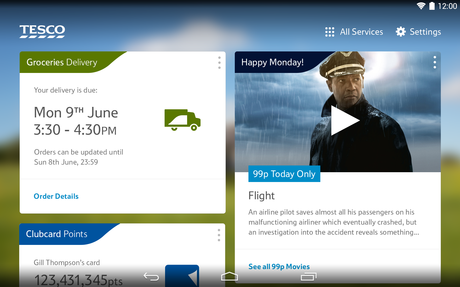
The presence of Tesco within the user experience was something we worked hard to get just right. Through user testing and brand presence and perception testing we have arrived at a place where both customer and client are happy, which is a great achievement. In order for a Tesco consumer to perform an array of actions such as adding groceries to their shopping basket, finding their nearest store and discovering new offers available from sub-brands such as F&F all of the Tesco services can be accessed from a left swipe on the home screen.

Having the Tesco content here means that it doesn’t impede on the experience a user should expect from an Android tablet whilst keeping it highly accessible. In order to visually integrate this dedicated Tesco area with the hudl tablet experience, we did several things. To create a personalised and seamless feeling we blurred the user's home screen wallpaper behind the content, and supported this transition with some animated touches such as the ‘Tesco’ wordmark building out from the ‘T’ access point on the homescreen.
To conclude, the hudl2 proves that the digital experience of a mass market product can be developed in harmony with the brand and industrial design through open communication and collaboration. An approach obsessed with user value and learning across the entire team and family of stakeholders to drive objective and informed decisions. Differentiated products require bravery and a learning mindset to ensure that by launch day you’ve made the right thing in the right way. It requires cutting away any superfluous messaging or semiotics that aren't evident in the product itself, keeping the user's perception and experience of the product tightly focused. Tied with an accessible price tag, the results have created great value for both hudl owners and our client’s brand.