Sky has always catered to kids and families, but was ready for a dedicated kids’ tablet app. Having increased their on-demand catalogue from 700 to 4,000 episodes of the most popular kids' shows, they had more of what kids wanted. The next step was reaching kids where they actually watch – not in front of a TV but on their devices.
It was a new product, brand and audience for Sky as well as a new working relationship for both of us. The priority for the first release was to get the basics right – it had to be a product kids loved and parents trusted, and one that reflected the Sky brand.
Kids can access almost endless entertainment on their tablet, so this app had to deserve and keep their attention. 3-year-olds need to be able to use it without their parents’ help and 9-year-olds should relate to and return to it. It had to work for a range of motor and literacy skills, tastes and affinities. The experience also had to be just as slick, engaging and immersive across a range of lower-end devices.
We had five months to create an app on two platforms for a beta launch. As Sky and ustwo we each had our areas of expertise, but to launch a brilliant product we had to collaborate intensively as a single team and let kids lead the experience and design.
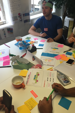
Our process
Kid-centered design
We involved kids from the very start. They did our 'expert review', tearing apart early concepts, and drove concrete learning we could share as part of our pitch process. We took care to demonstrate our approach and identify our common goals as build partners, rather than present high-fidelity designs for critique.
We then had to put our approach in action. A big part of our kick-off was immersion in kids’ personas and points of view to get our assumptions out. Co-creating with kids and parents was an absolute must to follow through and validate (or not!) those assumptions. Throughout the project, we:
- Met with kids and their parents every two weeks to validate our work
- Worked with experts in kids’ research to recruit participants, run sessions and help interpret testing results
- Learned to identify our assumptions and find new ways to test them regularly, moving from general ideas to specific concepts
- Identified and agreed core experience principles to drive design decisions
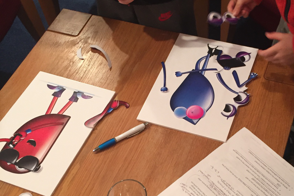
Observe, build and learn
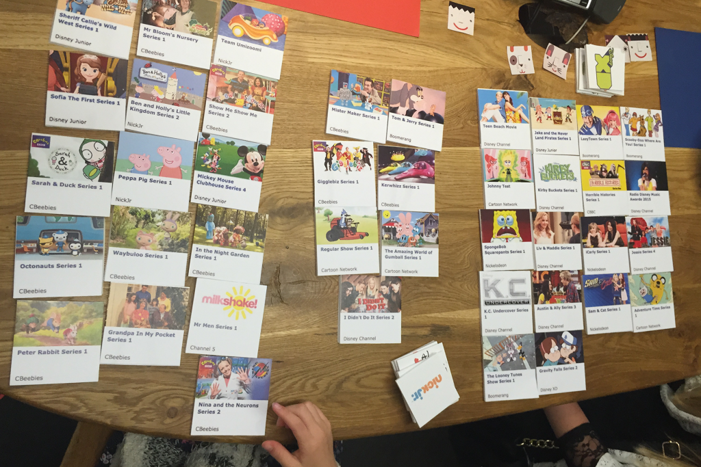
We began with testing existing products and using visual card-sorting exercises to understand how kids grouped content. Observing competitor app use helped us to draft our initial design principles. What engaged them? What frustrated them? What interactions were easiest or hardest? How did this vary by age?
We used this as a foundation and prototyped low-fidelity experiences to understand wayfinding and navigation. It left kids frustrated at being unable to play anything or do much, but revealed natural gestures and common associations. This helped us define a very simple architecture that didn’t rely on sophisticated interactions and transitions.
As the architecture solidified, we moved on to higher fidelity prototyping that simulated native app experience and transitions. Here we could play with more sophisticated visuals and interactions across short user journeys and discrete tasks.
Finally, we tested development builds on both platforms, so we could iterate directly in code. We continued to prototype in parallel for comparative testing that helped with future design decisions and concepts for later release.
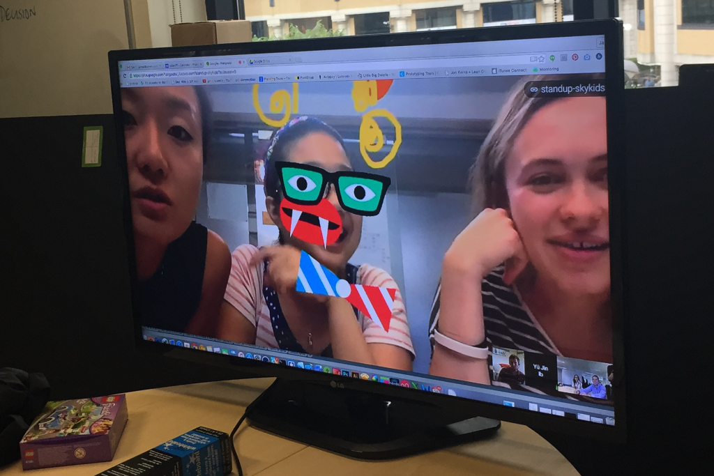
Testing with kids
Aka 'constantly being surprised'. Validating and testing concepts with kids was incredibly fun and humbling. It was also very different from working with adult users.
Kids are incredibly honest. They don’t post-rationalise and explain their actions like adults do. But when they do, they know it’s a story and their fantasies and aspirations are clear. We may act on the same impulses, but adulthood sometimes involves elaborate strategies for covering them up.
Kids play, meaning they will try things out for the fun of it, or to see what will happen. It became clear our job wasn’t going to be so much about making a playful app, as giving kids a chance to do what they want to do. Play happens naturally along the way.
Kids didn’t always know what a 'tablet' was but knew what an 'iPad' was. That didn’t mean they had device or brand loyalty. They were interested in being able to play what they wanted, whether it was on their mum’s phone or our test tablet.
Kids were immersed in the overall device experience. It mattered more than any one app, and their tastes changed quickly. We watched a four-year-old play three games simultaneously on his mum’s phone after getting bored with our lo-fi prototype. Two seconds in Flappy Bird, switch to another game and collect some coins, switch to yet another game and hammer the top left corner of an ad until the ‘close’ button appeared, just to play a few moves and then get back to Flappy Bird for another go. I was dizzy after 30 seconds.
Kids' imaginations were far richer and stronger than anything we could offer! But they were also generous – tiny interactions or details would be enough to make them giggle or trigger a bigger story. Playing 'what-if' got us some incredible ideas.
If we were testing for something specific, playing “what-if” only went so far. Kids need concrete feedback. Our lo-fi prototypes didn't play video, but they had play buttons. And that drove them crazy. It wasn’t always enough for them to grasp 'this would be an app that plays video' until it actually played. When observing reactions, we had to account for the app purpose not being clear in the early stages.
Kids are keenly aware of the social situation of testing. Alongside the actual question, they respond to tone, intention and what they think is expected of them. You’ll hear "this is the best app I ever used" because that's what's in front of them and because they're being rewarded with attention.
There’s no substitute for simply trying things out. Over time, we began to get a better feel for ways we influenced our participants and what they may expect. Still, after a week of ideas and anxieties, the testing session always brought clarity to our decisions and kept us honest.
Design for relationship
Our users were kids but our customers were parents – a product kids loved also had to be a product parents trusted. They knew their kids best. We wanted to support their relationship and attitudes to their kids’ device use.
Given parents pay for the service and get the app ready for their kids to use, they are the first to use it. Parents set up a profile that allows them to disable access to older kids’ channels and that drives relevant content on the home screen. If the process didn’t meet expectations or was too difficult, the app wouldn’t reach their kids. Any part of the app parents used was visually different, but with as little text and distraction as possible – a simple two-step process can still take ages if kids are clamouring for attention.
As we tested features for parental settings, it became clear the feature and task didn’t have the same importance. An example feature may put the app to sleep at a given time. The task, however, may be to stop the child using the device. What matters to parents was how they imposed the rule, the bigger set of family rules it’s a part of and their children's understanding of that. We avoided features that tried to be too smart or prescriptive, trying to keep restrictions minimal for the first release.
There’s also the relationship children have with each other. We often used friendship pairs in our testing sessions. As they tapped around, there were struggles for power, the sharing of stories, watching each other’s reactions and learning from each other. The watching activity was woven into the social interaction and heavily influenced by peers and siblings. Choosing a profile similar to their friend, but different from their sibling is what made the app theirs. Then seeing their name, chosen avatar and relevant characters on the home screen was enough for kids to identify with 'their' app.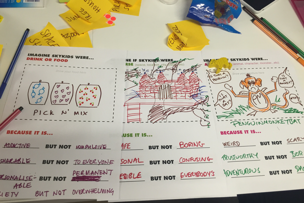
Our principles
Research means data, and fast-paced iteration means quick decisions about what to do with that data. Early in the process we identified five key experience principles we wanted the app to deliver on. As we tested and communicated new design directions, the principles were a useful way to guide our decisions and link the little details to the bigger picture.
Immersive: Content as interface
“Let me watch and discover in flow”
Kids want to watch what the shows and characters they love, as quickly and easily as possible. A gimmicky interface can’t compensate for that and certainly shouldn’t get in the way.
We wanted the player to be the first thing kids could engage with, not buried at the very end of a browse journey. The player is central to every screen and simply shrinks down as kids scroll the content beneath to browse. There’s always a video ready and it’s always one tap to play at any point.
Playable content is always in reach. Browsing and watching flow into each other as kids are able to sample different videos, rather than scanning visually or reading a description before choosing to play it.
**Empowering: Ability over limits **
“Show me what I can do, and let me do it my way”
We emphasised what kids were able to do and never showed anything that was out of reach. If a programme is unavailable or parents choose to restrict older kids’ channels for their pre-schooler, we simply don’t display them rather than have them be inaccessible.
Offering more than one way to do something can feel redundant when designing for adults, but with kids it caters for different abilities and preferences. We learned what these might be through observation, adding useful feedback or functionality where kids gravitated naturally. Kids often tapped a title heading that looked like a button, for example, so we decided it could double as another way to scroll up content. Another example based on observed gestures is dismissing the full-size player by either pinching the screen or tapping a close button.
Switching channels can be done carousel-style by tapping or swiping side-to-side through the pages, or by pulling down a channel picker and choosing a channel. Younger kids tended to navigate between the pages, which allowed for discovery and made the architecture clear. Older kids, more used to global navigation, tended to use the channel picker to go directly to their preferred channel.
**Adaptive: Interaction depth **
“I can use anything I am big enough to reach”
A highly personalised experience with custom UI for different profiles types is always alluring, but it is technically difficult and should be data-driven. With no usage data and in the MVP spirit of getting the basics right, the question was how to make kids feel the app was made for them.
After having chosen the Sky buddy for their profile, kids are taken to their home screen where their buddy appears in the channel picker and their name is part of the page title. Kids identified strongly with their favourite show characters so these were the first tiles on a home page editorially curated for their profile. A 9-year-old wouldn’t see a Peppa Pig tile on her home screen, just as her 4-year-old brother wouldn’t see a Demon Headmaster tile on his.
Very young kids don’t need to reach beyond the home screen to find and play their favourite videos. Older kids can reach for other channels, content and features sooner. Features that cater to parents and older kids are added in areas where very young kids are less likely to immediately reach, such as the channel picker.
**Playful: A touch of mischief **
“It wants to play with me”
Our starting principle was 'playful with purpose', which allowed us to focus on the core experience and create magical little moments that were unexpected without being disruptive.
We used the Sky buddies, in functional ways, to make the app feel alive. A kid's chosen Sky buddy hangs down, waiting to help pull the channel picker. Kids also enjoy seeing their buddy appear unexpectedly as the video scrubber handle, then being able to squish it when scrubbing.
Visual and other sensory feedback can be enriched as well. Tapping a tile creates paint splatter around it, showing a selected state. Adding sounds for different actions (sorry parents!) makes for dynamic interactions that are easier to remember. Before we added sounds some kids did it themselves, whooooshing as they swiped!
As adults, we’ve learned to separate play from purpose, and even older kids were also able to rank features by importance and say what they felt was necessary versus what was “just fun.” But they also taught us that “just fun” is a way of engaging and purpose in itself. Almost every kid who tested our ideas would casually toss out even more wonderful possibilities, which we continue to work on.
**Forgiving: Flexible and unbreakable **
“I can’t break it, do anything wrong or lose my way”
We wanted the app to feel like an unbreakable toy and constantly balanced design implementation with technical performance. That meant creating a colourful, tasty loading spinner to show as little as possible.
Kids learn by doing. They’ll tap around and figure out the pattern as they go. Constraints are key to making the app feel flexible: The less they have to do, the faster they master it. A simple architecture helps with orientation and wayfinding as the same design is repeated with different content across channels and shows.
It didn’t always mean faster was better, which is a difficult bias given how trained we are to design out friction. Sometimes a slightly longer journey made each step more explicit. A shortcut would be less forgiving for kids who may need to go back and forth a few times to understand a task. We wanted to be sure there were no dead ends, so that kids could always undo, go back, start over and orient themselves with a few key elements.
A foundation to play from
As is always the case, we learned far more than we could deliver in a first version. The ongoing challenge of a first release is deciding what features are included and what aren’t. It’s why collaboration is so key. Business, technology and design need to appreciate each other's viewpoint and capability to deliver the best possible product. It’s the only way to know what 'best possible' really looks like.
As far as our experience principles went, we had to keep in mind which ones were foundational, and be mindful of what fidelity we could deliver them at. Given that we were building from scratch, the Immersive, Forgiving and Empowering principles were core to creating a solid app architecture and naturally came up more often than Adaptive and Playful. These last two were brimming with possibility. Possibility is exciting but also unpredictable: there are lots of ways to create a playful and personal experience and too little time and resource to get it right the first time. Likewise, we learned that parental settings were a more subtle territory than we realised and preferred not to rush them.
Being disciplined about what a design can and should achieve realistically is tough. But with much of the guesswork taken care of in a first release, future releases have a solid foundation on which to layer a richer, more personal and playful experience. We now have a backlog of validated concepts and features to iterate, refine and take forward. Even so our young users continue to surprise and delight us, challenging our ideas and pushing our work to the next level. There’s nothing better than hearing “it feels like this is made for me.” And nothing more promising than hearing we “could make more of an effort.”