The five option tab bar used to mean a choice between prioritising features or nesting different functions within the same item. Neither of these were great for usability and as apps increased in functionality they began to outgrow these confines. In late 2010 apps started appearing with grid views, where designers could comfortably show nine-plus options on a single screen.
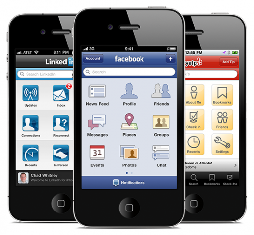
Parallel to this, the release of the iPad brought extra screen space to iOS, as well as new UI patterns that took advantage of the tablet form factor.
Split views, one of these new UI patterns, enabled an app to display top-level navigation options side-by-side with a drilled down view.
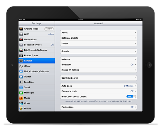
Twitter used this split view as the basis for their official iPad app and iterated on it to bring us a new stacked panels paradigm. Borrowing from the iOS split view, the Twitter app showed views as needed and crucially allowed the overlapping of panes. This allowed the user to flip between reading and navigating with ease.
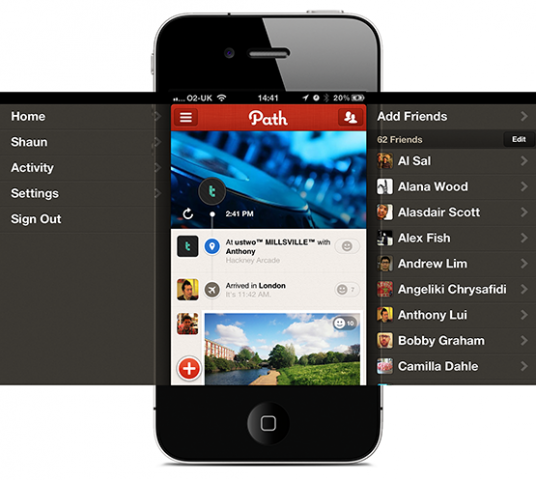
App designers began appropriating this view for the smaller screen as it created more room for content whilst keeping navigation only a swipe away.
Path's mobile app used split views to good effect. Swiping left or right reveals navigation options without leaving the main view of the app, however to aid discoverability, buttons to trigger the same action appear in the title bar.
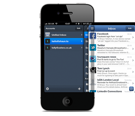
More recently, Sparrow for iPhone shows how using stacked panels for navigation can reduce the need to drill backwards and forwards through a menu stack.
Sparrow’s split view allows users to quickly navigate multiple panels whilst never being more than a tap away from the top level navigation. This mitigates the need to constantly move backwards and forwards through folders within a mail account—an issue with the iPhone’s default Mail client.
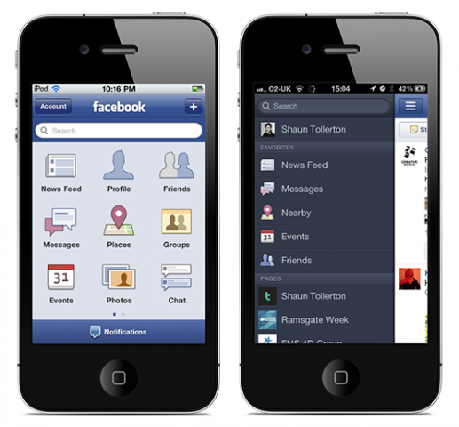
Whilst Path and Sparrow are geared towards the more tech literate, Facebook’s iOS app, with over 99m monthly active users is an example of a mainstream app that has moved from grid navigation to split-view navigation with great success.
But is this method suitable for navigating all apps?
Facebook is a complex app, which needs to accommodate five core sections (News Feed, Messages, Nearby, Events and Friends) as well as an indefinable amount of secondary sections (Pages, Apps, Groups etc.). Having a menu system that can grow helps give the user the functionality they expect from a mobile app.
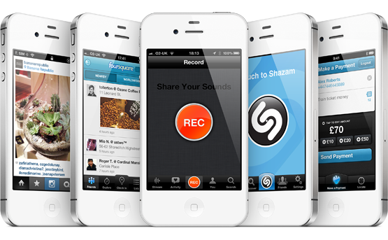
Apps with a more focused experience such as Instagram, Foursquare, Soundcloud, Shazam and Barclays Pingit benefit from having the old-style omnipresent tab bar.
Having a focused central icon across the experience helps reinforce the core function of the app to the user.
In Instagram’s case, having the focused “share” button on every screen tells the user that Instagram is more about participating than spectating.
Comparing Paypal to Barclays’ Pingit, whilst both apps use the tab bar, the central icon leaves no doubt as to what Pingit is for. Paypal on the other hand, is less direct and could be as much about managing your account as it is sending or receiving money. This reiteration of the app’s purpose could not be communicated with split view navigation.
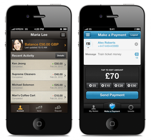
Whether a UI is better suited to a tab bar or split view comes down to the tasks the app is expected to do. Barclays Pingit is about paying friends and Instagram about sharing and viewing photos. They have peripheral features such as account management, but both are single-minded in their task.
In comparison, Path and Facebook are designed to do multiple tasks. They are about sharing and interacting with all types of content; engaging in direct and indirect ways with friends and in Facebook's case managing its own suite of applications.
The amount of tasks users expect to be able to do with an app has long outgrown the restrictive five option tab bar, and split views are an elegant way of accommodating this.
However, we need to remember that split views aren’t an invitation to shoehorn more features into an app. Sometimes a more focused experience is a better experience, and the tab bar is still perhaps the best way of focusing the user’s attention onto the app’s core function.