iShares®
A world-class design system to make investing accessible to everyone
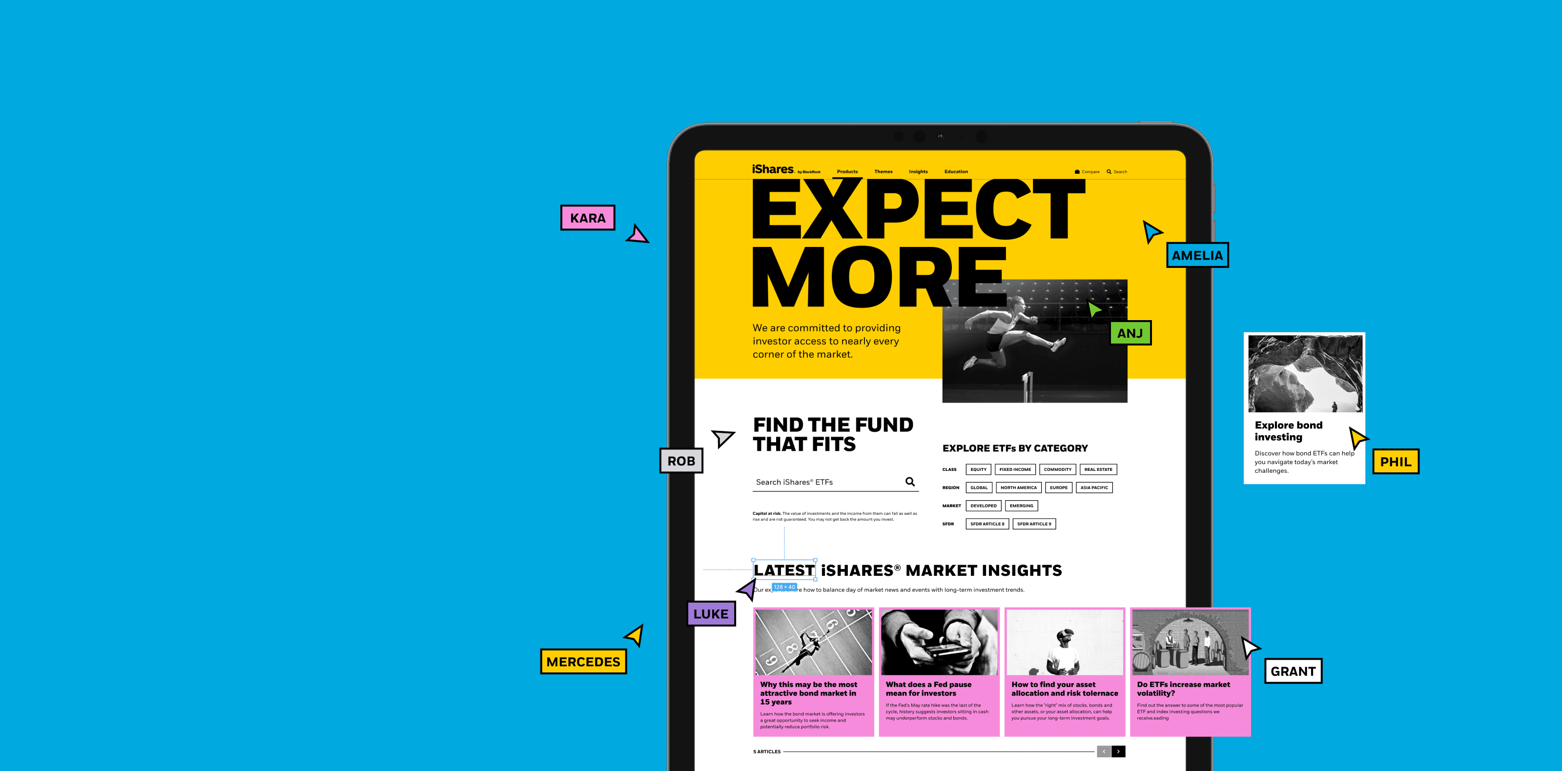
Through an enduring multi-year partnership we created a design system* to help the iShares® team deliver consistent and inclusive digital experiences for the 120 million investors who use their products.
*A design system is a comprehensive library of design elements, components, patterns, page templates and best practice guidelines.
- 15%increase in website accessibility rating 1
- 50%speed efficiency improvement with design kit 2
- 4/5InVision design maturity score for iShares® 3
ustwo absolutely feels and acts as an extension of the iShares design team. This relationship has been critical to the success of the Design System, establishing it as an enduring digital product and not a one-off project. They are in the weeds with all of us understanding how discrete projects are impacted by their decisions and vice-versa. This back and forth is what fuels the evolution of the work and its value across the organisation.
The opportunity
When the iShares® brand unveiled a new global identity in 2018 it set them apart within the asset management industry, expressing their challenger spirit and appealing to broader, younger audiences. The new visual language centred around a vibrant colour palette and bold all-caps type, perfect for high-impact print, but the iShares teams would need help to translate it into multifaceted digital experiences.
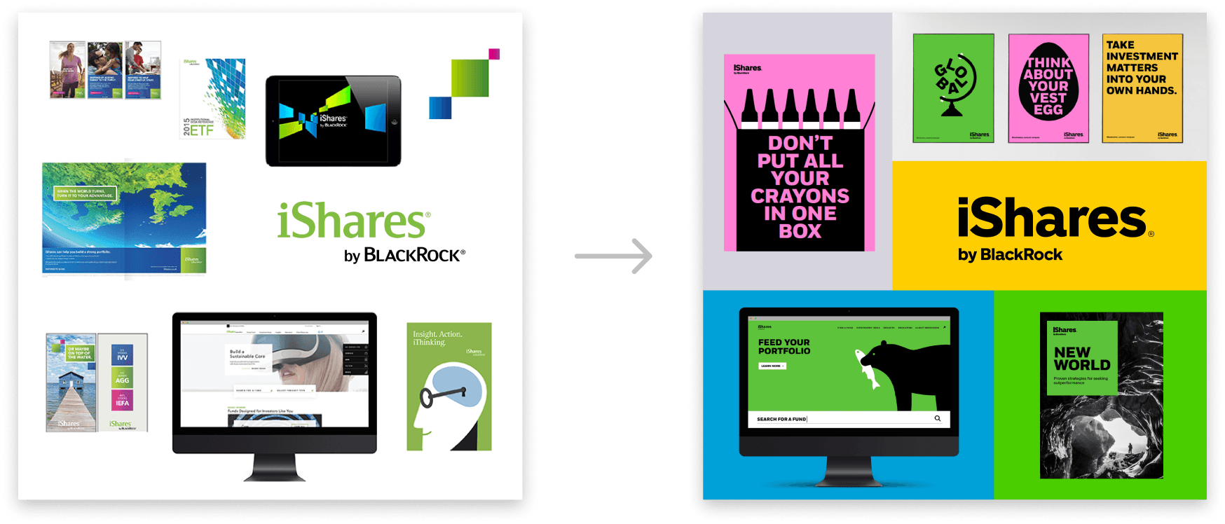
iShares® exchange-traded funds (ETFs) are the global leader in ETFs and are offered by BlackRock, the world’s largest asset manager. They help professional investors and individuals meet their investment goals with a range of low-fee ETFs such as stocks and bonds. A global network of sites serves these broad audiences and are managed at scale by local and global product teams, designers, content managers and partners. Any new design language needed to work effectively across complex areas such as fund comparison, all the way through to content storytelling.
We set ourselves a clear question – How can we express the identity in a way that is scalable and efficient and that effectively serves the needs of internal audiences across the business?
Cue the iShares® Design System
The iShares® teams needed guidance and tools to empower them to deliver exceptional web experiences while maintaining a strong and consistent brand identity. They needed a toolkit of reusable interface components (such as text styles, buttons and banners) and guidelines for how to use them along with a single source of truth for design principles and accessibility standards – The iShares® Design System.

Our approach
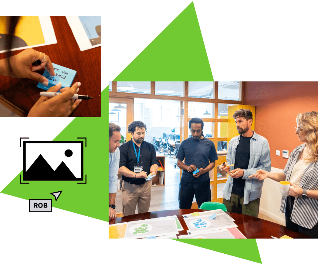
When it comes to building design systems, we follow these guiding principles:
- Design systems are products; they have users. Know who you're building for and what they need from it.
- Successful design systems should help teams to consistently solve user needs, and should allow flexibility to adapt when necessary.
- Effective design systems are more than neat Figma files. They should include implementation guidelines and standards.

From the very beginning, we treated the iShares® design system like a product that would evolve continuously to ensure future success.
It needed to be versatile and comprehensive, making it easy for teams with multiple needs and goals to create engaging experiences for their customers. We started with three main parts: a documentation site, a design kit and a front end library.

Designing for designers
The design kit was created in Figma, which we chose for its collaborative power. The Figma files are a library of design styles and reusable UI elements that designers and developers at iShares® can drag and drop, and customise to build new web pages in half the time.
All components are meticulously crafted and organised so teams can easily see everything available to them, and intuitively understand the many ways they can customise each component. This front-loading of effort by the design system team empowers the iShares® designers to work more quickly and effectively.

Moving the design kit from Sketch to Figma increased Kyle's design speed and efficiency by 75%.
Due to the time spent creating a sophisticated design kit, the workflows of our end customers improved exponentially. A flow that would have previously taken him four hours to complete in Sketch now took only two hours with the collaborative power of Figma.
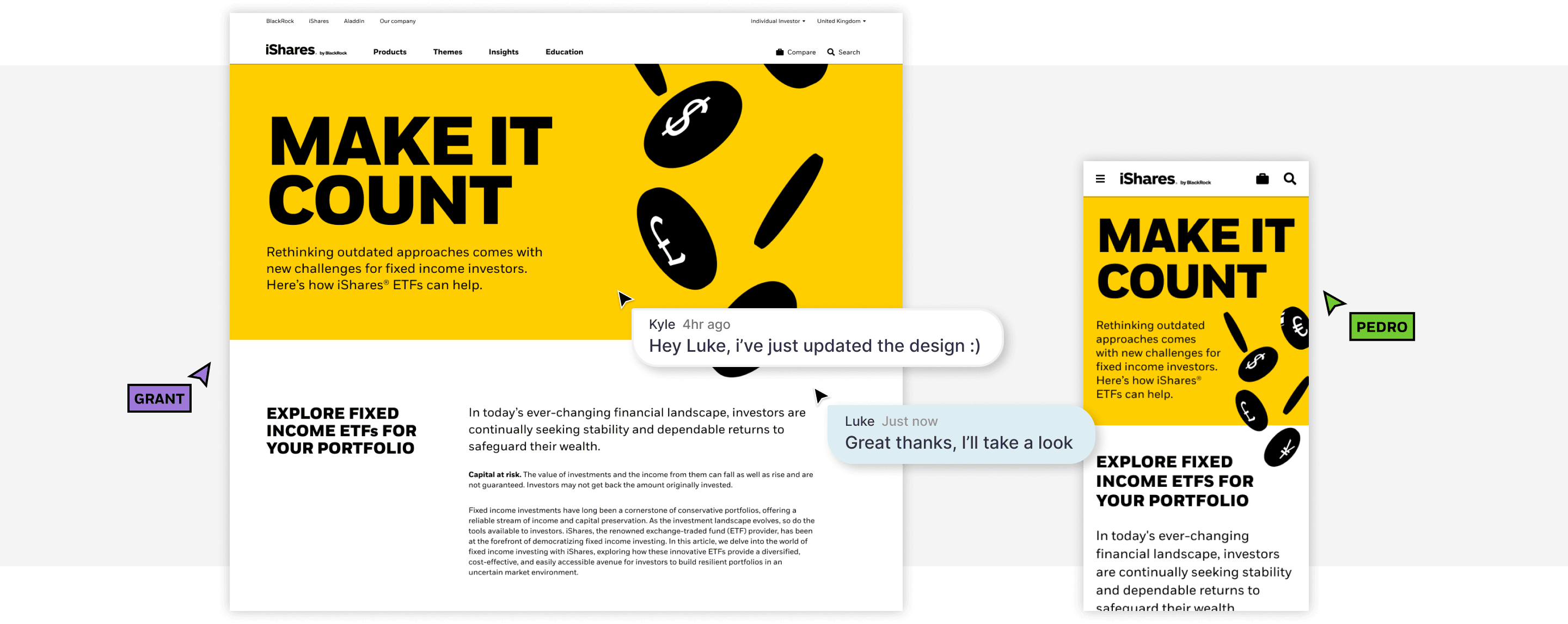
It’s no use building a design system, especially for multiple teams and markets, if there aren’t clear guidelines on how to use it. So, the second element we built was a documentation site where everyone can find information about the design system, including usage rules, onboarding documents, design components and instructional videos.
We also built a front end library that allows the iShares® teams to play with live components independent of the content management system (CMS) to experience how their content would behave in the end product.
Designing for multiple end users
A design system will live or die depending on how it’s adopted within the organisation. It was important for the iShares® design system to be the single source of truth across the business, so we had to consider the evolving needs of designers, developers, publishers, content marketers, and their external agencies – essentially anyone who develops or maintains the iShares® website. That’s a lot of people with different job requirements, skills and knowledge levels.
Four years later, we continue to assess the design kit, documentation site, component library and CMS guidance against the requirements of the organisation’s diverse teams, to ensure we’re including everything they need to do their jobs efficiently.
Not only is a successful Design System the sum of its parts, it also must work within the environment it’s catering to. In our case, that environment is global, has no fewer than five wildly different user types, and within a complex matrixed organization. Ustwo embraced that challenge and became embedded in our group, navigating it all with expertise and empathy.
Key considerations
Future-proofing
iShares® ETFs empower millions of people to make better-informed investment decisions. By creating a future-proof design system, we’ve enabled the company to reduce their design and development costs, which means they can build digital experiences faster, and at scale.
iShares® employees now have more time to be creative and can quickly release new content, website updates and products into the market. This in turn benefits customers who can now enjoy a consistent experience across any device and can find expert investment advice and insights easily.
Localisation
We recently enhanced the design system to provide a better regional experience for international customers. We created special links in the navigation to connect U.S. customers to the main advisor center, and we developed specific type styles and components that can account for different characters in German words and many other languages. These improvements cater to iShares® APAC, Japan and China markets, providing a truly localised experience.
Accessibility
Designing for customers with varying and diverse accessibility needs was crucial. So we rolled out a new fluid typography scale and grid enhancements to reduce the size of content and make line lengths more comfortable for readability, especially for people who use screen readers. We made sure every website component had the correct heading tags and aria labels. We also released a video player with transcript viewing, audio description and captioning to ensure a better experience for all users. Overall, we improved the iShares® website accessibility rating by 15%.
Looking to the future
A successful design system is never static, so we spent significant time on development and quality assurance standards. Over the course of our growing relationship with iShares® we have earned the trust to continually evolve processes, tools and even the visual application of their brand through the design system. This benefits the iShares® teams, freeing them to experiment with the brand and create delightful experiences for their customers.
The strong partnership between ustwo and the iShares® team is now a launchpad for an exciting new chapter, evolving the design system to work across the BlackRock® brands for the entire organisation to enjoy the same advantages.
© 2024 BlackRock, Inc or its affiliates. All rights reserved. BLACKROCK® and iSHARES® are trademarks of BlackRock, Inc. or its affiliates. Other trademarks are those of their respective owners.
1 Siteimprove A11Y rating improvements over time.
2 iShares® agency partner report 2023 on speed improvements made upon implementing the design kit in their workflows.
3 Invision's Design Maturity Score is a framework developed by InVision to help companies assess their level of sophistication in terms of design processes and culture.