After over a year of pouring our hearts and souls into Whale Trail, we wanted to make something new, quick and agile. Introducing Blip Blup: a minimalist puzzle game.
What it is
- It's a game about thinking
- It's a game about stopping and taking your time
- It's a game about logic
What it isn't
- It's not a game about speed
- It's not a game about timing
- It's not a game about quick reflexes
Concept
Whilst we were proud of Whale Trail, we were very aware that some things could have been done more efficiently. Being inspired by the "fail fast" approach we’d been applying to client project prototypes, the gaming team worked on gaming prototypes in week-long sprints, each ending with a presentation. 
I joined this prototyping process in August 2012 after four years of working on large scale software development projects for external clients. By this point we had several prototypes and I was extremely keen on getting involved. Being an obsessive gamer, I was given the chance to craft an idea of my own. More importantly, I just wanted the opportunity to play and explore.
The presentations were opened up to the rest of the company and became something I massively looked forward to. Not only was it a chance to see something brand new and interesting, but it was an opportunity to kick back and talk about games. Gamers love playing games almost as much as they love talking about them! If an idea was engaging, we'd take it further. If it didn't have a spark, we would shelf it and move on. It was an important lesson for us to learn how to say no to our own ideas if they simply weren't good enough.
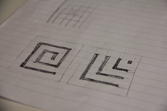
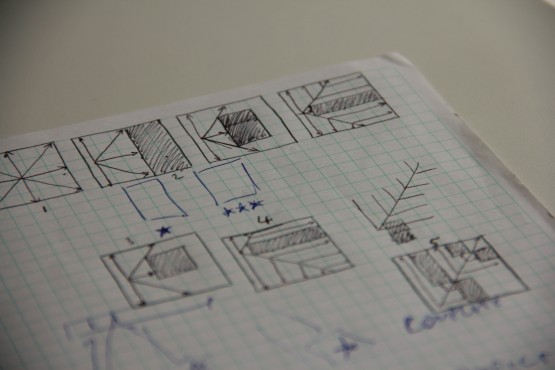
The idea for Blip Blup started on paper. I've been a gamer for most of my life, with a particular love for puzzle games. In my mind, the mechanic came from a few basic sketches and then asking myself questions like:
“How would it feel to tap on some squares and see light spread out from my finger?”
"What if there were things that blocked the light?"
"Can I create a puzzle from this?"
The result was a minimal prototype in which the screen starts with a grid of dark squares. Tapping anywhere sends out a pulse of light in all directions. The aim was to light up all the squares of the grid within a given number of taps. Something about the prototype just felt right. There was a core mechanic that was in itself satisfying, and that mechanic has served to be the pillar throughout the entire development of the game. Over the following weeks, I took the prototype further to include a level editor which allowed us to quickly and easily prototype new concepts within the game.
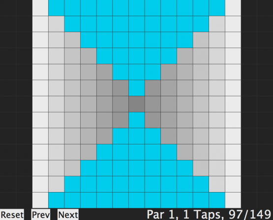
As we built more levels, we were also delving deeper into the puzzle aspect and starting to build an arsenal of levels that explored different puzzle elements, and this led to the inclusion of what are now known as the "special tiles", tiles which might change the direction of the light, or “kill” the player if touched and so forth.
The 3 most important strengths of the prototype were:
- It was simply fun just to tap anywhere and watch the light spreading.
- The level based model made it easy to visualise a complete game with a large number of levels.
- There was a clear puzzle arc that allowed levels to vary from very easy to very difficult.
After iterating on this theme we felt we had an engaging prototype to take forward to production.
Visual Style
There was something engaging about the minimal style of the prototype and this influenced the overall design in many ways. We steered away from heavy characterisation and went for styles that were more stripped down and abstract.
The visual style of the game has evolved multiple times before settling where it is now.
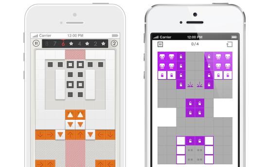
We started with a skeuomorphic aesthetic which made the levels feel tactile and physical. While it was wonderful to look at, over time it became clear that it wasn't conducive to puzzle solving. I remember reaching a point where it was not only easier but more enjoyable to solve the puzzles in the simpler prototype visuals. Getting to the final treatment was an exercise in finding a balance between our love for beautiful design as a studio and simple graphics that allow the puzzle-solving to be centre-stage.
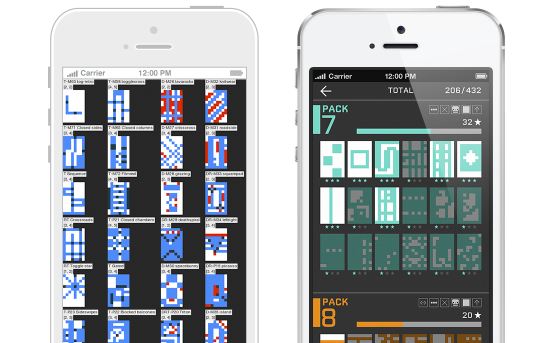
One of the boldest examples of the prototype-inspired design is the treatment of the level select screen. In the prototype and level editor, I implemented level thumbnails that were dynamically created from the level itself. These were not only incredibly useful for seeing which level I was working on, but seen together they were all visually striking. We took this into the full game and they instantly made sense once they were in place.
Game Design
The core gameplay of Blip Blup is rooted in the levels themselves. The challenge as a level designer is to create levels that are fun to play, actually require puzzle-solving, and are visually interesting. Many gruelling hours were spent playing, tweaking and re-playing levels until we'd gotten the difficulty and balance to a place we were happy with.
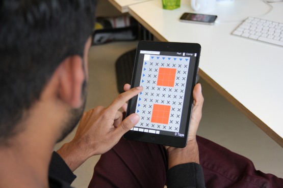
One of the biggest problems we faced was creating the tutorial. The original intention was to try and teach by exploration and experimentation. I was opposed to tutorials that spell out the behaviour and I was convinced that we could teach the gameplay purely through a series of levels that progressively introduce different aspects of the mechanics. It only took a few short rounds of user testing to prove me wrong!
Blip Blup is not a game about trial-and-error. Every level solution can be arrived at through logic, but it requires an understanding of the way the mechanic works. Without an adequate tutorial, we found that users were either resorting to trial-and-error or giving up altogether.
One of my favourite memories of user testing involved a user trying to solve a level with around seven possible tiles to tap on, and somehow tapping every single tile multiple times except the correct one.
The vast majority of people simply didn't understand the way that the tiles were spreading and we resulted to creating a dedicated tutorial. This began as a handful of in-game text prompts and has evolved into a more conventional approach of having some pre-level explanations and visual guides.
Q&A:
Why sell it for £1.49 with no IAP?
We always wanted Blip Blup to be a simple proposition - straightforward puzzling and nothing else. We feel it also offers a premium experience that is ultimately aimed at a niche audience of puzzlers over the mainstream. We also wanted to let as many people try it as possible, so it was natural to have a free ad-supported version alongside the 'full' experience. We think that showing one advert before each level is a simpler solution than trying to shoe-horn a freemium mechanic into the game. The only IAP we seriously considered was a Hint system, but in the end we decided to wait for player feedback before choosing additional features.
Our Android version on the other hand is a whole different beast. With piracy a possibility on Google Play, releasing a fully unlocked premium version of Blip Blup would have increased the risk of that version being ripped on day one. We decided the best approach would be to release a free ad-supported version as the only SKU, with IAP used to unlock that game with all features. The cost is the same but with a different delivery method.
Why is it called Blip Blup?
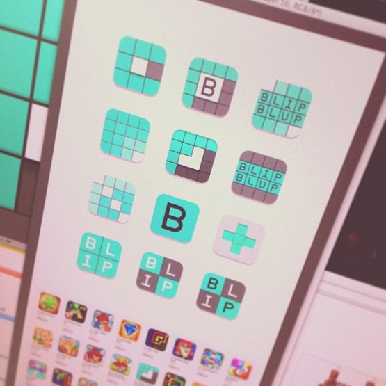
The original prototype was called Blip and was inspired by blips on a radar. We referred to the game internally as Blip before coming across a recent release with the same name. During our attempts to brainstorm new name ideas and detraining ourselves from calling it Blip, our visual designer semi-jokingly updated the game visual to say Blip Blup. The rest is history.
Who made the music and SFX?
We’ve got a good range of talented people at ustwo™, so we were fortunate enough to have someone in-house with the skills necessary for our music and sfx needs. Dev did an excellent job in hitting the right tone and I think that shows in our gameplay and promo trailers. The sound is crucial and is 50% of the Blip Blup experience.
What user testing did you do?
Extensive user testing was a key requirement on such a cerebral experience as this, and we worked with as many friends, family and ustwo™ fans to gain as much data as possible. Taking note of such events as number of taps a player has made, number of people perfecting certain levels and even when they flat out gave up and didn't play for a while. Using this data enabled us to make changes and get the balance just right.

What are your expectations for the game?
It’s very difficult to say, but our ambition is for Blip Blup to break the top 100 in both the paid and free puzzle categories. On both platforms within our first year, we’d love to sell at least 10,000 paid and 200,000 free versions of Blip Blup.
What tech did you use to build the game?
Blip Blup started as a prototype built in AS3, which was ported to HaXe/NME, and eventually built from the ground up in Unity. This is our first release with Unity and we envision using it for future releases too. Fun fact: we still use the original level editor in HaXe!
Done!
All in all it’s been a fantastic six month journey, and this post only scratches the surface of our learnings doing this, but one thing we will say is taking an iterative approach and not being too precious about ideas has allowed us to work more efficiently and release new products sooner which frees us to be more creative in the long run.
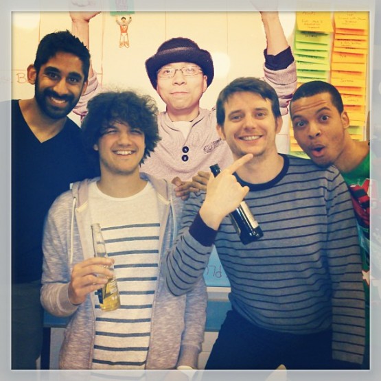
We're already back in the process of experimenting with new ideas. Stay tuned for the next bold creation from ustwo games, but in the meantime pick up Blip Blup from the App Store or Google Play now and tell us what you think of it.