TL;DR: We spent a few weeks experimenting in Daydream, and documented our process. Want to see what we built? Download it here.
At ustwo, we like to approach both new ideas and new technologies by getting our hands dirty. Making something tangible means we can really get a feel for the product and test it with real people.
VR and emerging platforms are a priority in the NYC studio. On our downtime between projects, We are constantly trying to push our horizons, teach ourselves and each other, and create reusable assets and processes that enable us to work at a rapid place with these relatively new mediums.
With VR, we’ve learned that tangible prototypes are not only important, but should be at the core of the design process. Validating ideas quickly through real feedback is the best way to understand an idea’s potential without getting too caught up in figuring out all the details upfront.
Keeping this in mind, we started thinking about what we could do with the new Google Daydream VR headset. Spinning off of the success of playful and creative experiences like Tilt Brush and Job Simulator, we wanted to explore how VR could be used to support everyday work at ustwo. This lead us into thinking about creating tools for ideation and collaboration.
The Google Daydream headset enables a higher degree of interaction than its predecessor, the Google Cardboard headset. The main difference between the two is that the Daydream headset allows you to use your hand (via a controller) as an input method rather than simply moving your head around and clicking a button on the headset as one has to while using Cardboard. We wanted to explore the limits of what you could do with this controller, as well as attempt to raise the bar for what types of experiences one can create for the platform.
We wanted to use this experiment to explore the following questions:
- How would it be if it was effortless to move whiteboards, Post-Its, and work sessions from the physical space into VR?
- Do the physical constraints of these objects affect the way we think while ideating?
- There’s something that gets lost when trying to have meetings on digital platforms like Slack or Hangouts / Skype; is it the physical presence, our facial expressions, or the limited tools that make these platforms so inefficient and awkward when it comes to ideation?
- What if all of these physical nuances could be moved to a digital space and still remain tangible for the user?
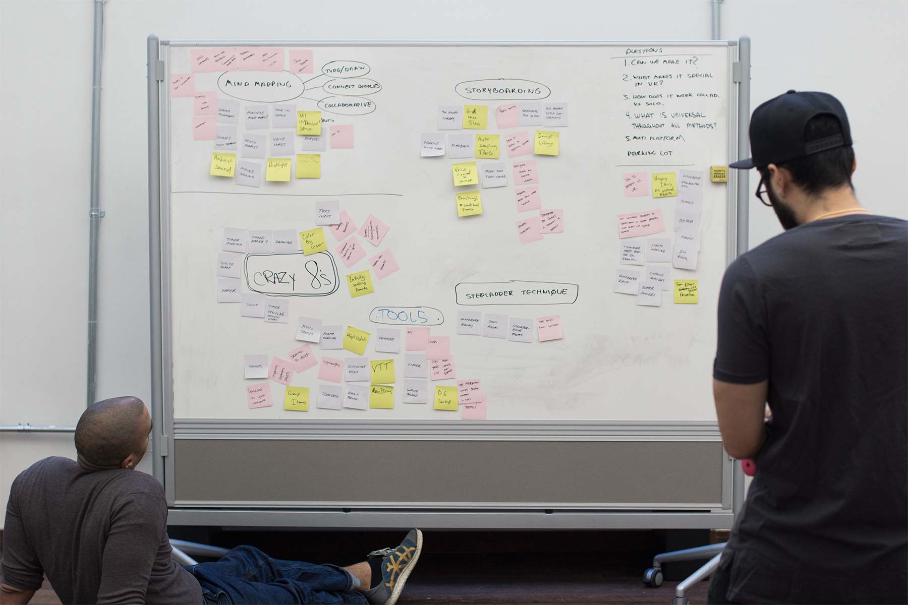
We gave ourselves four weeks to research, conceptualize, prototype, user test, and refine the experiment. Our time was divided up into two sprints, each spanning two weeks.
The first thing we did was research collaboration and ideation, both in terms of methodology and group psychology — how do group dynamics play into how people interact in a brainstorming session? Who gets heard? Who speaks up? Who is negative vs positive? Who generates the most ideas, and why? We realized that this is a large set of possibilities and that we needed to be selective about what to choose since everything was interesting to test.
Using ustwobies in the studio as our target audience, we analyzed which tools and methods were commonly used for ideation. From there, we were able to select a minimum set of interactions to which our prototype needed to cater.
First, we identified that the most common methods of capturing ideas were drawing and writing. There was also a need to organize these ideas between the users. Second, it was clear that this experience needed to be collaborative, so we needed to create a multiplayer experience where users could interact in realtime.
Here’s a recap of what we wanted to test:
- Drawing
- Writing
- Moving ideas around
- Working in a multi-user setting
As a team, we started thinking through how this experience could work, getting perspectives across design, development, and project management teams. We were exploring ideas of how to create a platform for exploring ideas. Talk about meta!
The idea that got us most excited and unified was attempting to create something that felt like an extension of your hand. Could we use the new controller for drawing? Could it be precise enough to write with? And how would you be able to interact with objects?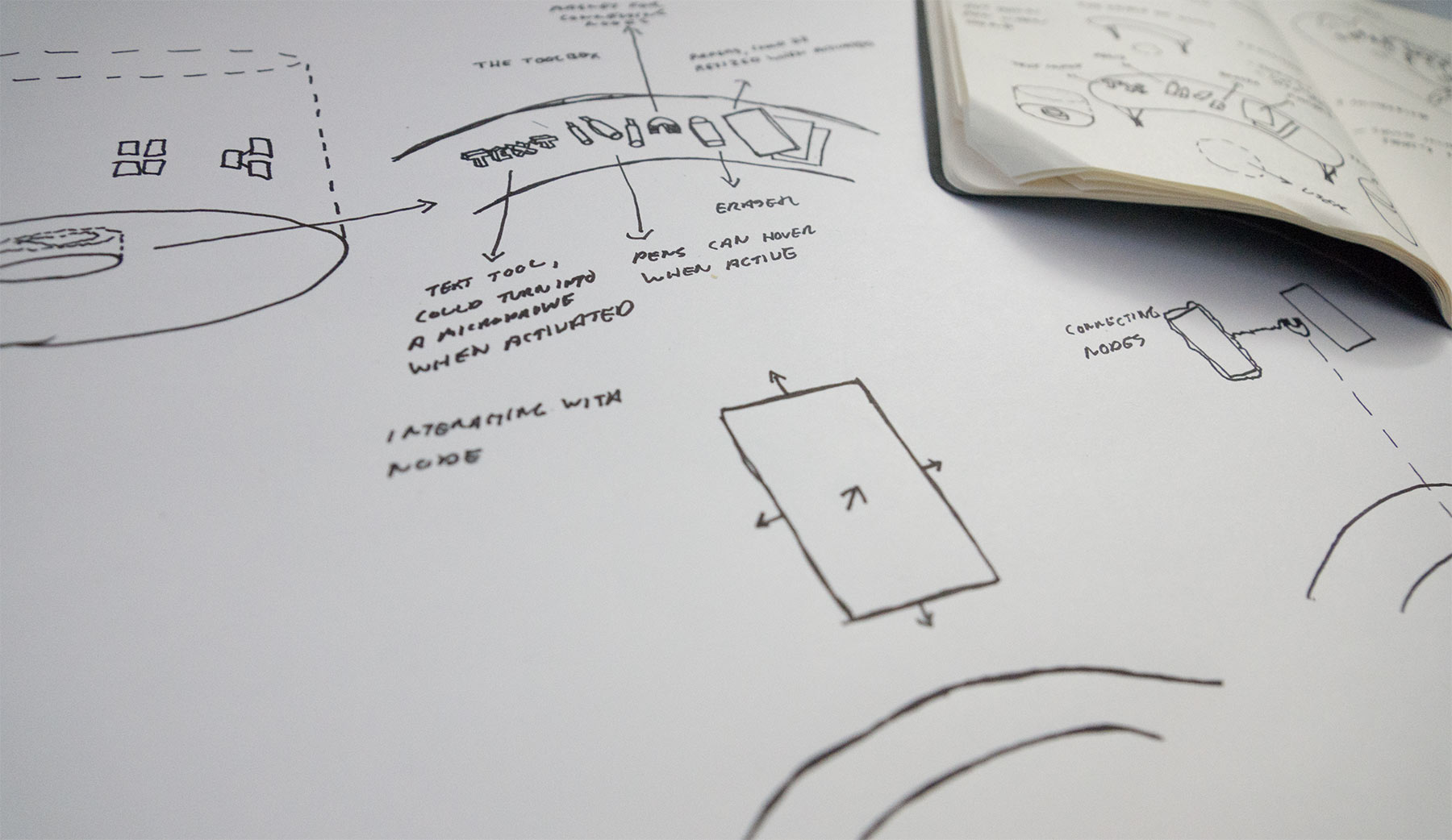
After figuring out what to test, we kicked off development, from both a technical perspective and a design perspective. We wanted to tackle the elements which would be the biggest risk to the product not working first, as fast as possible.
Design Considerations
How would you create ideas; draw and write? Which interaction model should we use? We started exploring both the use of a 2D menu system for tools as well as having tools in the form of objects in 3D space.
What sort of environment should the user be in? We wanted to move away from reality with boring meeting rooms and whiteboards, but, at the same time, we wanted the environment to not interfere with the work. We knew that we could put the users on a sunny beach in Hawaii, but that could make the users feel as though they were on vacation. We chose to go the minimalistic route and explored the idea of an unobtrusive open space / room.
Development Considerations
The main tasks involved implementing multiplayer, drawing, and writing text. We wanted all of the interactions to be close to reality from an effort perspective — if you’re drawing or writing with a Sharpie on a Post-It in reality it shouldn’t be more difficult in VR. After using other Daydream apps, we had a suspicion that writing text using the controller could be difficult, so we started thinking about a Plan B: Exploring libraries for translating speech into text.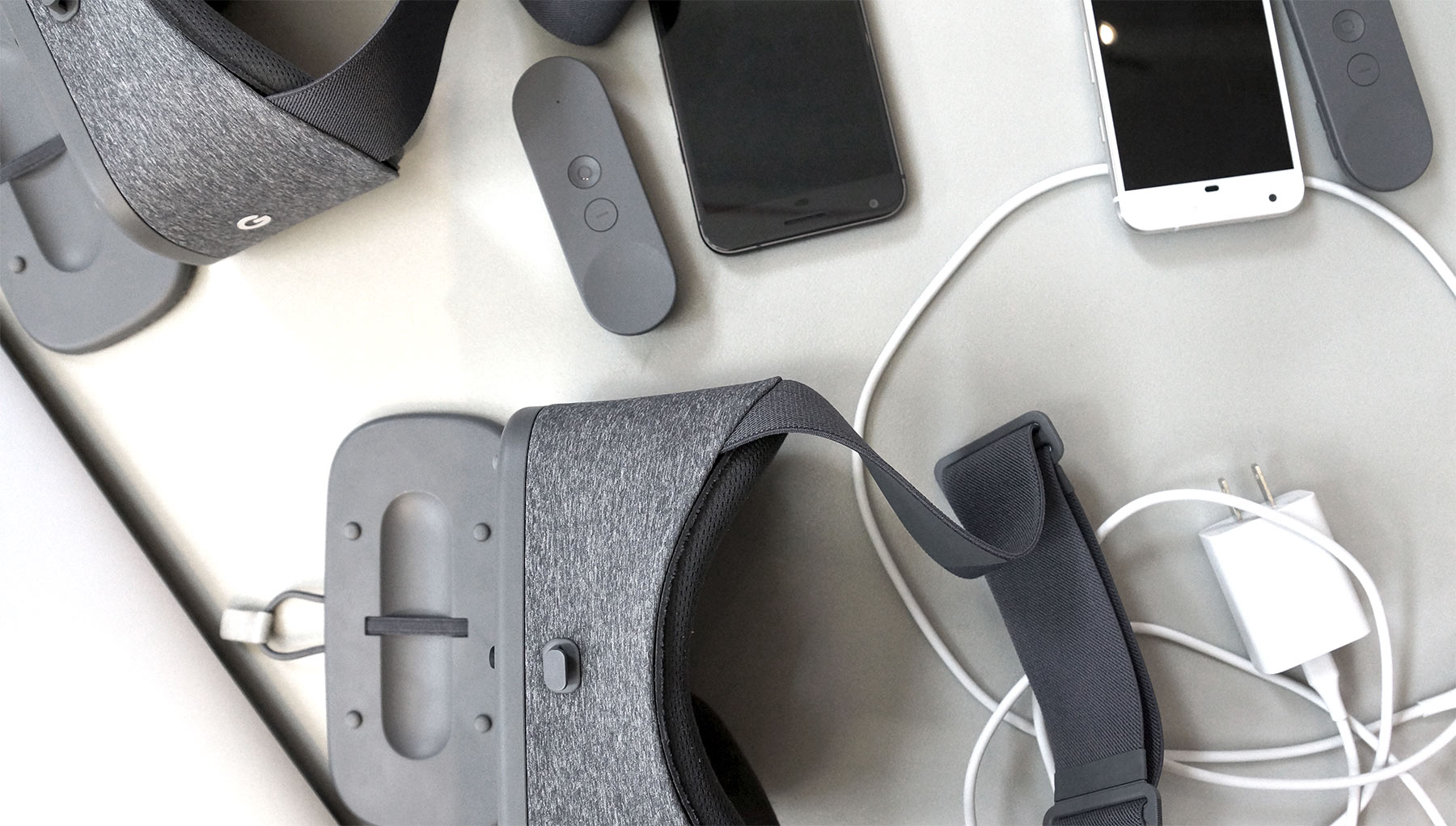
Our First Sprint
During the first sprint, we started with designing assets and exploring the environment for the experience. On the development front we got basic drawing in place, but our assumptions about it being difficult to write text turned out to be accurate.
For the drawing mechanic we started with a 3D brush similar to Tiltbrush. Essentially, when the user draws in space we create a mesh that follows the tip of their pen. This was was great at first because it was really fast. However, the 3D brush quickly revealed its limitations when we added features like blending colors, shapes, sizes, and opacity. Additionally, we ran into some performance issues with this method. As the user draws on a note, additional geometry is added to the scene. After a few minutes this extra geometry becomes a burden to the hardware, thus slowing the scene down significantly. Once we made the switch to a 2D brush that essentially painted a texture onto a note, we were able to add the desired features such as variable brush size & color.
Luckily, we could pivot quickly and started exploring different libraries for translating speech into text. Through sketching and discussions, we created a vision for how we would design the experience from an end-user perspective.
In the second week of sprint one we had finished assets, an environment, drawing in VR working, and had a rough implementation of speech-to-text in place. We were ready to put it all together and try it with users to see what would happen.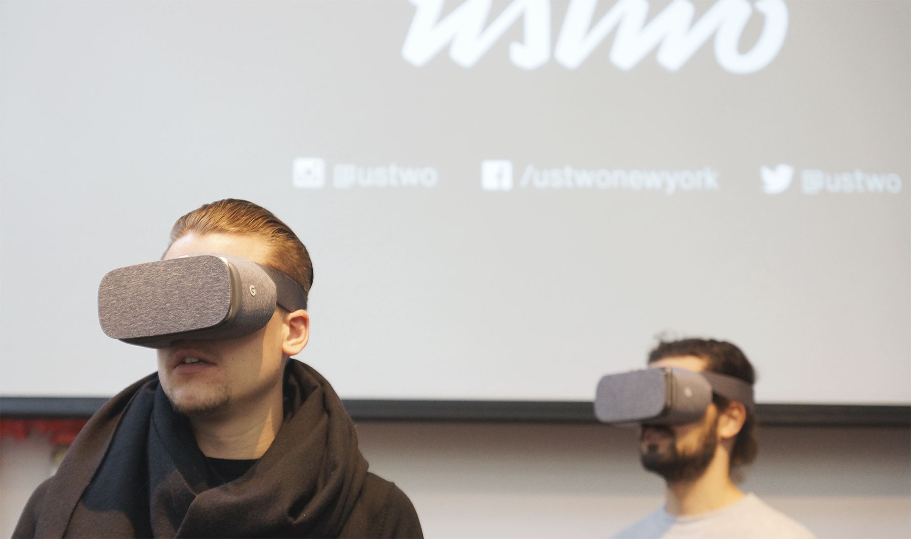
User Testing
User testing was done in pairs. Once headsets were in place, we started with a verbal on-boarding session so that people understood the basic mechanics; the goal here was to gather feedback to inform us how to build the actual in-app on-boarding. While this was important, our focus was primarily on testing the core features of the prototype, not the on-boarding experience.
Our main insight from the first user testing session was that people thought this would be a great tool for remote collaboration. People stayed engaged. No one wanted to leave the experience. We even had to ask them to take off the headset so we could ask them questions!
We also discovered a lot of bugs in the experience with drawing, speech-to-text, and moving stuff around that definitely interfered with the users’ ability to give conceptual feedback due to the friction of using the app.
The best part, of course, was that our team garnered tons of data for new features, such as different types of brushes, colors, Post-Its, exporting data from the experience, automatic groupings of Post-Its, and using avatars to convey other users’ presence in the VR space. All fantastic ideas that we never would have thought of on our own.
Recap of what we learned in Sprint One
- VR and collaboration between users has huge potential
- Even small bugs can get in the way of user-testing
- Prototyping is key for VR design. Be ready to pivot if some solutions don’t work as expected
Our Second Sprint
After reviewing and digesting the data from our first user test, we decided to change our focus to making our existing features better and easier to use rather than adding more to the experience. From a development perspective, we wanted to change the drawing to be texture-based instead of being based on drawing in 3D space. We also wanted to create a more robust experience for handling speech-to-text, because the biggest problem we observed was the feedback we provided the user with when doing the actual processing — it felt buggy and unnatural but was actually working from a technical perspective.
On the design side, we wanted to explore more environments. One tester felt weird being in something that resembled a round room, since he had never been in one in real life. We were still figuring out a balance between the environment and the experience.
We started to make the drawing more robust by changing the system to generate a texture by drawing instead of using 3D geometry. This enabled us to play around with different pens and colors and was much more performant than our previous implementation.
Speech-to-text was also developed further — The user was now talking into a virtual microphone and it was more clear that what they said would end up on a Post-It note. Quick and dirty explorations of different environments
Also on the design side, we explored more open landscapes. We finally landed on a single direction with a bright, warm world with different islands floating in the sky. Each island represented different rooms that you could go to by looking into a telescope on each island to navigate between them.
Recap of what we learned in Sprint Two
- Getting features to work smoothly will enable users to give conceptual feedback instead of being distracted by bugs.
- Even in a prototype, the visuals will have huge impact when doing user-testing in VR.
- Moving quickly and being able to change direction as a team is key to making something great.
Using the Daydream Platform
There are a number of things we learned about the Daydream platform:
Daydream offers a higher level of experience to the user in both the form of visual fidelity and input capabilities. With the headset strapped to your head, it opens up opportunities for longer experiences. The controller gives you the ability to interact efficiently and creates more freedom to look around and take in the world that’s surrounding you.
The Daydream is a step forward for mobile VR — the headset is light to wear, portable, and enables richer experiences than the old Cardboard headsets. But, it still can’t compete with the immersive experience of using tethered VR headsets, like the HTC Vive.
We’ve learned that you really need to consider the capabilities of the controller when designing for this platform. It works a much like a laser pointer that you can move around in space and use to interact. So, think about how you can use a laser pointer.
Ideation in Virtual Reality
It’s a powerful thing to move away from your computer and work physically with ideation, but we don’t necessarily think that physical needs to mean “not digital”.
Through this experiment, our team only scratched the surface of something interesting. There’s potential in using VR to create more inspiring environments rather than being stuck in a meeting room. Suddenly you’re given the ability to collaborate creatively across remote locations, or simply to enable a zone where you can think freely without constraints, which, in the modern open office environment, is a rarity.
During these quick yet insightful sprints, we were able to explore how something we do every week can be translated into VR and what that means for the way we work. It’s important to do these experiments to discover how technology can be used to create a positive change in the world, and we’re excited to continue down the path of exploring new concepts with emerging technologies.
