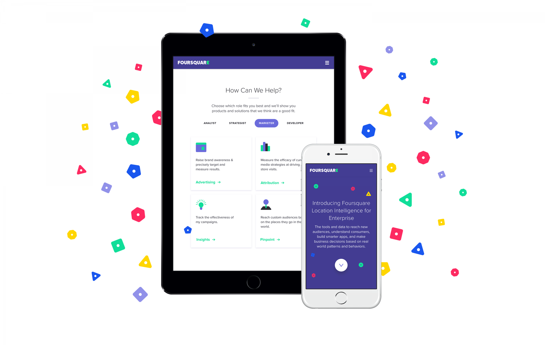
Foursquare is a company that almost everyone at ustwo has looked to for inspiration, both literally and figuratively, over the years. Naturally we were extremely excited when, earlier this year, we joined forces to create a brand new web experience for Foursquare's Enterprise side of the house, which would complement its consumer-facing website.
A Change In Mindset
Foursquare has always represented everything that is good about location services. The main Foursquare App, maintained by scores of avid users, is constantly up to date and brimming with useful suggestions and tips. Swarm’s super addictive social gameplay doubles as a personal location diary, and the Foursquare Location API is consistently used by legions of developers to power their own apps and services worldwide.
It was with this consumer-facing mindset that we dove into this engagement, since like many, we didn’t know much about their business offerings, or their vast potential. The fact is, over the years Foursquare has developed a suite of aptly dubbed ‘Location Intelligence’ tools which are mind-bendingly powerful and are set to change the way location data is used by advertisers, developers and strategists, amongst many others.

What Are Foursquare Enterprise Products?
Foursquare’s Enterprise Products can be roughly categorized into three main categories: Advertising Tools, Developer Tools and Place Insights.
Advertising Tools are essentially comprised of: Pinpoint a product which helps advertisers identify, reach, and measure audiences based on where people go in the real world. Attribution provides the ability to measure conversion in the real world for all sorts of cross-channel media. Native Ads - one of Foursquare’s earliest business products - allow advertisers to access the communities on Foursquare’s consumer applications with relevant advertising.
Foursquare Developer Tools are focused around the Foursquare API which is the most accurate way to recognize places, and Place Insights are business insights derived from real-time, ground truth data about the places people go and who these people are.
Our Approach
The challenge we were faced with when designing this site was communicating in a concise way how a ubiquitous underlying technology (location services) and the underlying database with billions of data points (known as First Party data) can actually be used in such a varied and creative way by Foursquare’s suite of Enterprise Products.
As in most organizations, language used to describe things which are complex in nature can rapidly become technical and difficult to understand. One key consideration we identified early on was: How do we explain what all of these incredibly powerful tools do in a way that isn’t laden with jargon, or require novels of text to explain? We wanted Foursquare’s products to be readily understood by a wide range of individuals from different industries, regardless of technical literacy.
To tackle this challenge head-on, we kicked off the project by meeting with and interviewing many of Foursquare’s executive, product and development teams, with a goal of gaining a deep understanding of how and why the company’s enterprise products were being built. This series of interviews helped us attain a perspective on how these thoughts are understood across different departments, and also how they were communicated internally and externally.
The end result was a well rounded viewpoint on what Foursquare's products are, and from this we crafted a website foundation using language that everyone can relate and feel connected to, thanks to multiple departments and points of view having added to the process.
Embedded content: https://vimeo.com/178918356
What We Built
Brand
Once we had time to digest everything that we heard from Foursquare’s teams, we undertook a series of exercises to begin fleshing out how the site would be designed.
The first task was to create a proto-brand for Foursquare Enterprise, as there was a need to draw a distinction between Foursquare for Consumers and Foursquare for Enterprise. This task saw the creation of a distinct business-oriented look, but carried with it some elements which reference the parent Foursquare brand. A large part of this challenge was locating an appropriate position for the new Enterprise brand - taking into consideration the playful and colorful attributes of the Swarm and Foursquare brands. How do these attributes which have been part of the company’s DNA since inception translate to a suite of powerful new business tools aimed at an entirely new market?
One of main challenges the team had was to create a simple and straightforward way to visually communicate Foursquare’s products’s core capabilities. Because these products can have many different and varied uses, the team wanted to find a theme that could be used consistently across product offerings. The results are manifested in 5 different elements we call Data Glyphs.

While these Data Glyphs were designed to represent different clusters of Foursquare’s data, they also serve as a visual aid to express some of the main capabilities of the different Foursquare Products.
Take Attribution as an example. As explained above, this product can effectively measure who visited your physical store. When thinking about a visual way to explain this concept, we decided to go with the “counting” animation you can see below. These Glyphs are used throughout the site and serve as one of the main components of this new Enterprise initiative.

Information Architecture
Given that Foursquare’s suite of Enterprise products are aimed at a slew of different audiences, ranging from advertising industry professionals, to developers, to Wall Street analysts, we faced a challenge around how to best communicate these products to each audience. Adopting a unified approach for everyone was something we didn’t want to risk. Our solution for this was to create an information architecture on the site that allowed each type of audience to self-attribute what sort of content would be most relevant to them based on their role/background. This is reflected in the top level navigation, aimed squarely at helping individuals navigate to the areas of the site that are most relevant to them.
Show, Don't Tell
Another leitmotif that we adopted through our design of this site was the concept of ‘Show, don’t tell”. The thinking behind this was inspired by seeing Foursquare’s Place Shape visualization - essentially a heat map showing how check-in frequency/accuracy around a specific place in the real world.

We concluded that showing and explaining things in a visual way is in many ways Foursquare’s unique selling point - and this should be reflected in its marketing site. Employing visual language is more engaging than explaining things with text - and helps us stay true to the design principles behind Foursquare’s products. This can be seen reflected in our data ‘glyphs’ mentioned above, and our Segments and Insights interactive features - allowing you to sample some of Foursquare’s choicest data points.
How We Built It
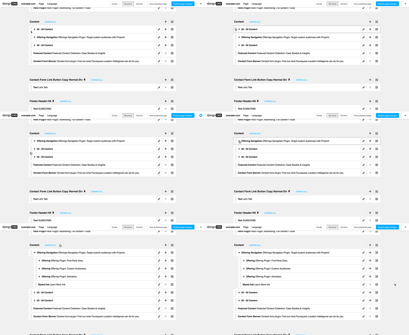
From the outset of the project, it was a requirements that non-technical teams at Foursquare would be able to easily update the site, without the help of engineers. This meant that we needed to consider components to build the site that could and would be reused throughout, both for content and features.

Our solution was to build customized Django CMS plugins to fit the needs of the site. Working together with the Foursquare team to source data and insights, we were able to populate some of the more robust features that can be seen in the final product, including the Attributions tool and the Segments tool.
A Fresh Future
With the project complete and the site live, the Foursquare team now has the ability to update the content via their custom back-end, ensuring that it’s always fresh with new data, case studies, and information for clients. Check out the final product at enterprise.foursquare.com.