If you do a search for "icon" on Dribbble most probably you'll see lots of pictures depicting ultra-realisticreal-worldobjects. This is interesting as icons were never intended to serve as copies of reality—as small, still-life pictures to look at. The fact that the realism is pushed to orbit means that the iconography in its current form has reached a dead-end: the old static-image-as-a-hyperlink-to-an-application paradigm is dying, the new one is not quite there yet.
Icons on a computer serve a similar role to signs on the motorway. They are to be recognizable at a glance, communicate information faster than words could and communicate across languages. For that, icons use familiar physical objects as the signifiers. On the motorway a gas pump signified a refuelling point, on the computer a notepad signified a place to write notes. This dependence of the physical similarity to real-world object ensures easy and reliable recognition for the icons and ironically also contributes to their demise.
![]()
As any other sign the icons have a signifier and a signified. The signifier is the form the icon takes, how it looks like. The signified is the concept it represents, the functionality or application it links to. For example the camera icon usually is represented by a generic camera shape/image (signifier) that serves as point of access to photographic functionality (signified). The reality is that objects we use are evolving and changing appearances. The iconic shapes of the signifiers are being lost due to the progression of technology. Mobile phones are now our still cameras, video cameras, game consoles, notepads, dictaphones, music players as well as our telephones.
![]()
In 2012, more photos on Flickr are taken with a mobile phone than with a dedicated camera. Also we’re not always going to have cameras that look like old point-and-shoots—look at the Lytro camera, it looks like no other camera that has come out before it.
iTunes, whose icon was a CD, ironically is the largest contributor to the prolonged death of the CD.
All icons based on real-world objects are sentenced to eventually become abstract symbols. The implication of this is that newer generations that did not encounter the objects used as icon signifiers in their everyday life will have to learn the meaning of these symbols.
It’s becoming less important that the signifier is an exact facsimile of what is being signified, and more important that the user remembers the icon and is able to identify it at the next encounter. In the same way we learn the abstract language of road signs or wayfinding symbols, we will figure out these seemingly abstract interface icons.

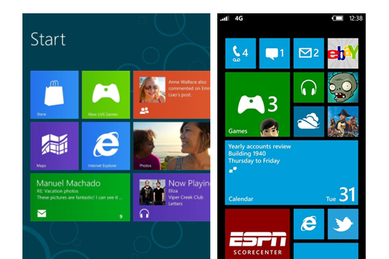
But are icons going to remain as static symbols of the functionality they provide? We have a glimpse to the future of icons in the calendar app icon of iOS and the live tiles of Windows Phone. With these, the dynamic content of the application becomes the signifier instead of a characteristic symbol or a static image, effectively ushering in a “post-icon” era.
However if content becomes the new motif in place of real-world object references, how will the post-icons for applications with similar content provide enough differentiation? How can a content-based “icon” for a notepad (short form text entry) be differentiated to that of a word processor?
The future of icons will be determined not only by their ability to change shape and form but also our ability to process them.
It’s telling that the most important functions in Windows Phone (Phone, Messaging, Email etc) are represented by real-world object symbolism and not the dynamic content available to those apps (i.e. person who called or new messages/mails received).

A bigger question is, icons have traditionally acted as a link to a task or an application within an interface. Are we still going to need them when our interfaces evolve from being passive and app-centric to become smart agents displaying context-dependent relevant information? Or when interfaces become based on events and conversations?
We’ve reached the zenith of realistic icons. In the same way that painters refocused their efforts on meaning as soon as they achieved realism, the role of an icon designer now is not so much “what does the app behind this icon look like” but rather “what does the app behind this icon enable you to do”.