At ustwo we’re very passionate about solving problems with travel and transportation, so we were very pleased to be invited, together with InUse and frog, to participate in the Skånetrafiken design challenge. The challenge was based around “The unknown trip”, and sought to create design concepts, and travelling experiences, for mobile where the traveller feels in control during the whole trip.
So, we wanted to create an application that will guide the traveller, without being intrusive, during every unknown part and moment of a trip. We wanted to focus on reducing the stress level, relieving the cognitive overload and psychological distress linked to the “unknown trip” by providing necessary travelling information when needed and build trust by being simple, clever and friendly.
Pain points when traveling to an unknown destination
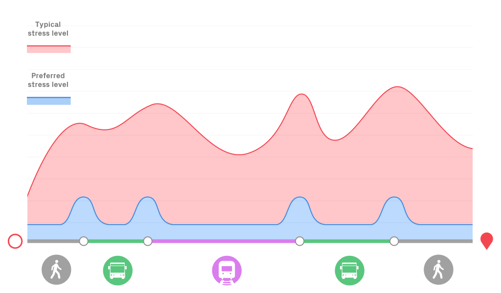
 For a more pleasant journey, we wanted to reduce the stressful situations to only a few critical points along the trip.
Having worked with Skånetrafiken before, on their 2030 vision, we know that they are very ambitious and aim to be much more than just a “transport from A to B” in local public transport. We decided on a concept that would not only solve the pain points of the occasional traveller, but also establish Skånetrafiken as the leading travel experience service provider in the region.
Travelling to an unknown location differs a lot from everyday commute. As a traveller, you do not always act and behave the way you would expect. Stress levels rise and you doubt your own senses and start double-checking, or even triple-checking your decisions. “Is this really the right bus? Are we going in the right direction? Where is my stop? I should ask a fellow traveller and check maps just to be sure.”
To figure out what makes for a pleasant travel, and what Skånetrafken could do to avoid the most common pain points for a traveller, we put a lot of effort into examining use cases and digesting background information from Skånetrafiken. On top of this we experimented with internal workshops and field studies.
We identified several ways of how to make an unknown trip as pleasant and comfortable as an everyday trip:
Visual cues that matches real life – to be able to easily follow your journey and that the world outside the window matches what you see in the app reduces stress levels.
Positive feedback on correct actions, and feedback on mistakes – like a friend that acknowledge any mistakes and encourages you when you do good.
Focused travelling, breaking down a journey in tangible parts – relieves the cognitive overload and reduces stress.
Focus on the nodes/transit where extra attention is needed – typical points in a journey that might be extra problematic and require the traveller to pay full attention and be alert.
Extra help on nodes/transit calms the traveller.
Transparency on cost and payments – being simple and clever on costs of travelling creates a friendly attitude.
Positive experience from previous trips – to build on positive experiences encourages more travel.
The journey overview – before travelling

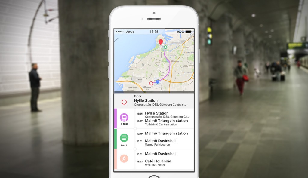
To cater for different individual’s way of navigating, we offer a clear overview of the journey in both map and itinerary, this will also help the traveller in confirming that the selected journey is the correct one.
The journey is displayed in detailed parts which give the traveller a clear overview of what the journey will be like, starting point, end point, modes of transportation, travel time etc.
Travel view - travel progress

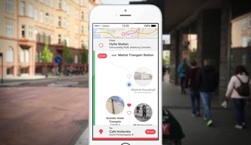
When the journey begins the application uses progressive disclosure, showing only what’s needed at any one time to reduce the stress level. What the user needs to focus on is enjoying the ride and only focus on the next upcoming task, usually a stop or a transit node, by putting focus on the current card.
We've added visual points-of-interest in the application that coincides with what the traveller is experiencing outside their window. These could be local landmarks or popular sites or venues. Visual cues create positive feedback to the traveller and confirm the progress of the travel. It’s possible to mark the visual cues as favourites and gain access to them later.
The critical parts of a journey are the transit parts, where a user is going to switch means of transportation. Because of that, we paid extra effort to the transit cards allowing the user to get visual cues and direction in the application by putting valuable information on top of the real view, also called augmented reality. These could be directions to a bus stop, the correct exit from a train station or walking directions to your final destination.
Getting on the right transportation
With a combination of techniques it’s possible for Skånetrafiken to know when and where you are travelling and to help you when travelling. Using positioning data, Skånetrafiken knows the exact locations of all and buses and trains. In addition to this, like with Wayfindr in London, they can also be equipped with bluetooth beacons to sense and detect applications and travellers that are in close proximity. Combined with positioning data of the traveller Skånetrafiken are able to inform users when he or she tries to board the wrong bus. Or confirm that the user is boarding the correct one.
It’s also possible for the bus driver to know if there are passengers that should be getting off at certain stops, or stop even if the passenger missed the call out, which would add a higher level of trust.
Because of the combined journey planner and the exact location of buses and trains as well as the travellers current location, the application can guide and help a traveller if, for some reason, they decide to stop for an errand, meet a friend on the street or help you when you just missed the bus. Being friendly and intuitive also builds trust.
The future of public transport
We only spent a week exploring the possibilities for this design challenge. There are a lot of public transportation companies on a global level and we are sure we’ve only seen some of all the solutions and explorations that are happening right now.
There’s a lot more that could be explored based on this concept. Integration of tourist information and services from different local service providers, for example. The application would benefit from a layered approach, to suit different types of travels for travellers with different types of information needs and expectation.
So far we have yet to see something that is fundamentally different and solves local transport problems in a revolutionary way. Travel guide applications currently seem to be "more of the same". With more "fresh" thinking from designers around the world we are sure there is a lot of innovations to be made.
Prototype
To explain and test parts of the user interactions, in addition to the screenshots, we quickly developed a prototype for iOS and we've created a web version so you can try it out too. Please note this is just for testing and should not be considered as any type of final product. Try it out (Prototype no longer available - here is the case study for the project)
How to explore the prototype:
- Drag from left to right in the itinerary view to expand it.
- Hidden function, click the from icon to open the camera/augmented reality view.
- Hidden function, click the bus/train/walk icon to show messages.
- Hidden function, click the travel time (bottom right) to show the arrival screen.