Lush
A retail m-commerce platform designed for informed product discoverability
Bright eyes, bushy tails
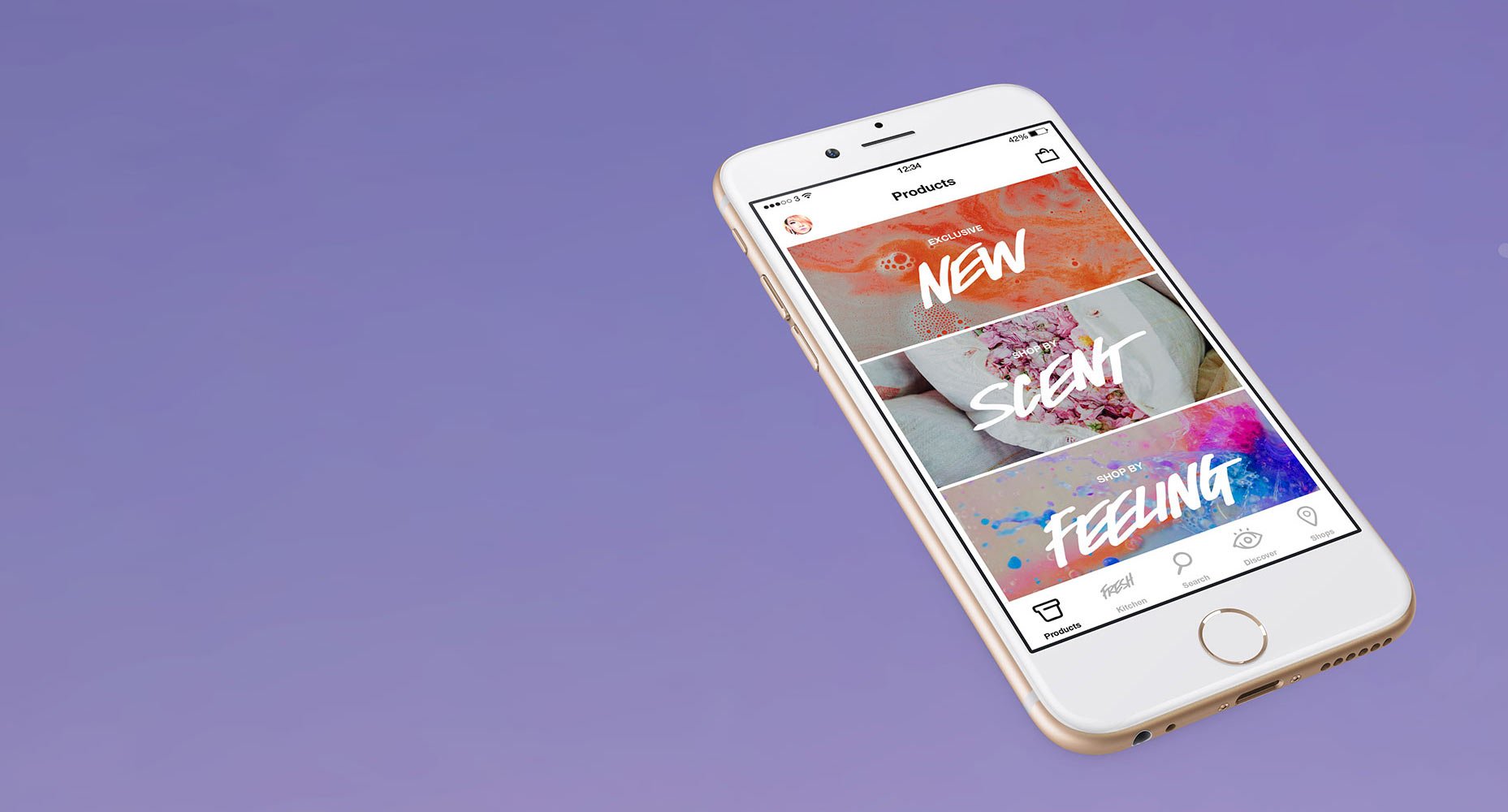
In mid-2014, the folks at Lush Cosmetics were looking for a partner to produce their first mobile experience: something through which customers could discover the products Lush make and, just as importantly, how and why Lush do things. ustwo were fascinated by the chance to get involved with an ethical cosmetics company and to explore the world of shimmering perfumery, natural skincare and social activism.
The newly formed design team within Lush were looking for a studio from whom they could learn new software design and development processes, having delivered a brand overhaul and website relaunch a few months prior. Being able to deliver iOS software end-to-end and to help instil good practice within the company secured ustwo the gig for an initial 3-month engagement.
Diving in
The challenge would be to immerse ourselves in the Lush brand, design and build something that customers needed and do this whilst imparting the intricacies of software development within a very demanding timeframe.
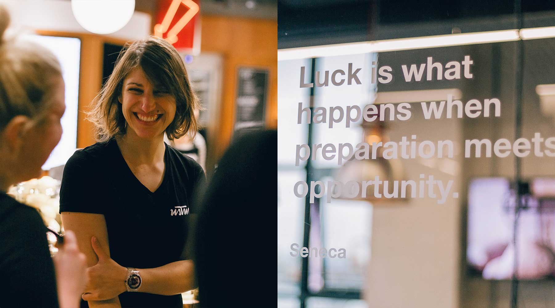
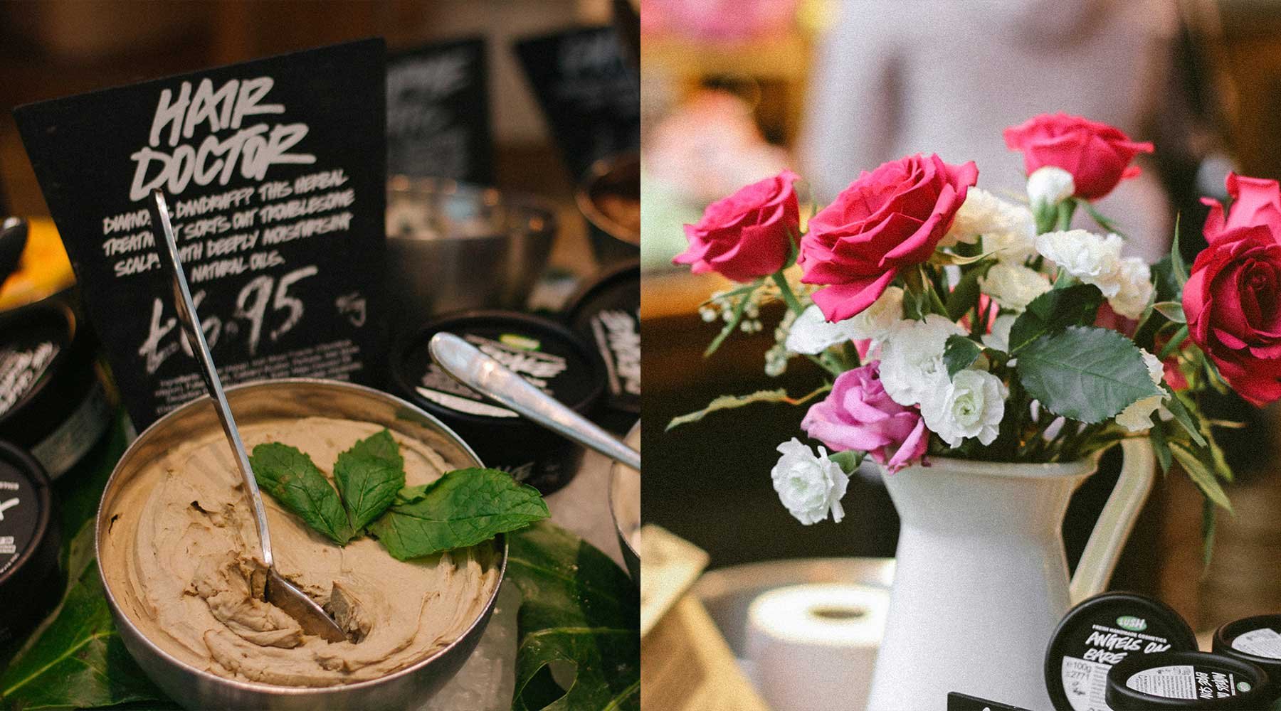
We quickly discovered our biggest asset in getting to understand Lush would be its retail staff and shop locations. There are over 100 shops in the UK and we met with managers, sales assistants and passionate customers across the south during the few weeks of the project. The staff were, without exception, hugely energetic advocates for the brand and its ethics, as well as being knowledgeable and highly trained. Our combined team realised that to succeed quickly we would need to lean on their perspective – if something felt right to the shop staff, we would pursue it with clear consciences! And with such devoted Lush fans, we were inundated with diverse customers from across the globe who all shared the same passion for the brand. We quickly built up knowledge of how the brand is perceived, which was instrumental throughout.
First it giveth...
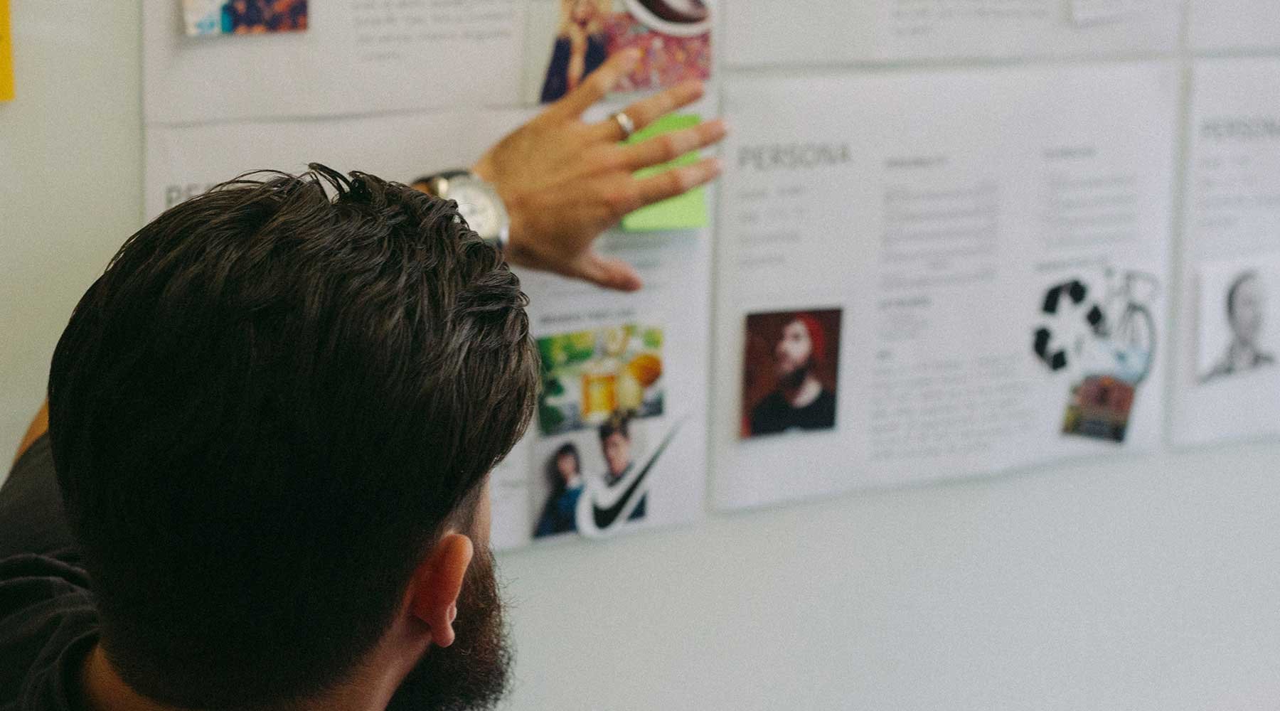
Meanwhile in a quiet corner of Dorset at Lush HQ, the team uncovered aspects of Lush’s existing content database that would need to be refactored for mobile. This would come to present a big hurdle for us early in the project. Alongside developing mobile design principles and interviewing staff and customers, the first order of business was a full technical assessment to evaluate the confines of the website system and propose ways to scale it up to mobile. Working hard with systems provider i-KOS, ustwo designed, drafted and managed the construction of a new API that we could build our application on top of.
Despite our best intentions, 2 months in the combined Lush/ustwo/i-KOS team was moving slower than we needed to. We also realised that having Lush employees on the delivery team who were managing several other projects meant that we couldn’t easily predict the amount of work we could get done within our timeframe. We’d overstretched ourselves and the project was starting to feel like climbing a mountain whose peak was obscured by cloud.
Roll with the crunches
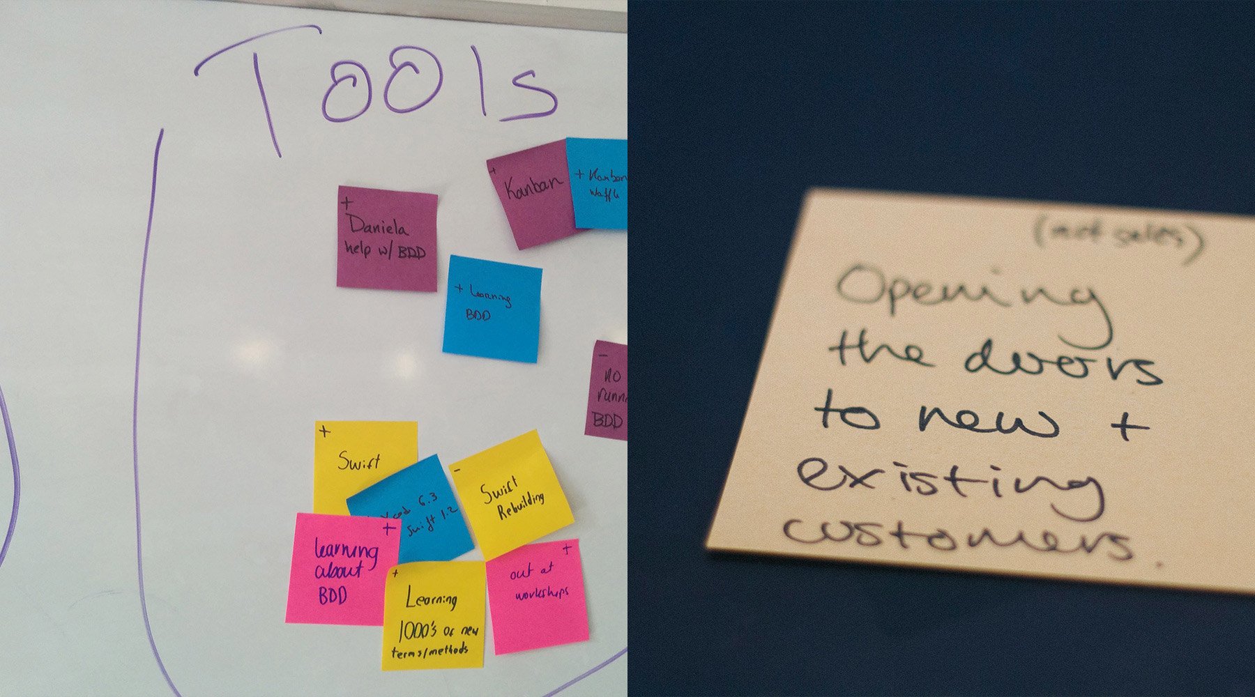
Time to redouble our efforts. Before Christmas 2014 we had some difficult yet productive discussions about the scope of the project. ustwo learnt a valuable lesson here about working to protect a brand that has a big personality. ustwo’s ethos is to get to market as early as possible with a few features, and grow the product based on customer feedback and data analytics, all the while making money through sales. This was somewhat at odds with the vision of Lush, who were concerned about customers feeling hard-done-by if they didn’t have all the features they were expecting straight away. Sacrifices were made to get us across the 3 month finish line. Heads were scratched. Goodwill was strained. Beers were consumed. We grew to understand each other better and to trust that, whilst our approaches were different, our goal was the same – spread the Lush message and enable their customers to discover and learn about the delicate relationship between our bodies, cosmetics and the environment.
Tell me more
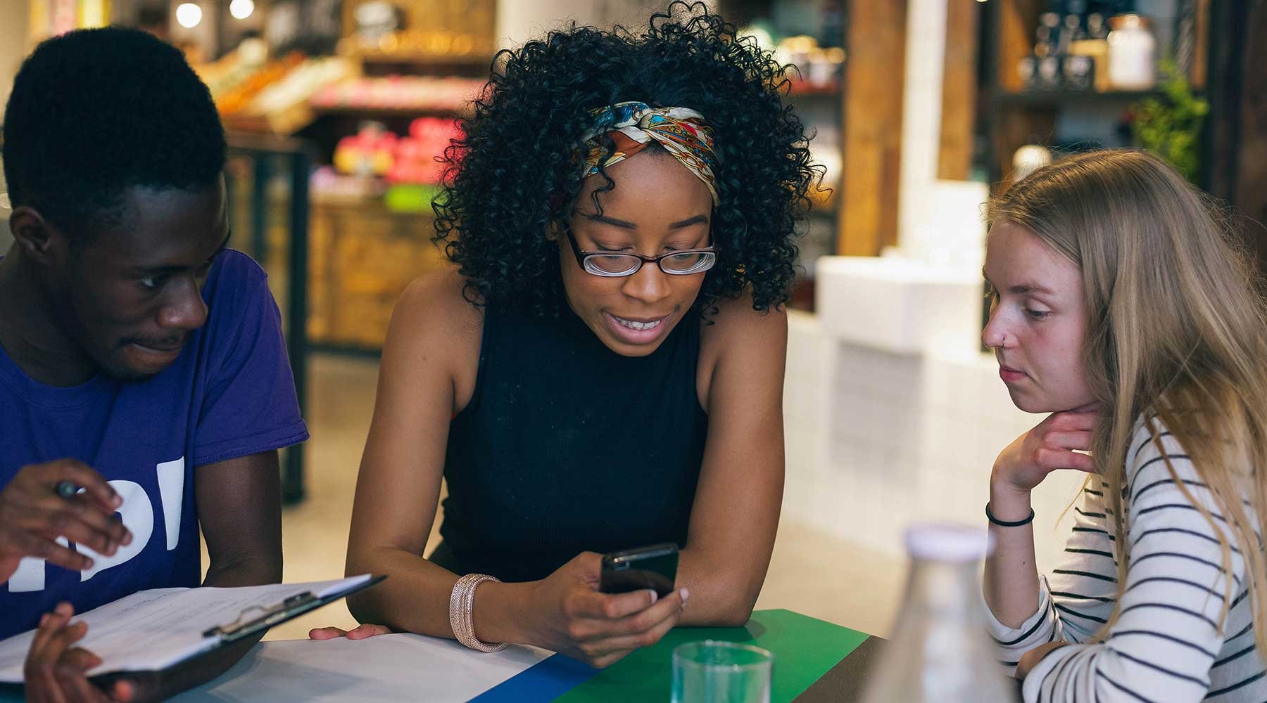
With a waterproof plan-of-action in hand, we beavered away on the last parts of our soft-release – the initial product which we would sneak to market to start to learn what was working and what wasn’t. Along the way we continued to test our application with real shop customers, and ran an internal beta with the Lush design staff. Not only did this give us critical feedback at just the right time but it gave the rest of Lush a sense of buy-in, and levels of excitement grew.
Fresh hope
And so we pushed our baby live! With a first release in the bag, the sense of relief was palpable. One of the most satisfying post-launch tasks for our product teams is to watch data analytics start to flow in, seeing early growth past 15,000 active users. A month or so after release we were gathering a button-for-button picture of how customers were using their pocket-sized portal to the Lush world. Especially fascinating to watch were the customer search terms – a real insight into what’s popular.
Through this, we reaffirmed our belief that mobile use-cases are more focused than on the web, and demand a content structure that focuses on finding things quickly, rather than the casual browsing you might associate with desktop web use. This rule-of-thumb could be applied to many products, services and brands, but now helps us to continue to tailor the experience.
