In the previous Parts 1, 2, 3 & 4 we dealt with the legacies, changing patterns and a look into the technological and design possibilities of the near future in HMI.
This section is focused on our learnings primarily from the work carried out with a leading automotive manufacturer. Much of our final concept is wrapped under the cloak of an NDA and cannot be discussed here. However, we will speak about our learnings and the challenges faced, along with our viewpoint on HMI.
Our Approach
At ustwo we see a significant opportunity for designers and developers alike to narrow the gap between the concept and engineering aspects of new product development, by using a lean and prototypical approach that traverses multiple disciplines from conception to pre-production. 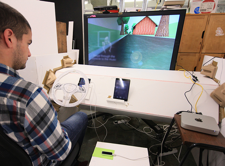
We employed just such an approach when we helped a leading automotive manufacturer conceptualise the future of the in-car HMI experience. Our approach in a nutshell:
- Arrival at a design statement which forms a basis of exploration — working hand-in-hand with product owners over multiple workshops.
- Identification of significant technological and experiential drivers, to form a basis for a set of narratives. Narratives help us ask questions to test the weight of the design statement, while considering users and their actions in a particular scenario.
- Iterative investigation of each of the narratives with prototypes. This is carried out by focussing on testing with real users. The mindset employed during these investigations is to humanise interactions by rapidly building and testing variations.
- Prototypes generally consisting of an interplay between screen-based user interfaces and spatial / product interactions, with each experience and discipline bleeding into the other.
- We generally consider currently available consumer hardware as proxies for nascent technology. This enables us to probe the constraints of the tech, without waiting for the release of specialised products. APIs and SDKs available for certain hardware enable us to quickly prototype eg Myo, Kinect and Leap Motion.
- Creation of an ‘experience demo’ which ties the narratives together into a working concept. The demo is a tool both for communication and as a basis for getting to know limitations and potentials for future production.
- We also test visual design theories and ideas simultaneously with prototypes and demos, gathering user feedback as we test iteratively to form a guideline of best-practices for the visual / UI design (which incidentally has informed some of the thinking in this document).
Below, we speak about some of our specific learnings with the experiments carried out in the course of the project.
Gestural Interactions
A key area of focus in our concept was the building of learnable gestural interfaces through micro-interactions and their triggers, rules and feedback.
One reason for this focus was that it can prove less distracting to perform as it avoids potential cognitive overload created by looking at and comprehending a UI while allowing the driver to keep their eyes on the road.
In doing this, we aimed to make use of the benefits of the technology and solve the associated problems for the in-car context.
In order to think about gestures clearly and identify what is meaningful, we used the system presented by Dan Saffer in his book ‘Micro-interactions’.
In-car interactions in the context of driving need to be modular with very effective trigger mechanisms in the light of safety, with rules and feedback on the activation of those triggers. For example, the rule inherent to steering (a trigger) is that the car turns, with feedback given both visually and haptically when the act of turning the steering wheel becomes harder.
Through several rounds of testing with the Leap Motion sensor, quickly iterating with varying ‘columns of interactivity and feedback’, we found that understanding these issues was important for our users. 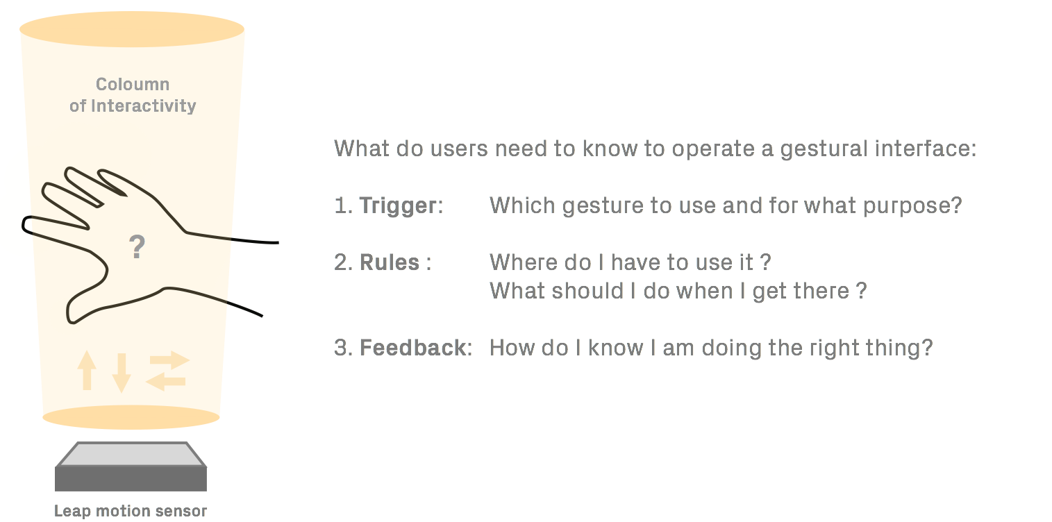
Tests were conducted by placing the Leap Motion in an ergonomically convenient and logical position for the driver from where they could interact with the HMI via gestures, unhindered by other physical controls (i.e. gear shift/stick).
From these tests our key learnings were that a meaningful gestural HMI needs:
A. A gestural interface with a focus on shortening the learning curve by using rich visual and aural feedback loops (car interiors provide for a controlled, fertile environment to affect rich feedback systems).
B. Balance between meaningful gestures and on-screen GUI. A couple of interesting research explorations point to the way this could be achieved:
- Recognizing Shapes and Gestures using sound as feedback - Javier Sanchez, CCRMA — Stanford University
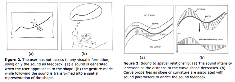
- AHNE — Audio-Haptic Navigation Environment demonstration video by SOPI research group, 2011.
Embedded content: https://vimeo.com/28447850
Data visualisation and semantic skeuomorphism
While solving some problems, our concept also presented a visual design challenge, that being how gestural interaction and tangible interaction are distinguished visually.
Given that our concept had a mixture of buttons and non-interactive graphics, as well as other user inputs such as gesture, we applied semantic skeuomorphism (discussed in Part 3) in the form of a crisp shadow to pressable buttons only. This established a visual language that effectively defined all buttons as pressable and everything else not pressable. Other signifiers were used to prompt the use of a gesture or voice, such as the the ergonomics and placement of certain sensors (as described earlier in “Mapping”) and audio cues.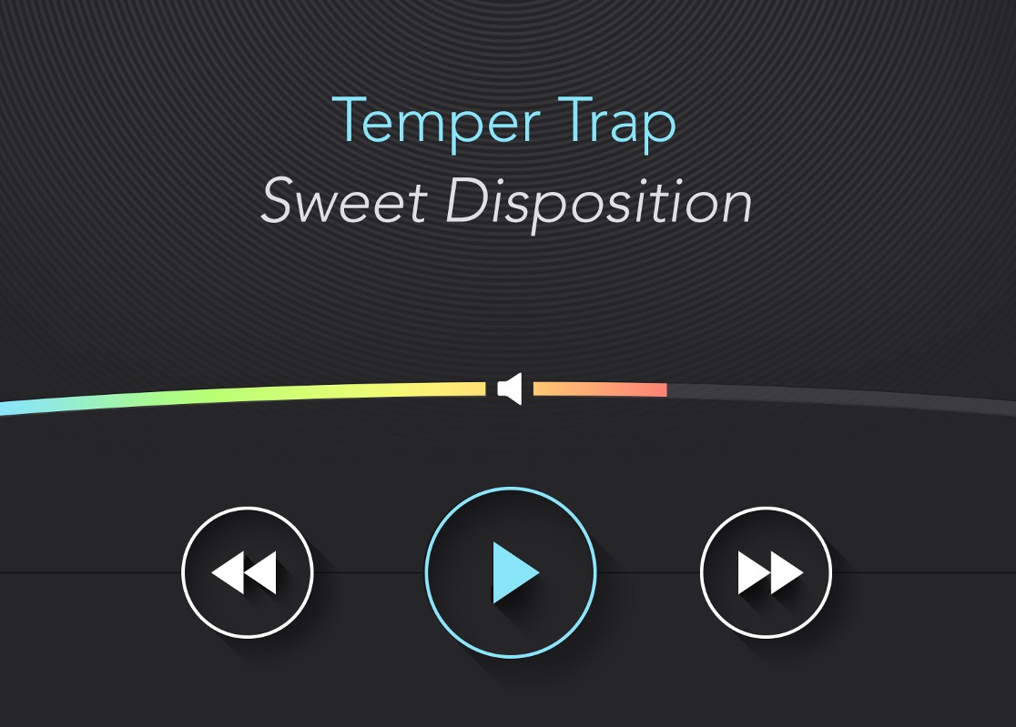
In another area, we shied away from skeuomorphism: the overly familiar speedometer. We discussed earlier how the speedo comes from the legacy left by mechanical and technical constraints, which in turn became a form of semantic skeuomorphism when those constraints were lifted by technological advancements. However, is a pin pointing to a number the most effective way of communicating a driver’s speed? We explored alternatives to stress test this established data visualisation.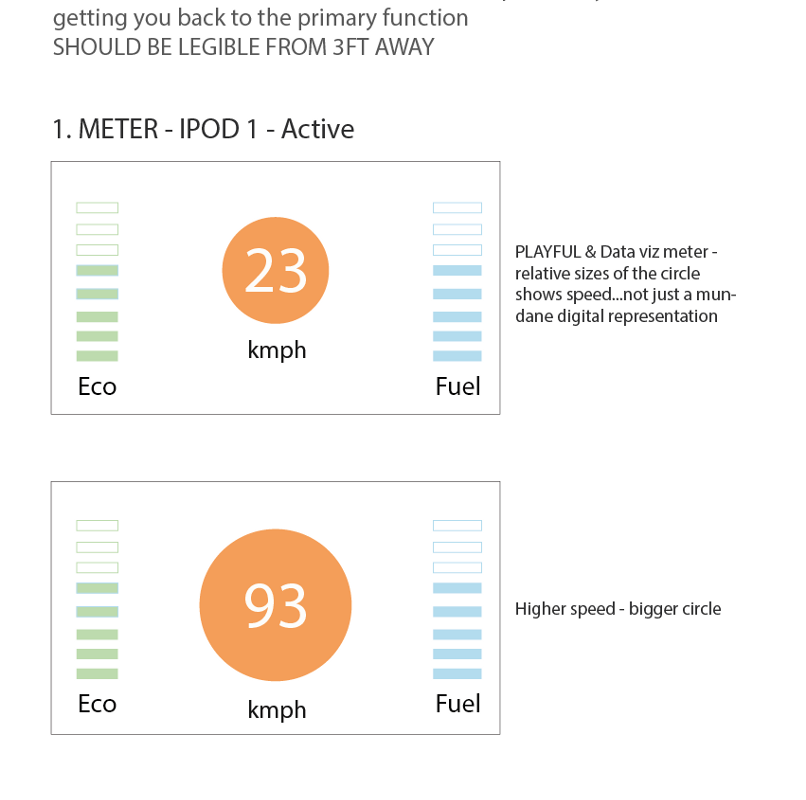
In our concept, we redesigned the speedo with an expanding and shrinking ring that changed colour depending on how close you were to the speed limit (defined by the particular road limits using geo location). A simple number in a constant position within this ring represented the speed and the consistent position meant the driver could quickly glance at the correct spot on their dashboard, decreasing dwell time.
“Micro-dwell” — information in pixels
When it comes to visual communication in an in-car environment, you want to achieve the opposite of what we’re used to as designers, and that’s have the audience (in our case the driver and passengers) looking at your beautiful, painstakingly crafted design as little as possible, ensuring the driver is not distracted and has their eyes firmly focussed on the road.
This is where the term “micro-dwell communication” came from. We have touched on audio and haptic feedback, but there will be times where visual communication is necessary, at least within today’s confines. In these instances, we must ensure that the driver is looking at the visuals for as little time as possible. It’s not dissimilar to a poster advertisement in which the message should come across instantly, though unlike the poster, the viewer should not dwell further. There are a number of design decisions that can be made to reduce dwell to a minimum, a handful of which include:
Readability and legibility: As discussed later, text should be kept to a minimum and should be as readable as possible. Graphics, as well as type, should be legible: contrast and scale play a part in this.
Grouping: Information related to a specific context or scenario could be grouped. For example, music controls grouped on one screen, geo-navigation on another.
Hierarchy and quantity: Ensure information is delivered with the correct prioritisation. Display as little information at any given time as possible. As a rule of thumb, we tried to keep information down to just three pieces per screen/instance.
Interactions: As our concept utilised touch screen inputs along with gestural and vocal input, it was important to distinguish between and communicate them differently. Interactions should be done quickly.
To accommodate these considerations, we found that by using graphic systems such as infographics, icons, “affordance” and colour-coding, we effectively reduced the length of time the user had to look at the visuals to understand what was being communicated. In fact, understanding of the information and the way in which the system worked became quicker as the driver had more exposure to it. We even took this approach in redesigning the speedometer, as discussed previously.
Text & Readability
We also looked at the very basics of design and sought to employ them in the most appropriate way for the in-car context. 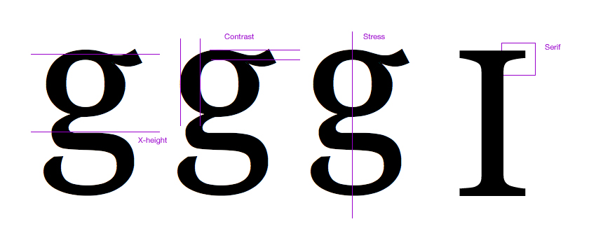
The use of text in in-car HMI is a key consideration: it should be kept to a minimum. This will ensure readability (not to be confused with legibility). Paragraphs should be avoided completely, at least when the driver is actually driving. Long pieces of text are not only uncomfortable to read but also distracting — the length of time to consume the information is too long, which can be dangerous.
Overlaid text and graphics should always have the appropriate light contrast (true of all UIs, automotive or otherwise). This will ensure legibility.
Good screen design happens in the subatomic level of microtypography (the exact definition of a typeface), the invisible grid of macrotypography (how the typeface is used), and the invisible world of interaction design and information architecture. Minimum input, maximum output, with minimal conscious thought is what screen designers focus on.
Despite some experimenting, a dark background seems to be the shade of choice in automotive design. There’s a reason why so many car UIs have dark backgrounds, and that’s because they are less distracting and reduce glare. But more on that later.
Given that the background should be dark, the best option for text is white or preferably very pale grey or pale colours. We actually opted for a dark grey background as deep black was too severe against paler pixels and very high contrast text can be difficult for people with dyslexia to read.
In some digital design instances the inverse of black on white is frowned upon (with some AA accessibility exceptions), but the requirement of a dark background and the short engagement nature of the interaction negates this concern. This is thanks to the “read versus scan” hypothesis.
Reading involves focusing on words and characters for a thorough comprehension of the subject. This requires a lengthy dwell time.
Scanning involves skimming the information for a broader comprehension of the subject. This requires relatively short dwell times and often a “glanceable” understanding of the information is achieved.
Reading paragraphs of white text is stressful on the eyes due to all three types of colour sensitive visual receptors being stimulated simultaneously which “overloads” the eye. The projected light from the white (or brighter than dark pixels) of close proximity graphics, such as alpha-numeric characters, scatters into neighbouring characters, which is obviously detrimental to readability.
However, putting stress on the user’s eyes is not so much of a concern when scanning the information because long visual fixations should not occur (if the information is appropriately designed). Given that we should expect what we call “micro-dwell” times from the driver, reading is an unrealistic expectation anyway. Scanning, on the other hand, is a more appropriate expectation for which we can and did design for — at least during the driving experience. White (or pale grey) on black (or dark grey) therefore not only supports the anti glare colour scheme, but also makes it easier for the driver to scan the information quickly, the micro-dwell time negating eye strain concerns.
This white on black design also works well for the lighting conditions of the vehicle during a drive, which can vary from fairly light to often shaded and even dark. The automated dimming and brightening of the screen based on the surrounding light conditions could also prove a useful feature, much like how many laptops react to the lighting conditions of their environment. As an incidental observation, car interiors tend to be dark too, so a colour-match of the car’s interior and its UI could also be considered when attempting to blend the two, something we've already communicated a great interest in.
MIT AgeLab and Monotype have paired up to tackle the issue of typography specifically for the in-car HMI’. Find out more about this in an interview and in this talk.
Colour: beauty & brains
As we researched the car UI landscape and what had been before, we realised quite quickly that they all looked pretty much the same.
They were mostly dark, moody, neon blue-accented, metallic textures, bezels, and shadows.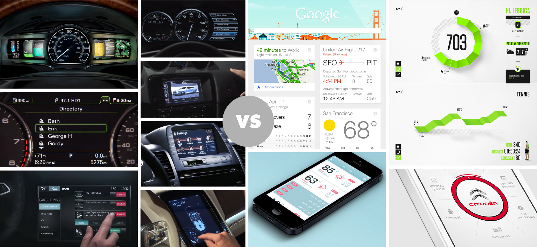
When we take a step back and look at the examples we’ve gathered, there is a strong feeling that many of the UIs exude a masculine feel, akin to the automotive industry as a whole, decades ago. In-car UI seems to be stuck in the past, whereas the rest of the industry has matured into an all-encompassing, unisex, contemporary space. We see a great opportunity to bring car UI up to date, enjoying the same maturity as the rest of the car. In so doing we have to go against what has been before.
The first thing we explored was reversing the dark background into a pale one. A paler UI tends to evoke notions of lifestyle, modernity, simplicity and approachability — exactly what we thought was appropriate to achieve our ambitions for our design. Darker backgrounds often evoke moody, masculine tones.
However, following some user testing and exploration, it appeared that this was perhaps not the correct direction after all. It seems there was a reason our research revealed so many dark car UIs. Dark backgrounds prove less distracting, provide less glare and are therefore, importantly, safer than paler screens. With that fundamental truth, we were confident we must switch to a dark background, but we still felt we could shed the common masculine, science-fiction aesthetic of so many other in-car UIs by making specific design decisions.
Everything has a personality: everything sends an emotional signal. Even where this was not the intention of the designer, the people who view the website infer personalities and experience emotions.
Choice of colour was one way in which we could offset the gender bias. A charcoal grey or other dark colour rather than black can soften the overall look. We also carefully chose a palette of low saturation, but bright pale colours to neutralise any negative stylistic connotations — the opposite of the neon blues of many car UIs.
The benefits of the use of colour are not only in its look and feel, but also in what it can communicate and — importantly — how we can colour-code groups of information. Instead of opting for the familiar monotone colour scheme, we used a range of colours. This helped to brighten up the whole experience, but also, there’s the added potential for extra information in those colours. We used colours to group information into colour-coded screens that each represented different categories of information. For examples, a blue colour palette was designated to the media player screen, while a green was the colour scheme of the eco information and performance screen. At a glance, the colour palette helped denote the screen and therefore orientate the user. In our concept, colour-coded information even helped create a relationship between two or more screens and enhanced understanding.
Colour is a powerful way in which to give personality to a design, be it a masculine tone or a friendly tone, something we used to great effect. Colour also carries great informational power; it can code, group, signify and prioritise pieces of information. But colour isn’t the only tool in our armoury that holds these dual emotional and informational abilities…
Grouping
Further to colour and semantic skeuomorphism, grouping is another way to empower information.
The selection and confinement of information to one instance, such as a screen can shed light on and contextualise surrounding information by mere proximity.
This is supported by Gestalt psychology, which theorises that our senses have the capacity to understand an image as a whole, particularly with respect to the visual recognition, as well as the collections of parts it comprises. This is known as the Gestalt effect.
Imagine a fan icon on its own. What would that mean? Probably cooling or heating. Now imagine the metric 71º on its own. What could that mean? What is at 71º? The temperature outside the vehicle? Inside? Put the two together and you immediately understand 71º is the requested in-car temperature. The two pieces of information make sense of each other. 
The 2015 Audi TT HMI uses the same principle, displaying this information right on the Nest-like air-conditioning fans. 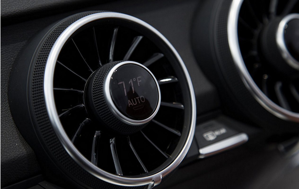
We opted to display information in simple, chaptered groups. Each aspect of function had its own designated screen, each with their own contextual pieces of information and colour scheme. We had a music player screen, an eco drive and performance screen, navigation screen and so on. By grouping the information in such a way, drivers were consuming just one type of information at a time, performing just one function, and were able to understand the different elements of information on the screen more quickly.
We also considered the positioning of the screens, as well as other hardware and physical elements of the HMI. Their positioning made sense of their function, visually and ergonomically.
User testing
We hold ourselves to a high standard at ustwo and we had to ensure that we delivered, not only for the client, but for what's best for the user and driver.
We were building a complex system, but we were also defining new and unique interactions that people had never experienced.
To guarantee the result, we grounded all of our work in user testing. Our process resembled that of a fast-moving start-up where short design and development sprints are followed by user testing sessions and lessons learnt from these steer the following cycle.
With UI, UX and those physical principles involved in a HMI in mind, and designing for the in-car context, we derived the term ‘3ft experience’, a derivative of TV’s ‘10ft experience’. We used this as a guide in user testing to measure legibility of information and usability of interactions.
If the user could understand the information from the seat of the vehicle, roughly 3ft away from the UI, then its scale and contrast was adequate; it was legible (using traditional AA accessibility standards and our own PPP). Through trial and error, we came to the conclusion that, given the minimum scale and quantity of information one can digest within short dwell times, displaying just three pieces of information per “group” was appropriate: one primary and two secondary items, specifically for the driving experience. These rules could vary depending on contextual empathy.
We always presented primary information in the same spot on each screen so that the driver learnt where to look from screen to screen. Secondary information, which was treated sparingly, surrounded this. This works within the muscle memory, learnability and positioning principles discussed earlier. We found that people were quickly learning to default their focus to the same area of the screen. In doing that, we swapped more relevant information into this spot as we learned what was more useful to the driver in different situations.
Treating touch interactions in a similar way is something we also focussed on. One such method is best exemplified in Matthaeos Krenn’s A New Car UI concept, which works within the same one-function-per-screen paradigm. Krenn’s concept encourages a similar “blind interaction” method to the one we explored with gesture based inputs, interactions with affordability — agnostic to precision afforded by visual reference. As with physical gestures, there’s some initial learning upfront, but so was there when swiping to unlock your smartphone was introduced. In time new interactions become second nature.
New controls can open doors for exciting innovation… but they also come with their new challenges that need to be respected and overcome.
Interactions should support a micro-dwell approach, through colour, contrast, brightness, scale and affordability. The topic of dwell, and more specifically micro-dwell, is an important one which we considered carefully when conceiving, designing, prototyping and testing features for our concept.
Throughout the project our process kept improving; the testing moved from in front of a laptop to a 1-1 scale model of a car cockpit, and the cycle time shrank from over a week to two days.
By the end of the project, we’d tested the experience with over 30 individuals in a close-to-real setting. And in doing so seen it evolve from something obscure and complicated to something seamless and delightful.
Our experimental platform
ustwo used the approach we previously formalised to construct an experimental platform for the project.
The platform was used to provoke questions and think about new paradigms in HMI with respect to a hypothesis / design statement, which evolved over multiple conversations with the client:
“How might we utilise the opportunities that come up when we move away from thinking about cars as tools and extensions of human function, to thinking about them as sensory and reactive entities, which can perceive and react meaningfully to the world around them?”
This concept is gaining credence due to present day research and development into human machine interactivity — which is bleeding into consumer technology. For example, the idea of a smart, intelligent home being driven by Nest.
In the course of building on this design statement we explored concepts with respect to:
- In-car computer vision to detect physiological and gestural data.
- The car as an ambient agent offering meaningful aural and visual feedback based on the data it senses.
- New principles with respect to data visualisation guiding interactions and visual design in screens.
- Qualitative user testing with low to high fidelity prototypes which were used to iteratively validate and humanise the experience.
Traditionally, you clearly define what it is a client will be paying for before any production work begins. But the amount of technical uncertainty on this project made estimation close to impossible.
So to de-risk our promises, the design and engineering teams came together to quickly evaluate what was achievable. And over the course of weeks into months, we continuously turned dozens of ideas into functional prototypes.
These prototypes, although basic, allowed us to present the client with a set of possible options that we knew we could deliver. We agreed on a subset, and set out to transform the most promising of these early prototypes into rich and contextually empathetic in-car experiences.
Tomorrow’s in-car HMI
To understand what tomorrow’s in-car software might look like, we turned to yesterday’s.
In the past, we’ve seen technology move from homes and offices to cars (think digital audio, touch screens and mobile Internet). Today, technologies such as the Microsoft Kinect, Leap Motion and Myo are allowing computers to gain a stronger awareness of the user.
We designed the car with the belief that in the future, sensors like these coupled with advances in AI will fundamentally change the human–machine interaction model. And tomorrow’s homes, offices and cars will understand and adapt to us in a way that no computer does today.
Today’s consumer sensors foster rich ecosystems which make them perfectly suitable for rapid prototyping. However, they are not designed to operate in the challenging environment of a car cockpit and are less reliable and more error prone in that environment.
Conclusion
We are truly excited about the future of HMI in cars at ustwo.
Automobiles as tools have always been known to be ‘extensions’ of human faculties and we are now entering into an exciting new paradigm with the addition of intelligence into these tools — opening up a new world of possibilities.
With connectivity, near-unlimited access to information, pre-emption and efficiency that the digital age brings to a car, we feel that one should not forget the primary experiential qualities — the nature of the drive, safety of passengers and fellow travellers, and, most importantly, the pleasure of travelling and being at one with a vehicle.
Technological ‘extensions’ also bring about ‘amputations’ — for example, the telephone extends the voice, but also amputates the art of penmanship gained through regular correspondence.
In working with HMI we should make sure we are not amputating something fundamental to the experience of using a car. We believe that car manufacturers need to adopt new approaches if they are to stay ahead of rapidly changing technology, its impact on design and user experience, and integrate it into their legacy manufacturing cycles.
The connected car approach presented by Apple and Google is a possible short-term solution which hands over the platform to an external device, but there’s an opportunity for car makers to take this further and explore new interaction paradigms of their own. Investigating these paradigms might answer larger questions — like is there is an argument for HMI to be completely non-visual, opting instead for audio and haptic feedback as well as vocal and gestural input?
Let’s think strategically. What will the world look like following Tesla’s announcement about open-sourcing their technology? What will we stand to gain from the emergence of truly connected cars or 'radically connected' as coined earlier in this thought piece? With the deep integration of internal telematics and infotainment systems to the web, from the ground up rather than as an afterthought, the possibilities are endless.
Beyond understanding technology, another factor unique to interactions within a car, or at least at a much greater priority than of most, is trust.
Designing to gain trust is an amazingly interesting design challenge—far different from the technical problems.
Compared to a smartphone, if a car fails the consequences are much more considerable — and people are very much aware of this. Gaining a driver’s trust with truly revolutionary driving features is a hurdle that will need to be overcome. Features such as automated driving and the engagement of safety features and how they relate to the HMI will be a huge challenge.
To conclude, we believe that disruptive innovation requires a new approach, and in our experience a ‘lean start-up’ and an entrepreneurial team using rapid prototyping is what’s required to keep pace with technology and user expectation. And that might just be ustwo.
We hope you've enjoyed this 5 part series and please do comment and let us know what you think. We'll be doing a summary post early next week with a link to download the official ustwo auto e-book which contains all 5 parts.
