With the ongoing integration of advanced computer systems into vehicles, the interfaces within are becoming ever-more complex. As the prime points of interaction between driver and car, these ‘human–machine interfaces’ (HMI) demand great care and attention from manufacturers, designers and engineers alike. In this five part thought series (we'll be posting everyday this week) we look into this phenomenon of growing in-car HMI complexity. We explore our belief that an interface should match the evocative nature and elegance of an automobile’s exterior and interior design. We also outline our key thoughts on how, in partnership with manufacturers, we can bring an extra layer of care into the design of compelling experiences, in order to tame the beast that is in-car HMI.

Introduction — why we are discussing this?
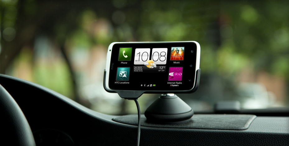
Which consumer technology market has changed and advanced most in the past decade? It has to be the mobile phone sector. Thanks to game-changing user experiences delivered through touchscreens the market has rapidly evolved, giving rise to tablets, phablets and the like. Along with advances in chip, display and web-based technologies, mobile devices have become more and more affordable, achieving unprecedented mass adoption. It seems only natural that they have found their way into the cars we drive today, replacing physical buttons and knobs with pixels.
There is much potential for in-car HMI, but we have yet to see a similar revolution in the UX and UI of the automotive industry.
A recent survey by software supplier Cisco Systems suggests that the automotive industry is not meeting consumer demand in respect of technology. In order to bring in-car HMI up to speed, the industry needs to gear up. Pervasive and distributed computing, affordable and accurate sensors for measuring physiological and mechanical systems, and the notion of networked objects (the Internet of Things) all play a part — and all are available through smartphones.

And therein lies the challenge: as people become ever more dependent on their smart devices, they begin to expect more of embedded technology elsewhere in their lives. Sadly, these expectations are not being met by the current generation of in-car HMI.
Furthermore, patterns of ownership have changed. The young urban populace is moving away from car ownership and towards ‘pay as you go’ or car-sharing schemes, throwing up all kinds of new design considerations.
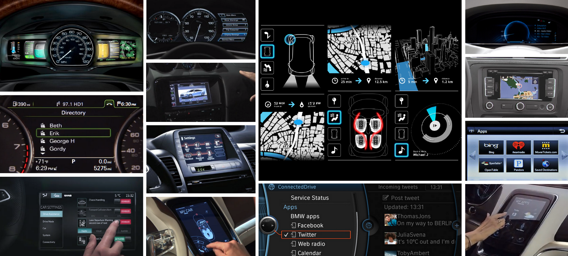
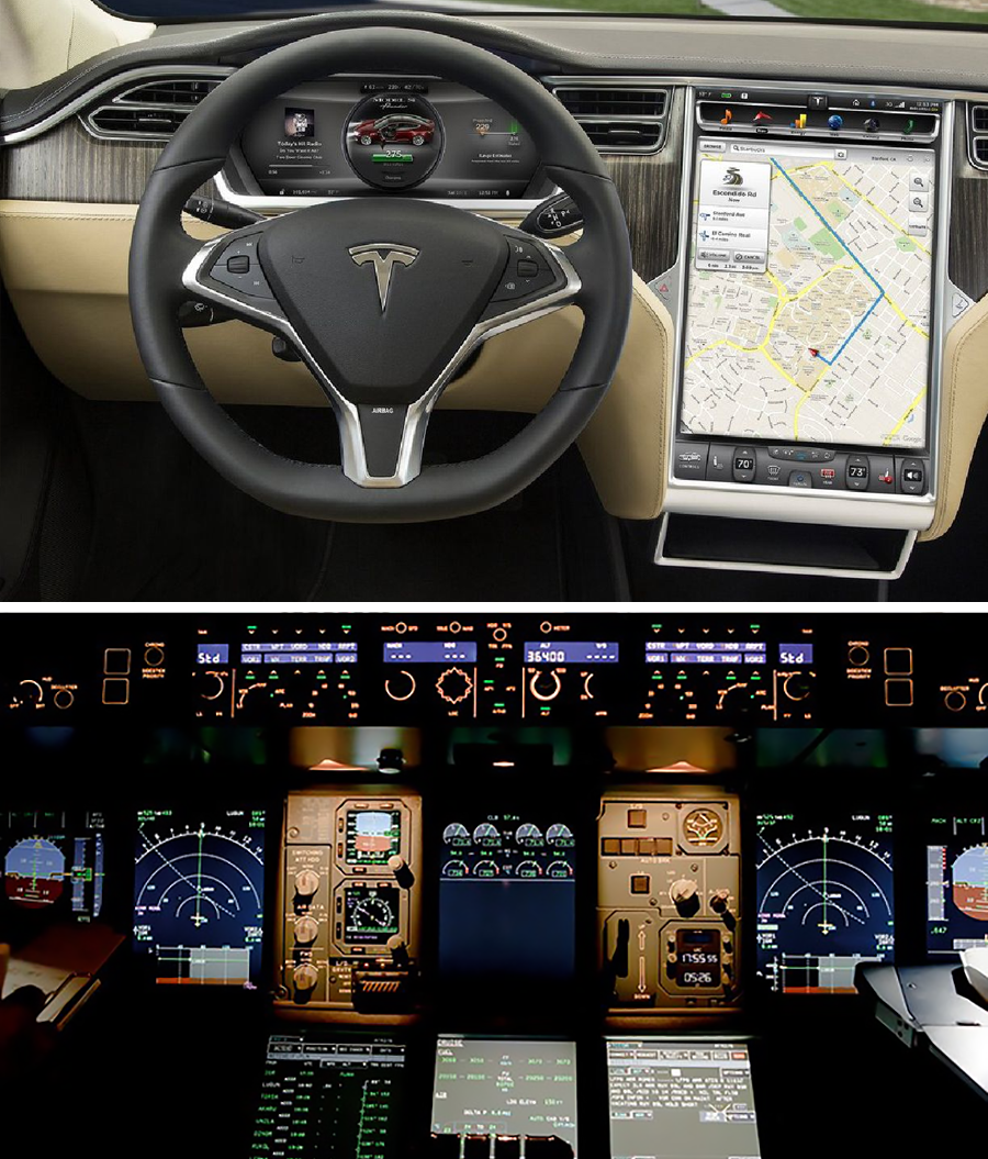
However, in the haste to get on-trend, car manufacturers have simply used screens to replicate what has been before, rather than taking an empathetic, intelligent approach. Skeuomorphism abounds, where physical buttons are replaced with look-alikes on a screen — familiarity is retained, but at the expense of tactile feedback. Current touchscreen HMIs are often simply ill-considered re-appropriated solutions developed for completely different contexts (which we will discuss later in the series).

We believe that there is a need to approach this topic anew, in light of these challenges and others we will highlight later on in this series.
ustwo is a design studio specialising in the creation of digital products and services across multiple technological platforms. When it comes to in-car HMI, we’ve been learning and adapting as we go — finding our feet and getting stuck in. Our experience in meaningfully connecting people and technology, through the rapid prototyping and testing of conceptual ideas gives us a solid base from which to challenge the status quo.
In this series we focus on recognising the issues, exploring the opportunities and offering solutions for in-car HMI. We also describe the approach we took in developing our own concepts for the in-car experience when working with one of the world’s leading automotive manufacturers.

Coming up next this week
As this is a five part series we'll be posting everyday this week, touching upon interaction patterns (covering issues with muscle memory and regulations), take a qualitative look at current on-screen interaction and visual design, briefly gaze into what the near future might look like (we see haptic and aural feedback), and finally say a few words about our own approach to in-car HMI design here at ustwo studio.
- Part 2 — HMI: Where we are now and where we were - LIVE!
- Part 3 — Looking at now: Changing patterns in HMI - LIVE!
- Part 4 — Looking ahead: Designing for in-car HMI - LIVE!
- Part 5 — Our experience and approach to HMI design - LIVE!

