In Part 3 we looked at the present and the past — in this section we look ahead into the near future.
Hard & soft Interactions
Before we discuss our thoughts on the best approach for in-car interactions, we will touch upon the types of interactions that exist in the in-car environment.
In-car interactions can be split into two distinct types: hard and soft.
Hard interactions can be defined as deliberate manipulative actions performed by the driver. Examples are: changing the drive position using a button, using an infotainment system via a GUI or inputting location data into the sat-nav.
Soft interactions can be defined as the actions performed by the machine as non-deliberate inputs provided by the user. Self-cancelling turn signals are an example of a soft interaction — where the machine autocompletes a sequence of actions without any user input.
The latter type of interaction especially is coming to prominence with the advent of embedded interior sensors and the notion of the connected car. Some of the possibilities have been exploited with contextual information displayed in HUDs (Heads-Up Displays), auto dimming of interior lighting, and even experimental tracking of closed eyelids. As an aside, we feel soft interactions require the greatest amount of care and appropriateness in execution since there is a thin line between being assistive and in being a distraction.
We believe that combination of meaningful hard and soft interactionsis the key to getting the best out of HMI in a car.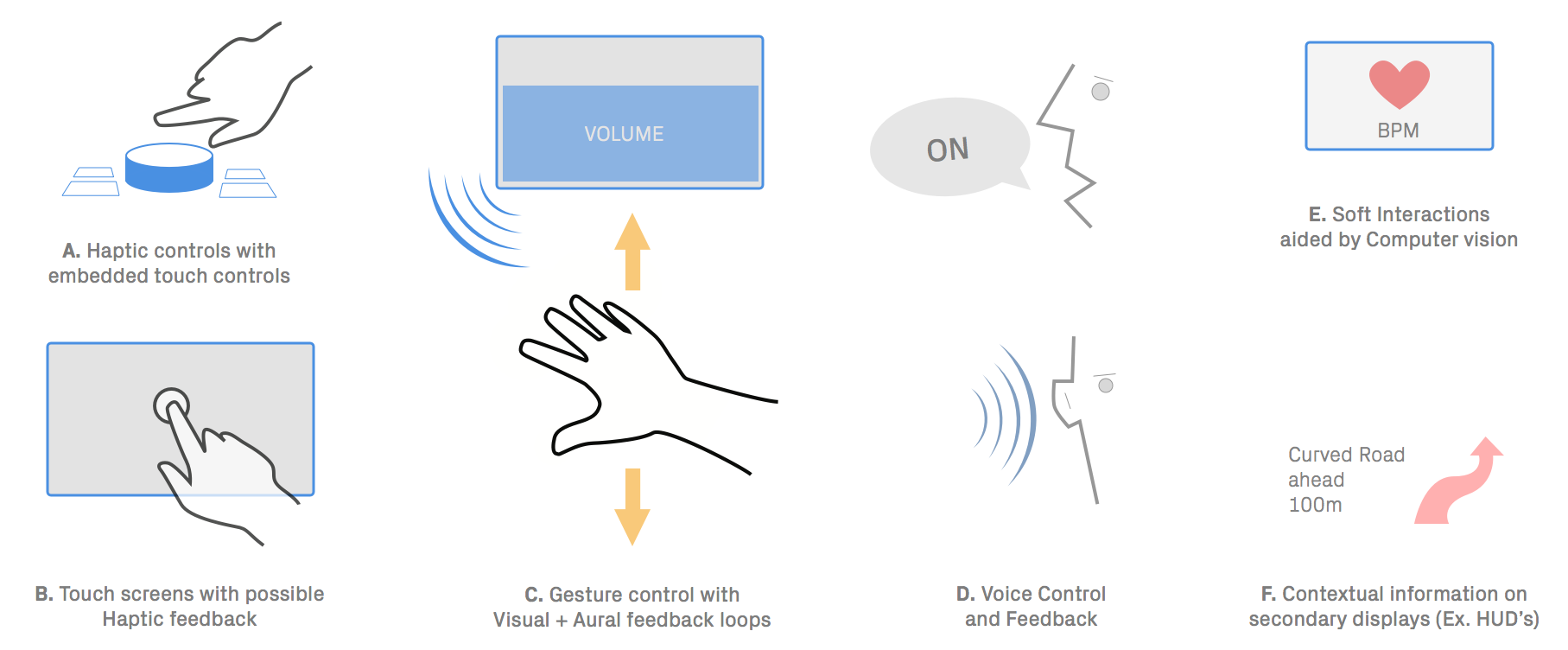
In the above sketch we have laid out what could be the set of possible interaction paradigms. This outlines some of our own research into near-future interaction possibilities using current technology. The interaction paradigms are informed by some of our research into the automotive sphere at the present and by predictive analysis such as the 'Gartner Hype-Cycle' below.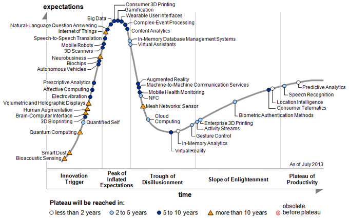
A machine is beautiful when it’s legible, when its form describes how it works. It isn’t simply a matter of covering the technical components with an outer skin, but finding the correct balance between the architecture of the machine… and an expressive approach that is born out of the idea of interaction with those using the object.
We will now delve into each of the above interaction paradigms
A. Haptic controllers with embedded touch surfaces: hybrid interfaces
Let’s take a closer look at the [i-Drive controller that BMW employed in the late 2000’s]Embedded content: https://www.youtube.com/watch?v=CwhvuJ00epc&feature=youtu.be&t=10s
In the video above, note the issues with modes — affordance and mapping a circular motion into a linear output on the screen. BMW went on to introduce the improved i-Drive Touch in 2013 to alleviate some of these issues by introducing a touch interface on the control knob itself (as shown in the video below). Embedded content: https://www.youtube.com/watch?v=WKmxrvDupCI
This form of hybrid interaction presents a significant improvement because it allows more active and tangible control of on-screen GUI.
B. Touch screens with haptic feedback
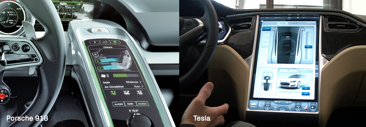 Touch screens are being put forward as the sole modes of control in automotive HMI, as demonstrated in the large-screen iterations in the Porsche 918 and the Tesla Model S.
Although they appear to offer a simple alternative, they are in fact problematic with respect to learnability, as discussed earlier. They can also be very distracting, because the driver has to rely on visual feedback all the time and cannot form a muscle memory or map of the controls over time.
An interesting set of experiments being carried out at Disney Research points to the way forward, where tactile rendering algorithms are used to simulate rich 3D geometric features (such as bumps, ridges, edges, protrusions and texture) on touchscreen surfaces. Embedded content: https://www.youtube.com/watch?v=zo1n5CyCKr0
If applied meaningfully, this could allow a muscle memory or ‘feel’ for controls to develop over time. This technology can be seen at Tactile Rendering of 3D Features on Touch Surfaces.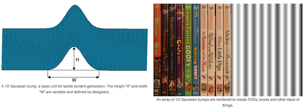
C. 3D Gesture control with visual & aural & haptic feedback loops
Using gestures to control certain aspects of HMIs is an exciting concept. This is primarily because it presents an opportunity to bring back the direct control and feedback which existed in early cars, although it is not without problems.
The sensing of 3D gestural data is getting progressively easier, not only because of low cost sensors and processors, but also as better algorithms become available.
3D gesture control as a concept is also taking root in people’s minds, because of gadgets like the Leap Motion and Kinect controllers. 
We can detect not just macro changes in physical characteristics, like nodding, facial position and hand gestures, but also micro changes like eye movements. However, the new interaction patterns emerging from low cost computer vision have not been fully cataloged and understood, which poses a challenge when mapping and learning a gestural interface.
There are literally hundreds of 3D gestures possible and it takes time to learn and understand a set pattern and thus in its present state cannot be relied on as a pure interaction — especially with regards to safety.
This was indeed a key issue in our initial experiments using both the Leap Motion controller and the Kinect as primary modes of in-car control. We found, as with any new control, gestural interaction is not necessarily intuitive. The rich feedback of physical interactions — clicking buttons, the movement of levers, gears falling into place — has not translated well into the fuzzy digital space. ‘Minority Report’ style interfaces remain a fallacy (The fallacy of a ‘Minority Report’ style interface). 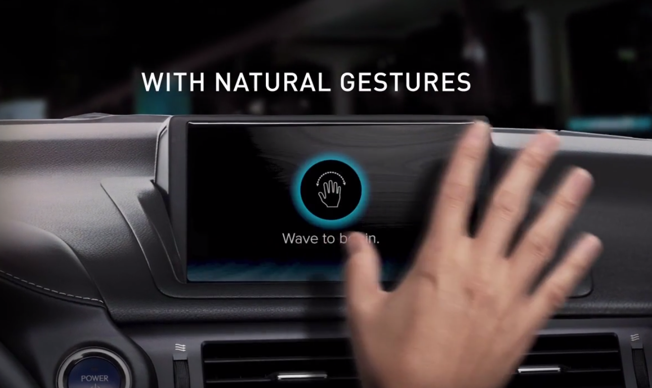
Also watch a concept using the Leap motion controller as shown below from Denso and Chaoticmoon. There are no buttons — only visual feedback is employed — which introduces the problem of fine grained control and learnability.
This issue with fine grained control has been the focus of research institutions over the last few years and we find this exploration by Disney research to be amongst the interesting ones — ‘Aireal — Interactive tactile experiences in free air’.
Here they prototype a new low cost, highly scalable haptic technology that delivers expressive tactile sensations in mid air as part of their long term vision for creating large-scale augmented environments which can deliver compelling interactive experiences everywhere and at anytime.
D. Voice controlled Interfaces
Voice based interfaces have occupied imagination ever since the pop culture exposure to the eponymous HAL 9000 and more recently in the movie ‘Her’. Though we are far from achieving human-like conversations with machines, due to continuous advances in natural language processing and recognition, the last few years have seen a number of high-fidelity consumer applications seeing the light of day (in essence this is a form of AI though some people might argue that it is not — a strong case of the ‘AI effect’ ).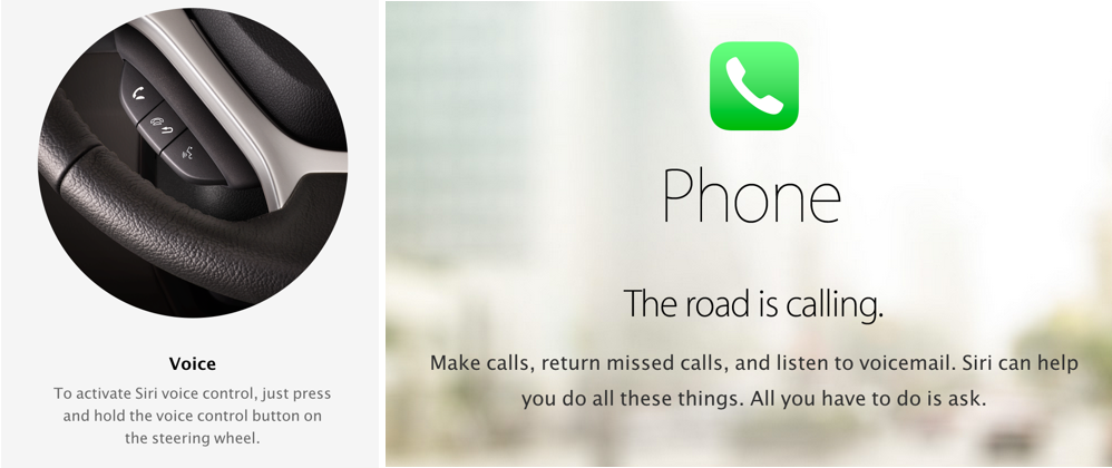
Siri and Google Now in mobile OS’s have also been playing a strong role with in-car interactivity with companies such as Nuance supplying their software expertise to manufacturers such as Ford — seen in their Sync range of HMI.
The promise of voice control lies with two factors, one in replacing physical and digital controls moving into the land of no UI, where one can freely converse with HMI and secondly minimising the distractions which come from the manual operation of HMI, targeting increased safety.
Vocal interaction design — a new challenge It is easy to say that voice could be a no-brainer in terms of next generation user interfaces, but we need to critically understand implications before designing for the same. In our research we find the following factors (among many) to be quite important to consider;
1. Discrete and continuous control: This is the difference between the on and off states of a button and the continuous rotation of a knob. Voice can play a large role in functioning as an effective discrete control e.g. ‘turn on radio’ or ‘radio’, but may not be as effective as a continuous control while changing volume, which operates over a range e.g ‘Increase volume… make it higher… higher…’, as it operates as an abstract, analogue, inexact notion.
We then get into the fuzzy area of actually allowing a user to set presets such that a computer understands what he/she is trying to achieve or time based learning where the computer understands intention by gauging past interactions. e.g. ‘Higher’ can mean increase by 20 percent. This fuzziness could lead to increased confusion and frustration if not dealt with carefully. (An interesting meta study into voice interaction and distraction can be found here )
2. The problem with ‘Strings’ and ‘lists’ : There is a challenge in dealing with the input of strings of sentences (alphanumeric data entry e.g Sat-Nav) and cognitive load it poses on a driver.
Though one would think this is where voice input could be ideal, by eliminating the need to enter text via a keypad, studies point to the contrary. Research carried out at the MIT AGELAB and the New England Transportation Center, point out that the distraction and engagement levels of voice are comparable to that of manual operations and the subjects of the study rated these parts of voice interfaces to be as demanding as using knobs and buttons.
“The destination entry task was the most time consuming, requiring an average of 111 seconds to complete in the first two studies. Task completion time was not a matter of problematic speech recognition, as most of the time the system had little trouble interpreting drivers’ voices. Rather, it was a matter of interface design.”
The complexities in the interface design arise from many multimodal demands posed by the technology. Among them are having to remember lists of information as spelt out by the interface. One of them is a behavior called the ‘orienting response’ — which often took the form of subtle, seemingly unconscious shifts in posture as the driver spoke to the HMI. A case of personification of technology.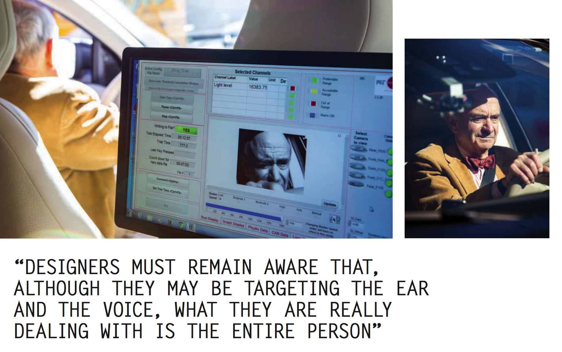
A way to effectively deal with the above issues as found by the study is by offering appropriate confirmations — both visual and aural. Treating a person as a whole rather than just focussing on targeting the ear and voice.
The orienting response often relies on visual feedback to the verbal input on the driver’s part. For instance, Apple with it’s CarPlay has tried to address the issue by deactivating the user interface whenever possible. But the implications of these modes of automatic behavior on part of the interface have not been studied in detail as yet.
3. Recognising emotion in voice: This seems to be the next step in Natural Language processing — where mood and emotion are triggers for in-car reactions. (Approaches being taken by Google and Nuance)
E. Soft interactions aided by computer vision
The ability of cameras to track micro-movements in pixel data allows sensors in the car’s interior to detect a driver’s physiological data. This can produce both synchronous (real-time) and asynchronous reactions (with a deliberate time delay).
By synchronous reactions we mean immediate and real-time reactions to changes in physiology, like the movement of a driver’s eyelids or reactions to gaze detection.
Infrequent movement can signify a tired driver and thus a car might prompt the driver to take a break or offer the driver directions to the nearest motorway services.
Asynchronous reactions are time-based. For example, tracking a driver’s heart rate over a journey and presenting them with hot spots where there are data spikes. Much like how a car’s fuel consumption over a journey could be mapped and studied, we can study and learn from physiological data. 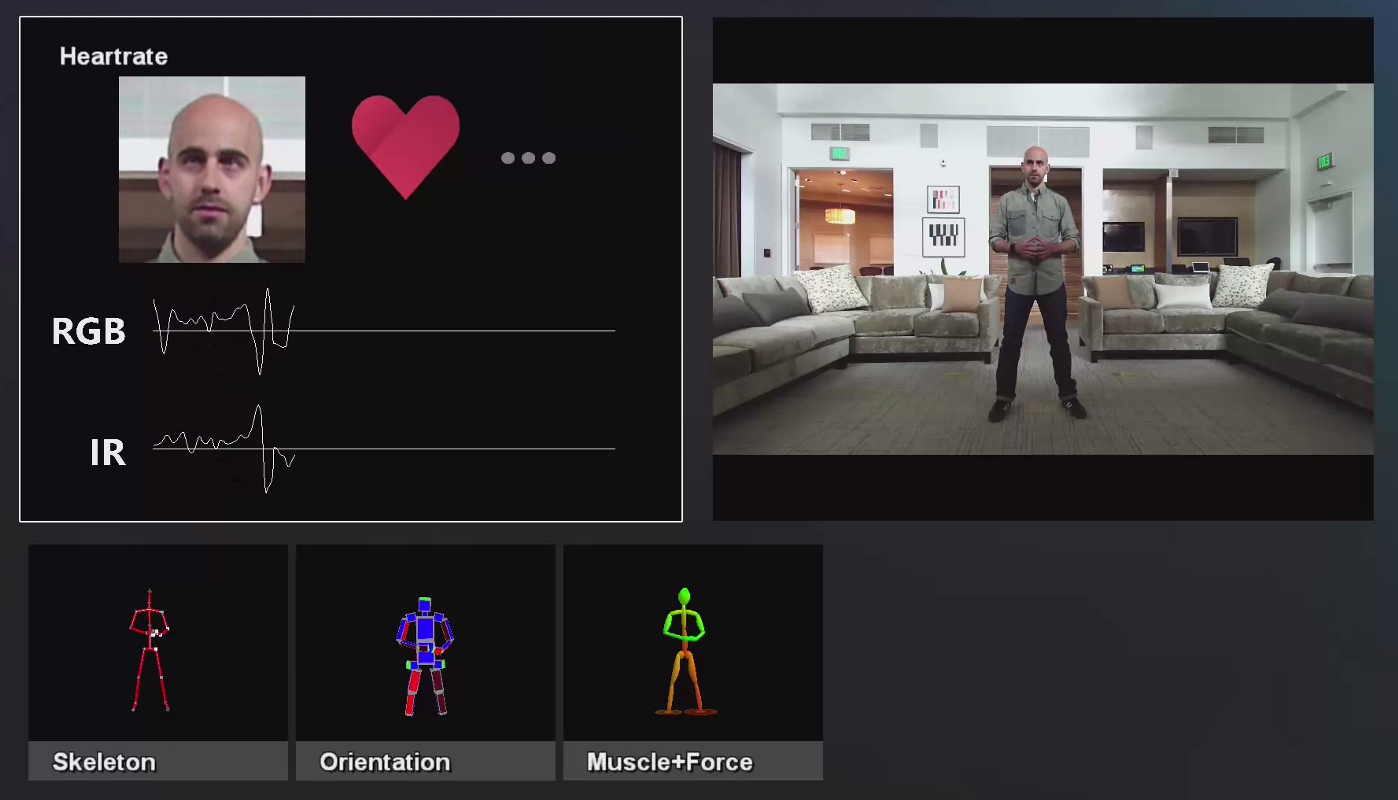
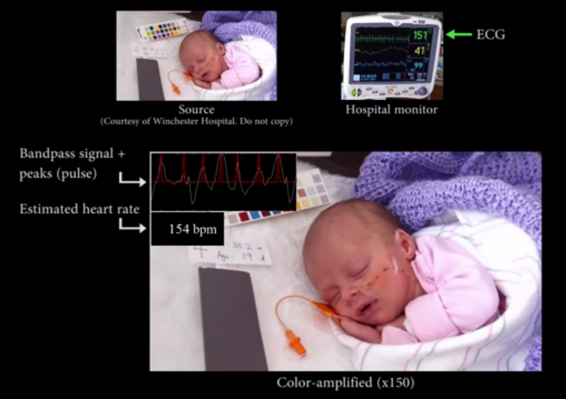
The Kinect One and ‘Eulerian video magnification’ have both been used to non-invasively measure heart rate (BPM) in a research setting. Happily there is already an element of consumer trust when it comes to such personal metrics — a survey carried out by Cisco Systems revealed that 60% of car owners would be willing to share biometrics such as fingerprints and even DNA samples if it would improve car security.
F. Soft interactions — contextual information on secondary displays supported by eye/gaze tracking
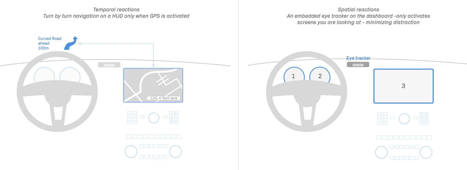 We could break the visual emphasis towards a central console and provide displays for the driver based on when data is required (temporal) and where it is required (spatial).
For instance, information can be broken down into a number of displays, to provide turn-by-turn navigation data when a driver requires it, perhaps using HUDs. This information can also be displayed where the driver is looking, via gaze detection techniques.
What technological implementations have we seen so far?
The first main implementation is the use of secondary displays in cars, like HUDs, for providing information on or near the driver’s line of sight have been in use since the late 1980s. 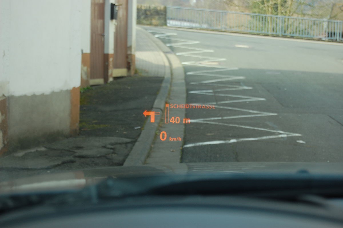
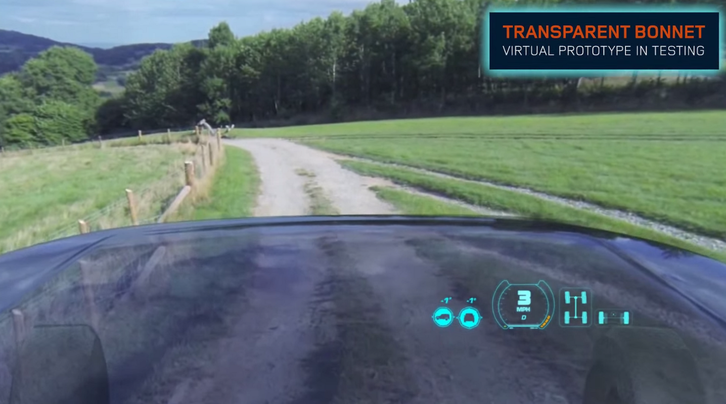
The LandRover Discovery invisible bonnet concept is a more recent idea, where a combination of contextual on-road information and actual off-road imagery from grille cameras is viewed through a HUD. Digital immersion through the use of cameras is something we expect to see more and more in in-car HMI, used mainly by augmented reality. 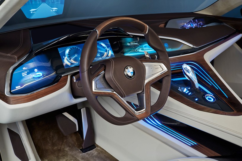
In a similar vein, the BMW ‘Vision Future Luxury’ speaks about the ‘contact-analogue’ HUD for the driver which augments the real-world view by projecting information directly within the line of sight. Buildings, traffic signs and hazards can be highlighted directly in the real-world environment, selectively directing the driver’s attention to specific information.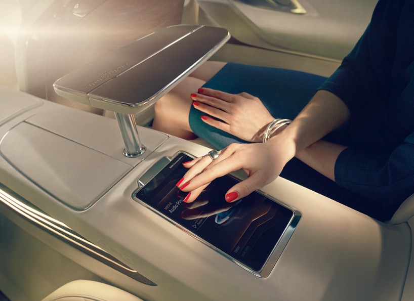
Then we have gaze detection or eye-tracking displays, where specific portions of the GUI become active depending on where the driver or passenger is looking (spatial reactions). This has the potential for minimising distractions and, coupled with the temporal reactions, can be quite powerful. 
It’s early days yet, but quite a few companies are working to integrate trackers into driver assistance systems, tackling issues like driver fatigue, especially for large commercial vehicles. For instance a Caterpillar & Seeing Machines collaboration. These systems are built using a combination of software (face and gaze tracking algorithms) and hardware (cameras and processing units to integrate with on-board assistive systems).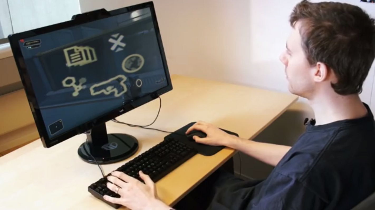
In a similar vein, Tobii has eye tracking systems which they have experimented with in cars and games.
Contextual Empathy
We’re still at the dawn of the in-car UI space and it’s worth remembering that there’s more to how you interact with your car than a UI on a screen, as demonstrated previously.
While we do see a future for the screen, and by appropriation, smart devices in in-car experiences for example, a more tailored approach has far greater potential, both in conjunction with and free from any platform bias.
The in-car space needs to mature into something that is as sophistically defined and crafted as that of the smartphone. As with smartphone and app design, context and the user need to be at the forefront of in-car HMI design, but they are so often overlooked. A person driving a vehicle is in a very different situation than a person sitting on their couch at home. This is where the term ‘contextual empathy’ comes from; understanding and designing for a specific situation.
Take maps, for example. Maps and navigation are clearly of use in the automotive space, but that doesn’t mean simply putting a ubiquitous service like Google Maps onto a screen. A driver has far less time to digest a map than a pedestrian, so the selection of which information to display when must be carefully considered. There’s perhaps less of a need to show roads that are not part of the route to the destination. Tom Toms and other such devices have already adopted the same contextual thinking — they are bespoke, tailored devices for the specific context. You certainly can’t send emails or Facetime anyone from them.
Before you become too entranced with gorgeous gadgets and mesmerizing video displays, let me remind you that information is not knowledge, knowledge is not wisdom, and wisdom is not foresight. Each grows out of the other, and we need them all.
Safety is of course a major consideration which makes designing for the in-car HMI unique to other UIs. Many recent articles have raised safety concerns about screens in cars, namely the potential distraction to the driver (eg Matthaeus Krenn’s excellent A New Car UI Concept). Safety is paramount, but these articles focus on one scenario; that of the driver while they are driving. There’s more to the in-car experience than the driver and more to it than the driving — the automobile and the drive are a romantic and aspirational experience after all. That’s where the importance of understanding context comes back into play.
Encouragingly, during their presentation at the Build Conference at CES 2014, Microsoft acknowledged a difference in what one should expect from driver engagement during a drive versus the stationary context. Though only a prototype, Microsoft seemed to have done some solid field testing with their in-car concept.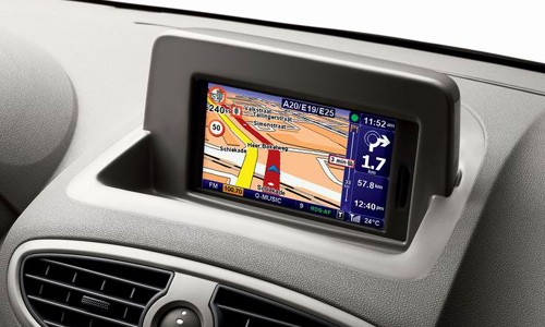
An in-car experience will primarily involve the driver, but they won’t always be driving. There’s the getting into and out of the car, the waiting in traffic and a plethora of other situations. How about the person in the passenger seat, the kids in the back and even the family dog in the boot? What about the car that communicates with the city and responds to the environment? A quality, safe, enjoyable and beautiful car HMI will cater for all of these stories and more.
This is a consideration Renault played to in their unveiling of their Initiale Paris model at the Frankfurt Auto Show in 2013. Renault’s HMI housed a rear-seat touchscreen enabling passengers to be part of the navigation, or “journey exploration” process. LandRover’s recent Discovery Vision concept also briefly alludes to empathetic user design, offering variations on the experience for the passengers.
Even with intentions of safety, there will be times when a visual platform, i.e. a screen or HUD, is the best way to communicate.
There are a number of technological and practical ways to facilitate this requirement, everything from the obvious — multiple screens for each passenger, to more abstract ideas such as stereoscopic screens where driver and passenger see different, but relevant information, and gaze detection whereby the system detects who is looking at the screen, with the driver taking priority. These are just a few ideas of many.
So, already we can see that the in-car context demands fresh thinking and design, from both a UX and UI perspective. And this is where so many issues arise in the current approach; a re-appropriation of the (touch) screen into a new context, the “empathy” lost in translation. The UI can help solve these practical and functional issues, but it also goes a long way to resolve some of the emotive problems associated with in-car HMI.
Design can be functional and beautiful
A great car has function and it has beauty, and should excel in both.
Beauty is a commodity in car design, a commodity that is sold so evidently in contemporary marketing campaigns, typically based on the vehicle’s beauty and the lifestyle it can offer. Indeed, the beauty of a car is often favoured over its functionality.
It is not enough that we build products that function, that are understandable and usable, we also need to build products that bring joy and excitement, pleasure and fun, and, yes, beauty to people’s lives.
We feel that all design should be as beautiful as it is functional — there is inherent beauty in the purity of function. Dieter Ram’s work for Braun is a great example. 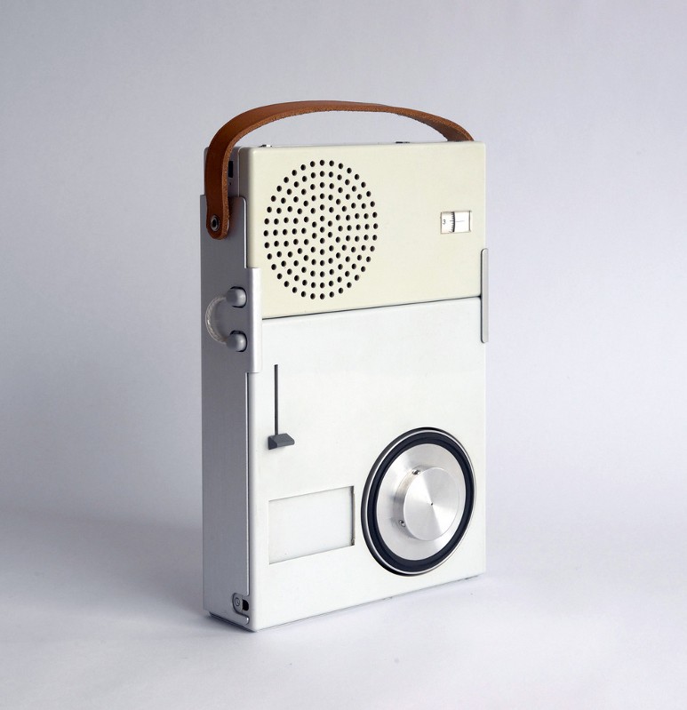
Why not bring the beauty of the car into the HMI, blurring the lines between the car’s exterior and interior design with that of the UI to create one unified piece of design? A UI can be a part of the form of the entire car, not just a simple module or an island of interactivity in the interior.
There are some challenges with this approach. The lifetime of a car production from concept to market tends to be five years or more, so logistically it might be difficult to keep the design thread that runs through different departments intact. This goes someway to explain the sudden emergence of smart devices in cars as we discussed earlier.
Good design is aesthetic design — The aesthetic quality of a product is integral to its usefulness because products we use every day affect our well-being. But only well-executed objects can be beautiful.
However, we believe that if the exterior styling, interior styling, trim and UI design teams work together from the very outset, this unified aspiration is achievable.
In fact, it’s encouraging to learn that Mercedes’ research and development department already utilise teams of designers and researchers with backgrounds in art, design, user experience, engineering, psychology and software to conceive new features and designs under a unified approach (source).
The connected car model assumes a software focussed approach, but there may be further physical and hardware characteristics beneficial to a meaningful HMI. While creating a bespoke HMI for a specific vehicle or a range of vehicles has its challenges, it does ensure that the design does not date during the production lifespan of the car. As design changes are made by other teams during the project, you can react and adapt — this applies to functional, physical and visual design.
We see three main ways in which this process can be facilitated:
- Design in regular system updates. This can help support the software of the UI, but should not be relied upon. Even if the car had regular and reliable access to the internet so that the OS / UI had systematic updates (a benefit of the mobile device connected car model), you can’t rely on the user taking action on, or even understanding, this process. Furthermore, a sudden change to the software, visually or otherwise, could cause serious safety concerns.
- Design the HMI and UI in a templated, modular fashion from the start, so that the design can be re-appropriated as the project progresses. This could also help in re-purposing or rebranding the experience for other models, as is already the case for many of the physical controls and is how the car stereo system has worked for years.
- Do not design for trends but instead design for function and context so that the aesthetic does not age badly, or indeed at all. It is impossible to predict trends five years in advance, nor should you try. Besides, the driver has to live with the HMI and UI for the lifetime of the car far beyond the launch of the vehicle.
Design tends to age badly if it succumbs to a trend. Conversely, there is something enjoyable in associating a car with its era, arguably an inherent part of the automotive experience and heritage. The HMI should be a part of that, as long as it is at one with the entirety of the car’s design.
Best practise should be a holistic focus in influencing the design, which could include accessibility standards and automotive-specific standards, to branding to the context of the environment to traditional design best practices such as layout and hierarchy. Putting some real thinking and commitment into the beauty of the in-car UI is in itself a step forward and something we are particularly excited by. 
So what does it take to achieve a functional and beautiful in-car HMI / UI and how does that differ from any other?
This is something we have explored in our studio, both in internal projects and working with one of the world’s leading automotive manufacturers. We will share this in detail in Part 5.
