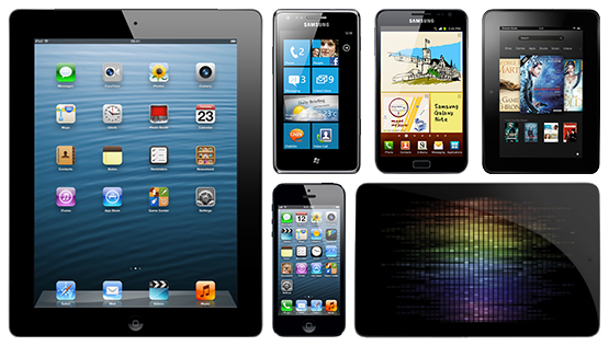
With the introduction of ever-higher resolution displays in mobile and tablets, and now desktop computers, there has been much talk about whether our industry will come to abandon the pixel altogether. After all, if they can’t be seen, why base our designs on them? When this day comes we will have become resolution independent—in effect going full circle and revisiting the days of print.
As designers we’d be able to draw everything as vectors, rather than pixel-based bitmaps, and have it scale nicely no matter what the size of the screen or its pixel density. We’d only have to draw something once, then be free to transform it as we please, with no worries about creating for specific pixel sizes—a situation that is all too familiar for anyone who has designed icons for a given platform with varying resolutions. Pixel precision would become obsolete, since it would be hard to make out if something was wrong in the first place—the pixel grid would be so fine that blurred edges are virtually beyond the distinction of the human eye.
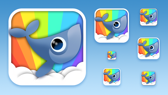
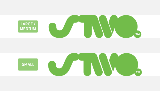
However, as much as this has been vaunted as the utopian design reality we’re heading towards, we would still need to create graphics at different sizes—details which seem fine when viewed at a large size can become obscured when shrunk down a 5mm² area. Our company logo for example comes in a range of sizes for different applications, including print—and let’s not forget, type has come in body and display sizes for a long time too.
Could we end up in a situation where our screens are too crisp? Mark Boulton and Erik Spiekermann have both commented on the how we need to carefully handle type with the iPad Retina display for fear of too much contrast, and also that it highlights flaws in the typeface itself. One solution that Erik suggests is “a renderer that can simulate paper grain and letterpress impression. Or look for the faces that work”. Although print is resolution independent its inherent fuzziness from the print process softens images and text, which hides minor flaws; so does this inbuilt limit of definition actually enhance our experience of the medium? Could it be that in the future we argue about the reproduction of text and images in the same way that we do with vinyl today: nostalgic rants about the warmth and depth of analogue reproduction versus its cold, clinical digital counterpart?
So, now that we’ve reached resolution independence in our delivery methods, how will our design tools change? Dealing with an exponentially increasing amounts of pixels means that for reasons of sanity we may have to abandon our traditional Photoshop methods. Our current tools probably aren’t the most fluid for this new style of design (or old depending on your viewpoint!), but by the time it becomes more prevalent no doubt there will be more options available. Photoshop could be updated to bring a resolution independent workflow, or perhaps the UI design tools will be rolled out of the app altogether to create something entirely new (a Fireworks replacement maybe?).
The release of iBooks Author offers a tantalising glimpse for the future of our design tools. On debut it seemed strange that Apple had chosen to use points as the unit of measurement on screen instead of pixels like its sibling Keynote (after all, at the time we were designing at the same screen resolution as the non-Retina iPad), and we just casually thought this was to aid the transition over to digital books for print designers. Then the Retina iPad was released—initially there was a scrap around to discover how to make our PPP™ handbook compatible, but we were overjoyed to find that the design we had created scaled perfectly with no extra work! Anything vector, such as all the text and shapes, worked flawlessly, and where we’d scaled down images within iBooks Author the extra detail was automatically shown on the higher resolution screen.
From this it would seem that the trick is to design at the lowest (1×) resolution using the resolution independent units of points for measurement, then let the device scale it up for you automatically. This certainly works well in the current Apple ecosystem, where screens are all whole multiples of each other—design at non-Retina 1× and then simply double the pixels for the 2× Retina; and some day in the future a 4× Retina as well? But what of other platforms? A similar situation may still occur though. Google seem to be staking their claim on a new unit, the design pixel (dp), which will act in much the same way—design at one size and see your designs automatically translate to higher, or lower, resolutions. However, this scaling at the moment is not as clean as Apple due to the myriad of screen resolutions and ratios, so will need more thought. Perhaps we could end up with a unit war on our hands: points vs. design pixels!
From a practical point of view there are a couple of things worth consideration. One thing that vector tools don’t seem to handle as well as bitmaps are gradients—specifically banding (see this article for a more detailed explanation). Using Photoshop it’s easy to apply a dither to smooth out the transition between colours, but this isn’t possible in most vector tools; it would require some sort of dithering applied within the host OS. The other thing would be textures—will we need to integrate these into our vectors, making them scalable? Could they be vectorised, or would that take up too much space?
One last thought close to our pixel-perfect hearts: if we know that there are pixels there, even if barely distinguishable by the human eye, will we be happy knowing that not every object and straight line is snapping to them, or will we just have to learn to live with this?
The future is paradoxically both certain and uncertain: resolution independence is coming, but how we’re going to adapt to it is an unknown. We've asked just as many questions as we've answered in this article. All we do know is we’re excited about finding out!
