

**UPDATE: We were thrilled to see this concept nominated in September as a finalist in two of Fast Company's **2015 Innovation By Design Awards categories – Experimental and Data Visualisation.
It’s been a while since our five-part blog and ebook was released and we're delighted with all the responses and feedback generated. In the time since, we’ve put some of our theories and learning into practice in this thought-piece, with a prototype and design assets ready for you to download and play with. We hope you enjoy reading this as much as we've enjoyed writing it.
Summary
Over the last year, we’ve seen a lot of new thought about in-car HMI. We’ve seen considered critique about the elements and design considerations (especially in the centre console), with safety rightly at the forefront. There were 10 automakers at CES this year, with 50 products designed to reduce accidents.
In the course of our research and partnership with CDR (Car Design Research), we identified one fundamental and ubiquitous element in cars which has lacked an effective redesign over the last few decades.
This element is the humble instrument cluster, with its speedometer and fuel gauge and so on. We’ve looked into how we can and why we should enrich this space. We want to present the results of this, not as a complete solution, but as a viewpoint and approach to be tested, debated and improved with your feedback.
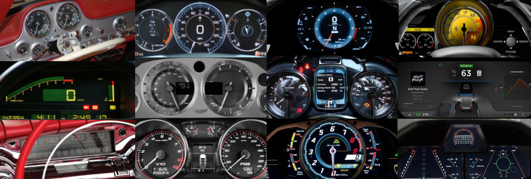
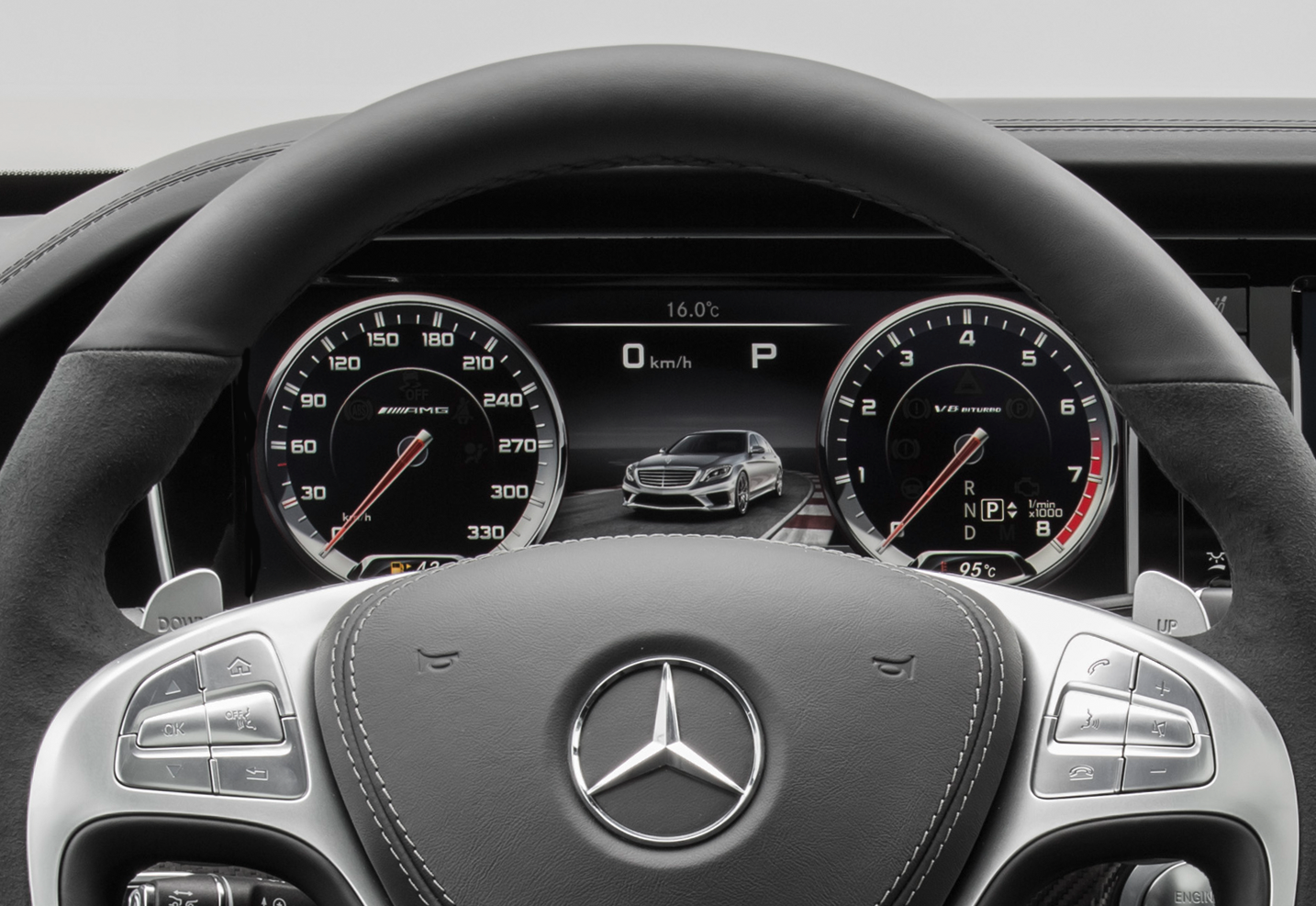
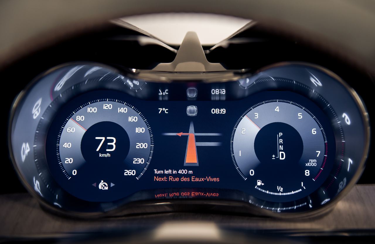
The instrument cluster as a feedback element has remained fundamentally unchanged since instruments first appeared in cars. Even today with LCD clusters, such as in the Mercedes S-Class, we see the skeuomorphic recreation of these mechanical dials in digital form. There are some good reasons for this, such as consistency, familiarity, brand perception and so on but we feel this ought to be challenged.
Our Hypothesis
By looking afresh at the instrument cluster, and applying modern contexts and technology to the problem, we believe that we can make better use of the screen real estate by clearly showing the right information at the right time.
With this contextual empathy in place, we can then increase situational awareness for the driver – when passing a school during collection time, in adverse weather conditions, accidents, road works, a slippery road and so on.
As a result of this, we may be able to provide better and more timely information, reduce driver distractions and therefore accidents. We would like to achieve all of this and still retain the positive aspects of the analogue approach – the ability to show relative information, a consistent design paradigm, and to confer a level of quality and reinforcement of the brand.
In order to test this hypothesis, we needed to design and build on our ideas. ustwo has an open and product-centric approach, which meant we were able to quickly design and build prototypes to test and iterate upon.
Here we present the results of this process, through a thought piece along with an explanatory video and interactive prototypes providing finer details.
Video Demo
Before we go to the prototypes, here's our concept in a nutshell:
Prototypes
We've also built a prototype of a non-branded archetype of the cluster below. It's interactive, so click the link, try it out and see what you think. If you'd like to develop and improve it more, download the source code and design assets from our github page.
The unbranded prototype above forms the basis of the concept and underlying principles – it is agnostic to the form and shape of the technological medium. The screen, as a medium, can be quite different in shape, due to easing of manufacturing constraints. This can be seen in the Sharp Free-form displays, for example.
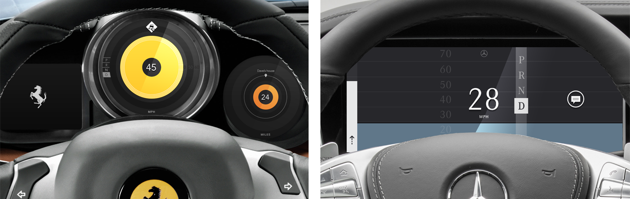
Here are a couple of interactive examples of how our concept could be branded to work inside an actual vehicle, within different form factors. Click the link or image and press the button ('Press to speed up').
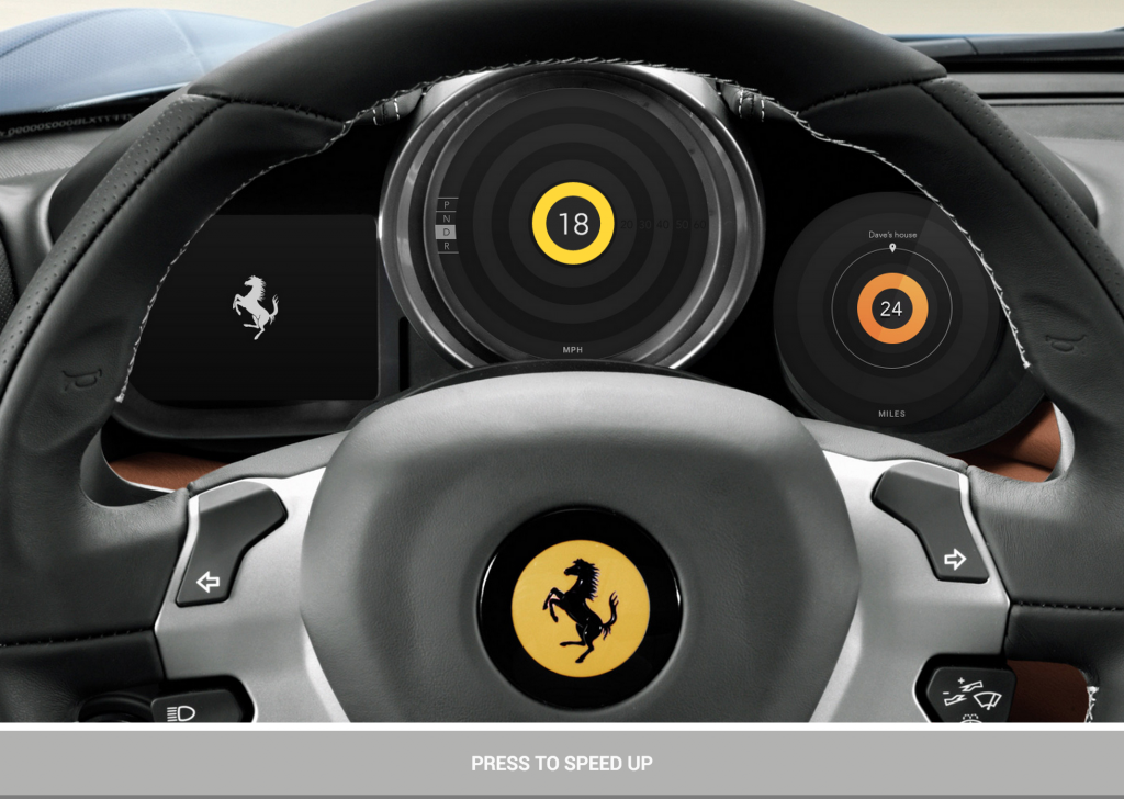
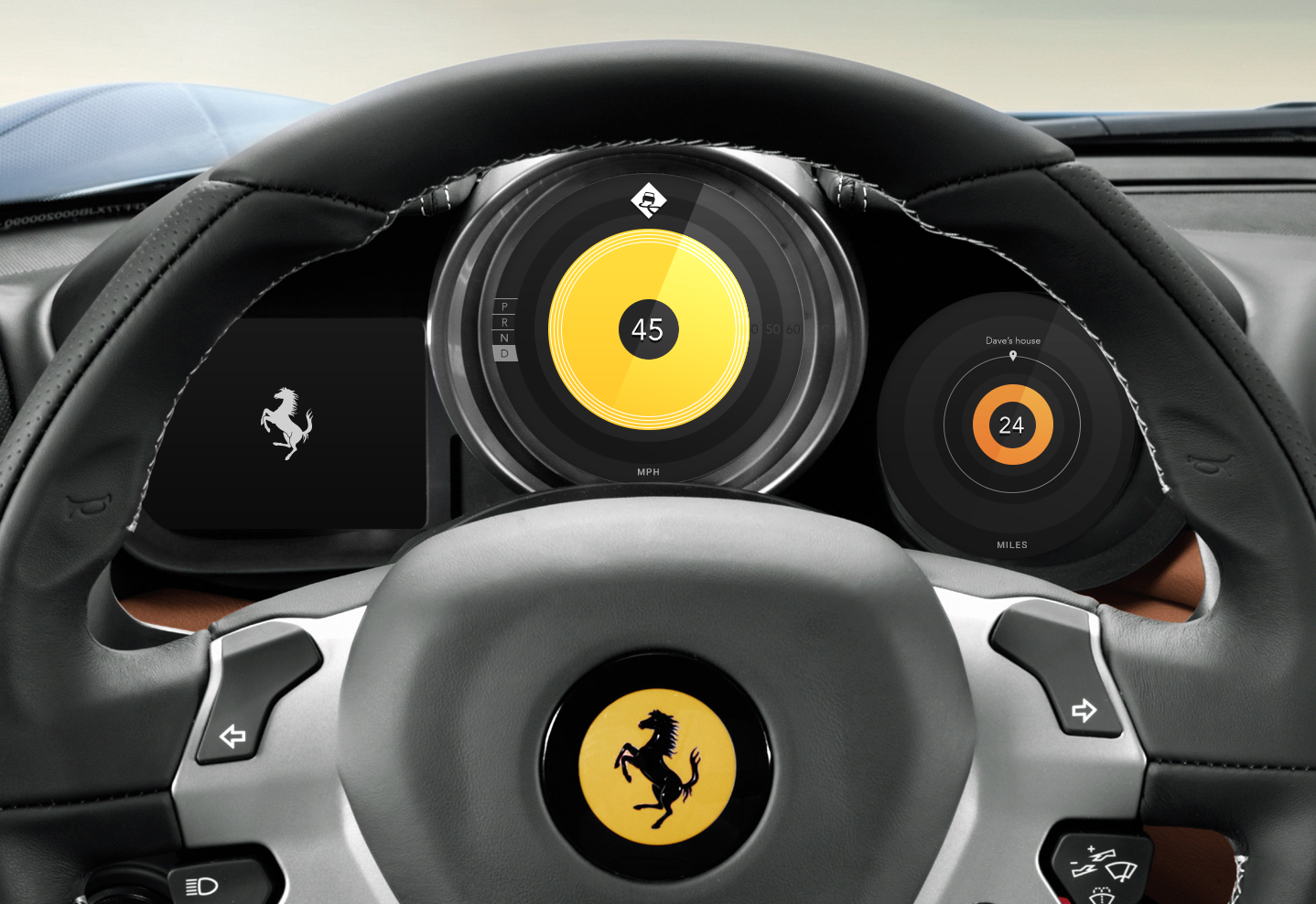
Above: Branded to the Ferrari California, with circular displays (The GT defaults to automatic control, where we see the rev counter being less important. In a manual scenario, of course the rev counter displaces the speedometer in priority)
Click the link or image and press the button ('Press to speed up').
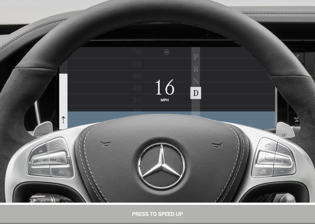
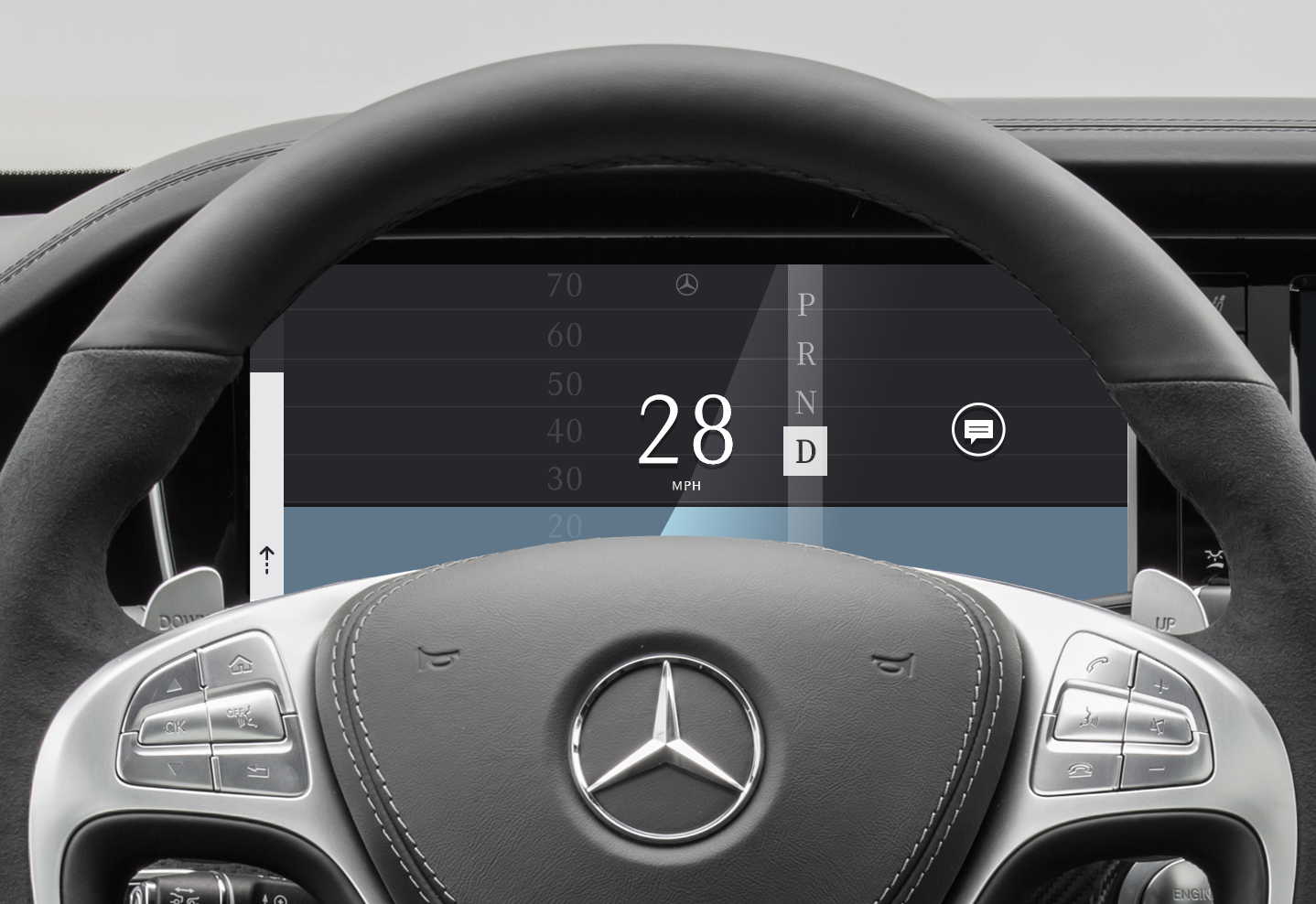
Above: Branded to the Mercedes S-Class whose rectangular screen was our benchmark
The Full Story
What made us look again at this ubiquitous feedback element? The instrument cluster seen today as a collection of gauges and indicators is among the earliest forms of feedback systems on an automobile dashboard. Their functional evolution has been a result of safety regulations (speedometer), considerations of efficiency (e.g. tachometer/rev counter) and at times due to plain practical considerations while using a car (fuel gauge/odometer).
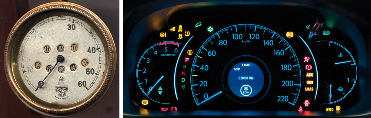
Above: Early dials vs present dials (Smiths odometer 1920 vs 2013 Honda CRV)
As covered in our ebook, although the mechanics are no longer used, the same method to communicate velocity is still adopted in nearly all cars. Is a dial pointing at a number really the most effective way of doing this?
There is a lot of legacy thinking with the cluster. Most of the primary feedback considerations have remained unchanged for decades.
We wanted to take a deeper look at it, and what we discuss next is a critical examination leading to the re-imagination of a standard cluster in a car with automatic transmission.
Having a broad look at the present clusters we can see a trend where manufacturers are moving towards having screen-based feedback systems. Here, for example, we see the cluster of a Mercedes S-Class saloon. At first glance, it is beautifully crafted and the screen seems an obvious and logical choice.
Screens present a rich visual medium for displaying data, they reduce costs when compared to mechanical elements and also make the entire cluster modular and easy to repair and replace.
But it is a prime example of what we call stylistic skeuomorphism – in this case, a HD display is being used to mimic traditional mechanical dial faces. We see this as a place where technology should be used as a material, and where design is not being used to its true potential.
We can easily ask the following questions of it:
1. Is the screen’s real estate being used appropriately?Is a dial the best form of displaying glanceable and understandable information, or is it an anachronism?
2. Does it offer contextual empathy and appropriateness?Location, speed limits etc. can easily be obtained from present day cars and the mobile devices people carry.
3. Why are clusters so feature-rich, but context-poor?Contextual representation of data can also reduce clutter in the display, if only the most appropriate bits of data are shown to a driver (reducing distraction). Also, what do all the dials signify or mean for an everyday driver (i.e. how important is the rev counter, other than for sports or faux-sports cars)? What is the simplest, most easily understood representation of important in-car information? Where is data about fuel capacity most relevant, while driving or while stopped?
4. Can a screen for the cluster be used to reduce dependence on other interfaces?For instance, a centre console or even an HUD (where information density is critical)?
We don’t advocate using technology for technology’s sake. As mentioned in our ebook, we are aware of the argument that analogue dials signifies a relative position – akin to ‘How many minutes to 2 o’clock? – as seen with traditional watch-faces. We’d like, however, to make the argument that there are now new and more relevant measures such as ‘how close to the speed limit am I driving?’
In our design process we tried to take strong elements from this traditional, familiar representation and marry them with learned behaviours and new signifiers relevant for the now in order to create a pleasurable and meaningful experience for users.
Key elements and design principles in the concept
OR – an answer to the question: What is the simplest, most easily understood representation of key information in a cluster, without being tied down by legacy and history as discussed earlier?
We have broken away from the traditional singular notions of quantified feedback (e.g. fuel capacity) and have introduced other elements alongside them, enriching the quantity with contextuality (e.g. fuel capacity is combined with known mileage of a vehicle, based on previous driving behaviour, to estimate a range).
What elements of a traditional cluster should we design for? What can be left out?This was a really important question, and for clarity’s sake we chose the following elements to be shown in our cluster design. Certain elements have been deliberately left behind, considering legacy and context, we focused only on the necessary.
Key elements
- Speed: Speed shown in relation to the local speed limits and other parameters, such as weather, with appropriate feedback
- Range status: Combining elements of a fuel gauge and range shown both as absolutes and in relation to the next journey
- Contextual alerts: Both based on location, time (school zone, slippery roads, traffic conditions) and where the alert originates from, for instance HUD (above) or centre console (left in the UK)
- Reverse: Rear-view camera takes over screen while reversing
- Gears: Consistently positioned and present at all times as is the legal requirement
We also devised five key design principles which we used to inform and validate all of our design decisions. Each are based on our experience with designing for the in-car environment and includes considerations such as safety, accessibility, increasing glance-ability and reducing driver distraction:
Key design principles
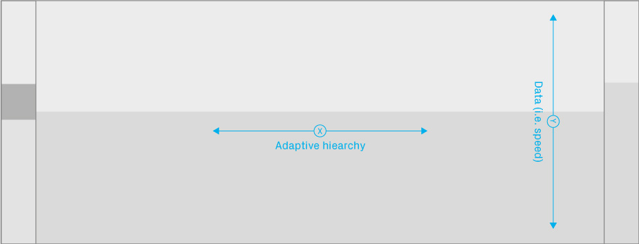
1. Adaptive hierarchy, agnostic to display2. Insight, not just raw data3. Designing visual feedback by thinking in time4. Understand the contextual relationships of elements5. Considered visual design
1. Adaptive hierarchy of elements based on action and user behaviour, agnostic to display
The layout of the design adapts, affording priority for elements based on the user’s action at any point to display just the right information at just the right time. This form of contextual empathy might allow users to be connected to both the HMI and the real world.
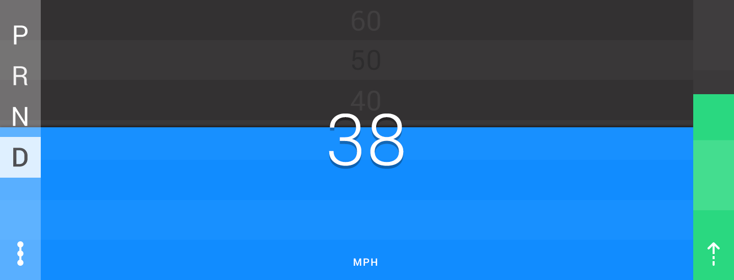
For instance the speedometer only shows itself while the car moves, and is minimised when not, allowing us to focus on more important details while not in motion, like range to your destination or fuel status.
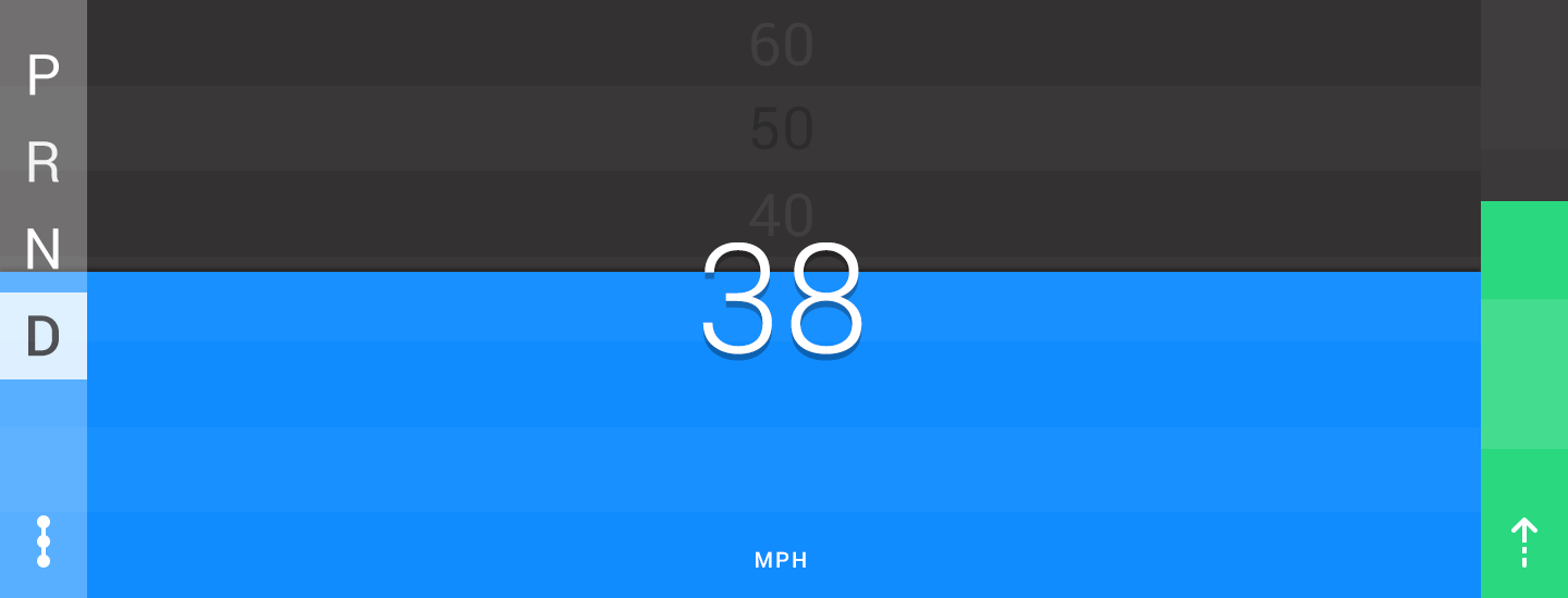
Above:_ while driving, speed takes top priority, while range (to the right) is secondary information_
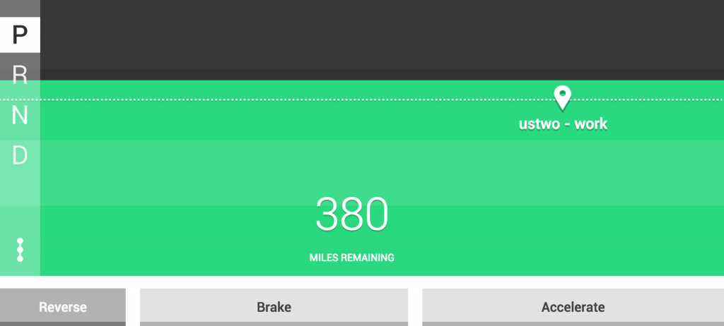

Above: when parked, there is no need for the speedometer so range takes priority instead
Above: how our concept utilises two of three dimensions
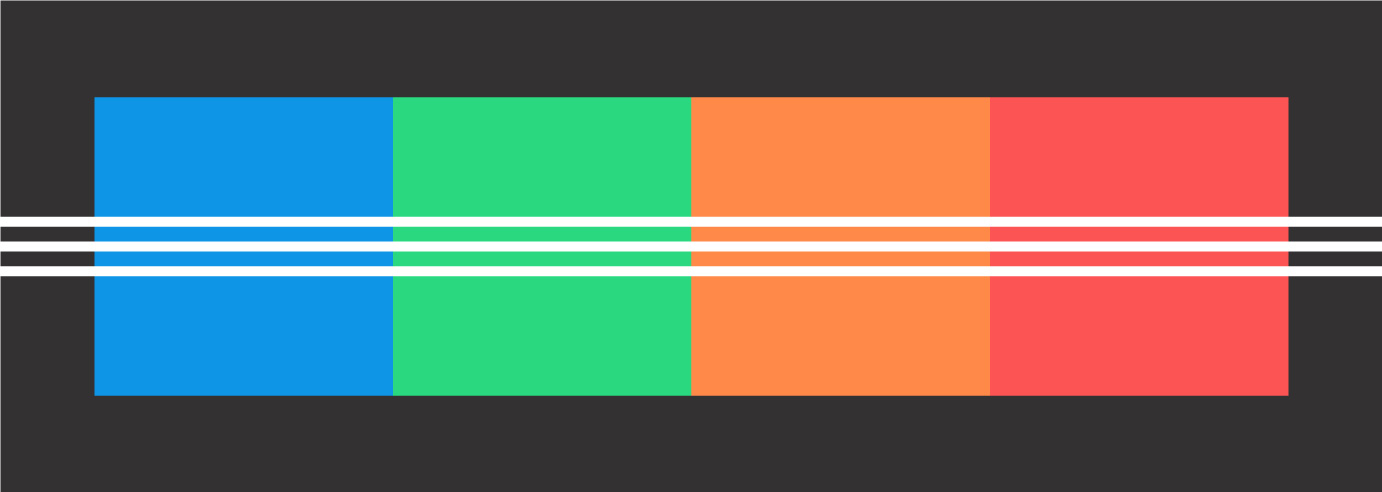
To accompany this concept, we derived an X, Y, Z axis system layout. The Y axis is the dimension in which the data is communicated. Coloured bars increase and decrease up and down this axis to represent speed and range. Low on the Y axis is low speed or range.
The X axis is used to categorise and prioritise types of information and is dynamic and adaptive to the context. The categories include the speedometer, the range gauge, the gears and rear camera when reversing. One or more of these are displayed depending on the driving situation and increase and decrease in width depending on their importance at any given moment. This forms the essence of Adaptive Hierarchy.
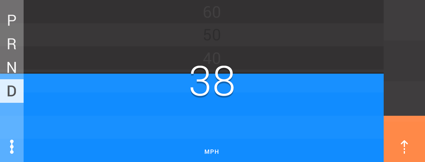
Above: the range indicator has increased in width because the range is low and a refuel is recommended. The increase in width brings it to the driver’s attention
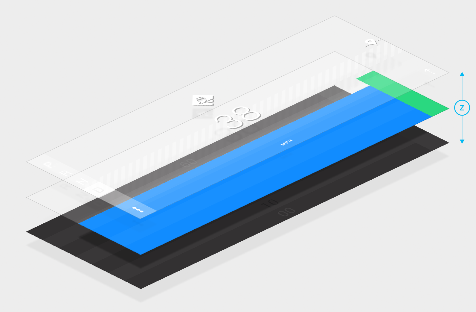
Above: _ The Z axis, or depth, represents context of what is displayed
The bottom layer is the background, and acts as the metric meter.
The layer above, the middle layer, shows the actual information or metric, mapped to the metric meter beneath it.
The top layer houses new and additional information where something new has been introduced, for example if a slippery road warning has been triggered or a text message has been received.
Above: the top layer on the Z axis shows newly occurring information, such as a slippery road warning_
This layer also orientates the information from where it is delivered, i.e. an icon representing a change in road condition transitions from the road ahead into the top of the screen, where as a text message notification transitions from the centre console to the left of the screen (UK). This contextual-physical orientation helps the user understand its meaning. The top layer is the only layer that is actionable and is therefore the only layer that is not consistent throughout the drive.
This layout has a number of benefits in addition to providing the information described above. The full-block colour dynamic ensures the information is understandable if part of it is obstructed by the steering wheel or drivers arms when turning.
2. Insights through visualisations, not just raw data
We shied away from using pure numerical outputs, and use visualisations where we can. Doing this helps create elements which can be understood quickly without excessive interpretation and cognitive load. The notion of range, replacing that of fuel status, is displayed explicitly – i.e. rather than “you have this much fuel/energy”, we use “this is how far I can go with the amount of fuel/energy I have”. The range indicator reduces with fuel consumption and is always seen in the context of the next journey the user undertakes.
3. Designing visual feedback by thinking in time
Macro-dwellLiving with a piece of design is a very different thing to a first experience. Like any relationship, the more you get to know it, the more you understand it, and once you do the design can evolve with it. Design needn’t be static.
Certain labels can reduce in scale after a few drives – MPH, for example, or colours could dim as the day turns to night.
Above: during first time use or first drive in an MPH zone (left), the ‘MPH’ label could be prominent, but after several drives, when it is understood, this label could recede (right), minimising clutter and distraction_
The interface could adapt to the time of week or even year. This will of course need to be done appropriately, with safety at the forefront of any design decision –you don’t want to change the design too much mid-drive for example. There’s a lot of potential in this idea and it’s one we’d like to explore further.
Micro-dwell and motion principles For the instances where we look at the ‘present’ experience, by using a combination of change in colour, and subtle changes using animation, we can provide information in the shortest of looks, or even provoke a glance when required.
We look to two types of animation:
Discreet: changes in layout and modes.
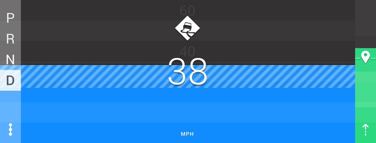
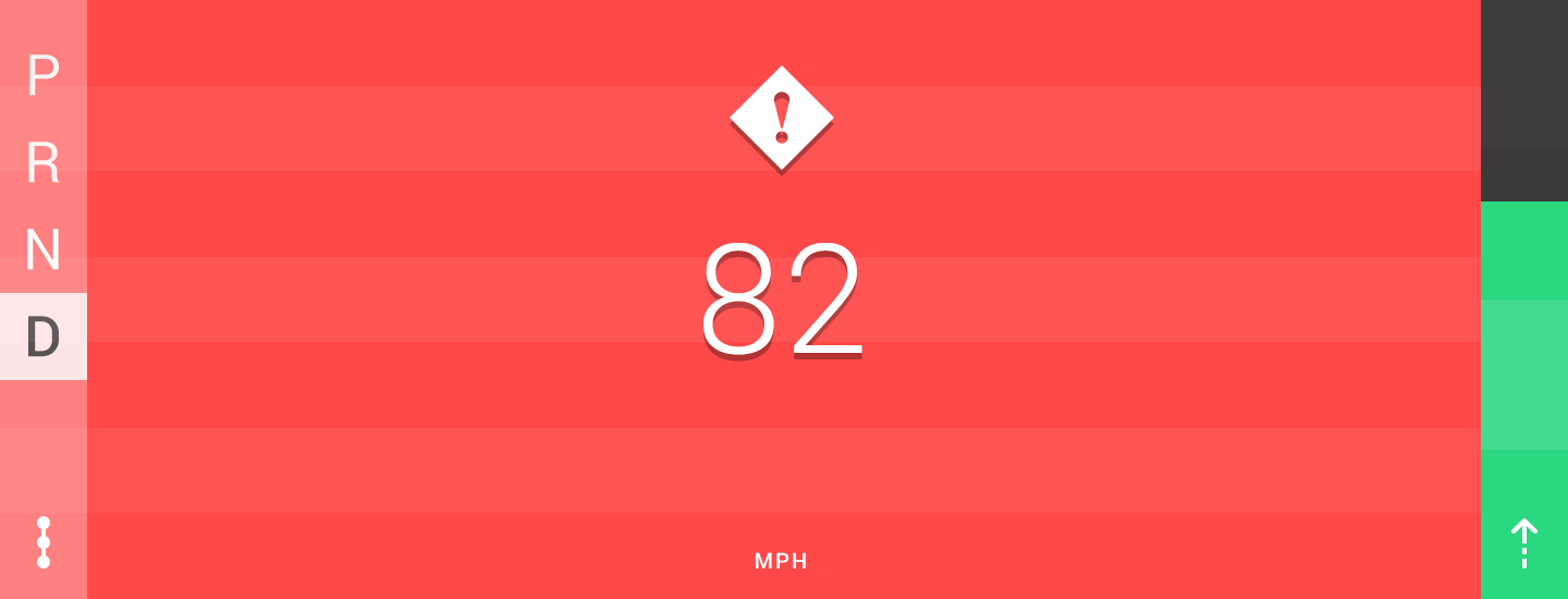
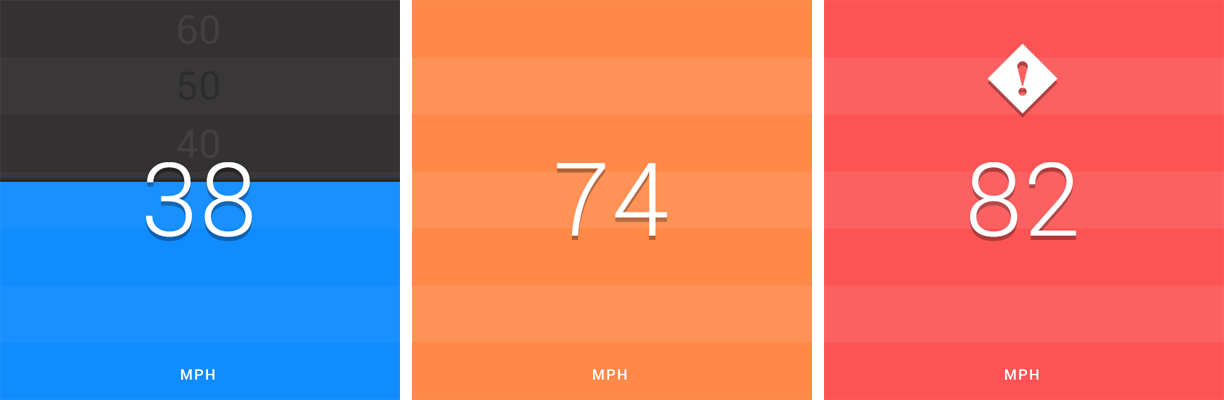
Attract: alerts and notifications that are designed to grab the driver’s attention. Breaching the speed limit, for example, is represented via instant changes in colour to the speedometer, provoking a glance whereas a speed recommendation in case of wet roads, is a gradation over color, with subtle animation.
4. Understand the contextual relationships of elements
We felt that the best way to bring together concepts of visualising data and designing in time was by adding an extra layer of contextual relationships.
The speedometer acts both to visualise data, with the rectangle changing height or colour and also operates with respect to the speed limits on the road you are driving.
Above: red indicates you are driving over the speed limit_
Here, the speed limit is 70 mph, and the top of the screen represents 70, while the bottom represents 0. As the bar raises beyond the top of the screen, i.e. over the speed limit, the colour changes accordingly.
5. Considered design – both beauty and the brains
Human Machine Interface (HMI) is a relationship between the driver and the car. When talking about designing for in-car interactions, it’s worth remembering that this relationship goes two ways – the car can communicate with the driver, just as the driver communicates to the car.
This relationship, however, is not necessarily monogamous. The driver could vary and be of any gender, age, height etc. This plays in to the dynamic nature and strengths of digital technology. We consider these varying factors because ultimately we want to distract as little as possible - the design should minimise ‘dwell’ times, or to use a trending phrase, improve ‘glance-ability’ no matter who the driver is. Better glance-ability means less time with the driver’s eyes off the road, less cognition, less distraction and ultimately, less risk of an accident.
To achieve this glance-able design, we researched and studied each of these design elements to come up with the most considered visual design:
- Typography
- Scale and Visual Angle
- Colour
- Visual language & Iconography
- Layout
- Branding
- Design in time
TypographyA font is a fundamental element of design, and most user interfaces. A good font is both beautiful and functional, it demonstrates style and identity while it also performs function and communication.
Fonts therefore have a dual responsibility within the car. The branded and couture nature of the automobile demands a strong identity and attractive aesthetic, while in safety critical UIs such as those found in the car, the font must communicate any given message or data element as quickly as possible, minimising risk of a road accident.
We didn’t have time to develop our own font (as much as we’d like to) but we can leverage the work of those who have …
Traditionally, automotive manufacturers have opted for a square grotesque font, the assumption being that they were chosen for their uniformity, openness and “tech” feel.
Above: Volvo Concept Estate_
However, according to research carried out by The Massachusetts Institute of Technology (MIT) AgeLab and the New England University Transportation Centre along with Monotype, square grotesque fonts increase dwell time by 12% over humanist fonts, which gives a 50-foot braking distance discrepancy in the car when driving at average speed (source video). That 50 feet can mean the difference between safe driving and a serious accident.
Monotype suggests a humanist font (sans-serif typefaces with oval shapes and variations in stroke thickness to create a more human appearance). Not only is a humanist font quicker to read, thanks to the echo of the handwritten form (hence the term humanist), but it also does away with the sci-fi, masculine aesthetic of the square grotesque fonts in favour of something more … well, human. See Monotype's list of recommended humanist fonts for the in-car environment here.
When deciding on a font to use for our concept, we drafted the following criteria:
- Humanist: Varying stroke widths that mimic handwriting, large apertures (this helps to avoid confusing an ‘e’ for an ‘o’ or vice versa) and X heights make a humanist font quicker to read, reducing the time the driver has their eyes off the road.
- **Many weights: **Many weights allowed us to test the most legible strength of a font.
- Completeness of glyphs: A full set of glyphs ensures that a plethora of data and metrics can be communicated in as broad a range of languages as possible.
- Friendly: Friendliness serves a function, it makes the font easier to read while also helping to get away from the techy, daunting aesthetic of many in-car HMI’s.
For our concept, we chose Roboto, as it met all of our criteria while also having the benefit of being tested in-car by Google.
the team tested Roboto for the car, using LCD shutters that testers wear like sunglasses, and which force the wearer to look at a UI in only glance-able fragments—just like you would in a car sporting Android.
We had the luxury, however, of having no brand guidelines to conform to (more on that later). We could write a whole separate blog piece on typography for cars alone (watch this space), but in the meantime we’d recommend this excellent piece by MIT & Monotype.
What we’ve described above covers off the “intrinsic factors” of a font, those design features which inform the font itself (such as line thickness and apertures). “Extrinsic factors” of the font, such as its scale, colour etc. must also be taken into consideration.
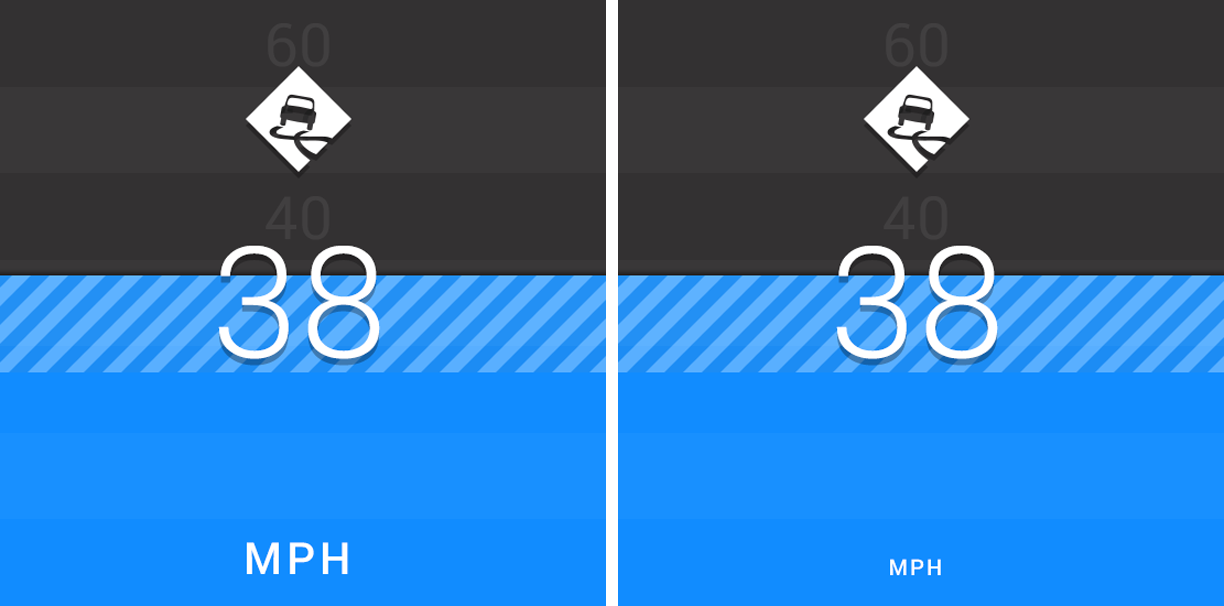
Scale and Visual angleThe scale of characters, alphanumerics, icons and any graphic that communicates is extremely important. Scale can make a piece of text legible, it can give a brochure a sense of hierarchy to lead the reader through the page in the intended order, it can even evoke an emotion in an animation. When it comes to the in-car environment, however, scale takes on a whole new set of characteristics.
The size of fonts for example should not necessarily be measured in points or pixels, but instead should fall within the optimal range, or what is known as “visual angle”, for any given driver.
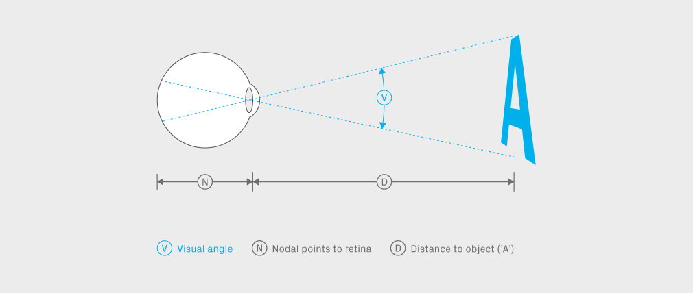
It’s far too complicated a mechanic to discuss here (read this for more information), but we can describe it with a simple analogy:
Imagine being in the cinema. You’re sitting in the front row because you think that’s the best seat in the house. However, you realise quite quickly that you’re so close that you can’t see the whole screen at once, you actually have to move your head around as the action unfolds. The visual angle is far too obtuse.
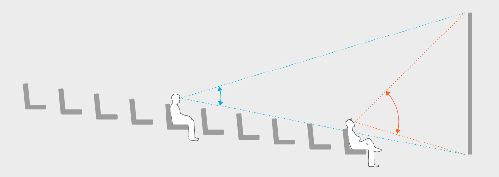
If you were to sit in the middle row however, the visual angle would be far less severe and you’d be able to see the whole screen at once. Now, sit back and enjoy Prometheus because it’s brilliant – don’t listen to what other people say.
You see, when it comes to typefaces or icons etc, it’s easy to think “the bigger the better” – the more legible it is, but as is evident in the analogy above, you can have too big (obtuse), just like you can have too small (acute) – it needs to be just right, somewhere in the middle.
In our concept we tried to use an appropriate visual angle for the type and iconography as is recommended in this study (PDF download 244kb) by Rochester Institute of Technology Research and Monotype. What’s interesting is that different drivers will be further or closer to the screen than others, digital displays allows us to customise the scale of type and icons so that they fall within the specific drivers optimal visual angle, another advantage of the digital over the mechanical.
To demonstrate adaptive UI based on an ergonomic visual angle, driver/seat position in the context of the car, we built a quick prototype based on a JS head-tracking algorithm here (the prototype needs access to your camera and please use the Chrome browser on your desktop for the best performance).
As you can see, the text size and vertical position in the speedometer, reacts to proximity with the camera (z-axis) and to your height (y-axis). Of course, the text size and position will be set as the driver enters the car, and will not change throughout the drive.
We can posit that with face-tracking cameras and algorithms already used in cars/trucks (tracking eyelids for symptoms of drowsiness for example) could be further repurposed to suit interfaces like the cluster in the near future.
You can have a go yourself here (the prototype needs access to your camera, please use the Chrome browser on your desktop for the best performance)
ColourColour is arguably the single most important thing in design. You can have a beautifully designed website until you turn everything white and then you can’t see jack. A digital display is made up of thousands of pixels and each has just one job – show a colour. All those colours team up and together display anything you want, like a well-organised show of support at a sporting event.
And this is exactly how we approached the design of our concept; each pixel must serve a purpose, without exception. In fact this is how we approach every project at ustwo. To our earlier point, if you make everything white, you don’t have anything at all, so contrast is of paramount importance, but that’s nothing new, so let’s focus on things of note in our concept.
When it came to deciding what colours to give each pixel, and with the luxury of not having a brand to design for, we turned to what is already familiar – familiarity after all is a powerful conveyor of meaning.
ISO are the international standard of symbols and tell-tales in the vehicle and they govern all the icons and tell tales in your car. This is how they inform the colours used in the information displays in your car:
5.1 When used on optical indicators or tell-tales, the following colours have the meanings indicated:
- red: danger to persons or very serious damage to equipment, immediate or imminent;
- yellow or amber: caution, outside normal operating limits, vehicle system malfunction, damage to vehicle likely, or other condition which may produce hazard in the longer term;
- green: safe, normal operating condition (where blue or yellow is not required).
As you can see from our concept, we have taken these on board. We use amber when the driver is driving at 0-10% higher than the speed limit (an allowance which is considered when policing driving speeds) and red when the driver is over the limit by more than 10%. Similarly, green is used when the range is adequate to get to your destination, and we use amber when it is low.
We have incorporated one other colour into our design – the blue of the speed indicator when driving within a speed limit. Blue is neutral, carries that meaning, and is also of the same colorimetry as daylight. The theory is that it will be the least distracting colour as it’s what we’re most used to (the same as daylight).
As discovered in our ebook, a very dark grey makes a better background than white, which can be too distracting and glaring. Dark grey here is the background, which represents nothing, while we use white to represent something. So black is discreet while white is attract. In fact, ‘discreet vs. attract’ is an idea we employed in all of our colour choices and even animation styles as discussed earlier, opting for a slightly pale colour palette to be discreet while also stepping away from neon Tron-like aesthetic of so many other HMI’s.
We utilise this attracting quality of white to draw attention to certain changes in driving conditions. For example, white is the colour of all icons that represent changes in the car and the road (on the Z axis described earlier), white is also used to display the gear, which changes throughout the drive. This concept isn’t strictly enforced in our concept at its current state, but may be something to work on.
An idea that we have used throughout our concept is driver personalisation. Just as we can adjust type sizes for different drivers, we can also customise colours and hues for different drivers to increase contrasts or make compliant for various type of colour blindness.
Colour is not the only feature we used to inform a visual language and infuse iconography with meaning, we also used shape. Visual language and iconography The visual language of an interface design helps users get to know and understand it, specifically over time, repeating and consistent visual cues help with mapping over time. Iconography, just like typography discussed earlier, is a big part of the language of the interface, so when it came to designing the icons, we did as we did with choosing colour, we stuck to the familiar, what people already know and understand. Why reinvent the wheel?
The icons, where possible, are taken directly from road signs. Simple. If you’ve passed your driving test, then you will already know what all of the icons in our concept will mean. If you’re a UK driver, these will be icons based on British road signs. If you’re an American driver, these icons will be based on US road signs – yet another benefit of the digital display. This method also has the benefit of being ISO-compliant (ISO ensure identification and facilitation of use of icons/symbols).
For those icons not covered by road signs, such as those that represent functions of the centre console and infotainment system, icons are derived from those that have become ubiquitous with the use of smartphones, such as message and music icons.
Using already familiar icons limits dwell time and cognitive load. As each icon takes on a different shape, however, how do you distinguish quickly between which is imperative to acknowledge and which can be ignored? To tackle this questions, we built on the works of German-American psychologist Wolfgang Köhler, who influenced the 1929 Bouba/Kiki effect study.
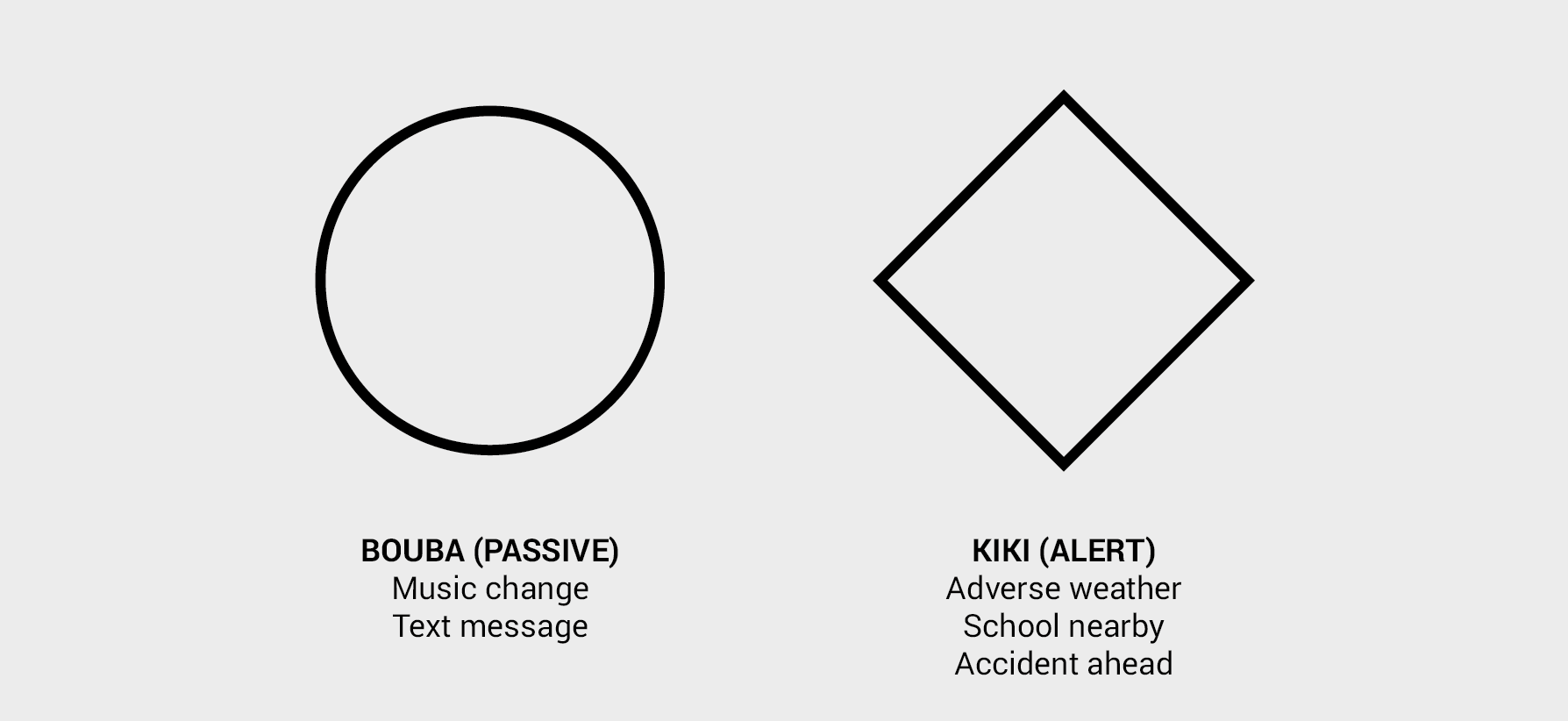
This effect is non-arbitrary mapping between speech sounds and the visual shape of objects. We have extrapolated this to signify iconography into two groups, a circle for passive icons (Bouba) which represents information where action is not required in the act of driving (i.e. a text message has been received) and a diamond for alert icons (Kiki) which represents information where action is required or should be observed in the act of driving (i.e. caution: accident ahead).
We used these two shapes to contain the icons –giving them meaning (the pictogram) as well as action (the containing shape). This helps the driver subconsciously pick out the important information (Kiki) from the less important information (Bouba), reducing distraction and cognitive load.
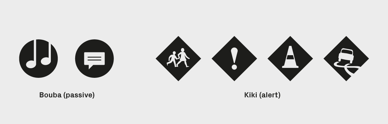
Above: icons incorporated into Bouba or Kiki_
The flat nature of the concept also plays into the visual language. As nothing is “pressable” in this concept, with all interactions being soft interactions (action taken on by the HMI on the driver’s behalf or feedback loops inherent in the interactions of the drive) there is an importance to style the graphics as such, reserving a “pressable” visual language for elsewhere in the vehicle, such as the centre console. So, in our concept, all graphics are purely informational and there is nothing superfluous, justifying every pixel.
BrandingAs we discussed in our ebook, we believe that branding is a very important part of the car and the experience of driving it. This is ignored in the HMI where elsewhere in the vehicle it is part of the very DNA of the design, for example you can tell a car is a Porsche by its iconic body shape and level of craft of the interior.
The HMI, after all, is one of the main touchpoints the driver has with the brand, a poor experience with an alien identity does not do the brand, or the driver, any favours.
Some of the discussion around fonts and colours earlier in this piece may seem to make any branding difficult. Using a brand’s typeface, for example, might not comply with some of the criteria we highlighted when selecting a font that is quick to read with minimal cognitive load.
This is true, but we believe there is a responsibility on the designer to strike the right balance, with both brand and considered design in mind, akin to designing websites for brands at a time when choice of fonts on the web was limited.
Above: how our concept could be designed to comply with automotive manufacturer's brand guidelines and unify the cluster with the interior and exterior of the car’s design_
Our process
As a team, we believe in rigour with our process – a focus on craft, maintaining standards for human-centred design in interactions, using technology as a material and keeping in mind industry conventions and recommendations (ISO, NHTSA, ESOP).
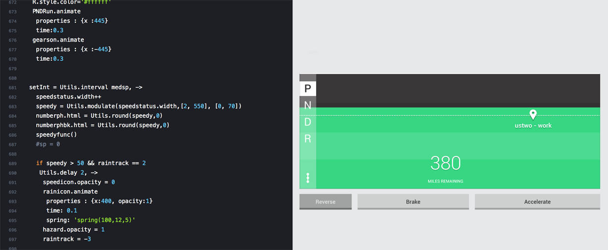
Above: Prototypes built and tested with the awesome Framer platform for Javascript
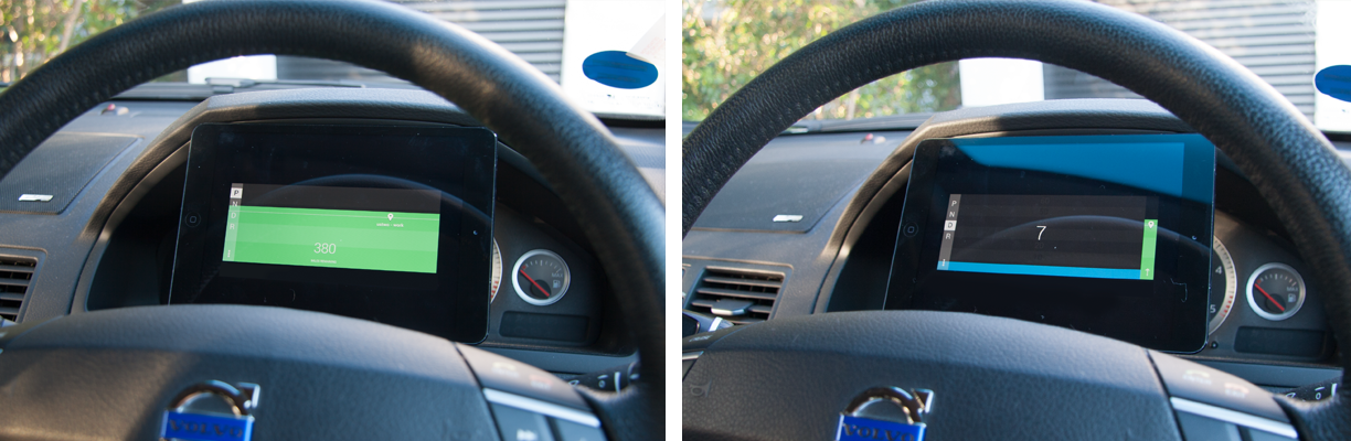
Above: Very early in-car tests with a proxy screen - an iPad. Behaviours are best tested over time.
In this regard, we built multiple prototypes of our concept, constantly iterating along the way based on reading research / technical papers and testing. Testing will have to take into consideration both cross sectional and longitudinal studies over time to see how people will live with a particular design idea.
We believe what you see above is primarily an iteration we are happy with and by no means a final answer – but more of a conversation starter with the greater community.
Conclusion
We truly believe this is a small but important step forward in thinking about legacy feedback elements in cars. As is in the nature of all conceptual work, we wish to provoke a constructive discussion with this thought piece.
When companies look to manage the digital and physical experience from the ground up, within their products and even services (e.g. Tesla, Apple with CarPlay, Google with the Android Auto OS), contextuality, connectivity and software is going to be enmeshed in their development like never before. We see a new exciting challenge, and huge opportunities for design and development.
In this spirit, we ask you – the reader, designer, technologist, manufacturer – to offer your valuable feedback so we can push the envelope further with elements like the cluster – together. Given the opportunity, we wish to carry on experimenting and iterating with the idea – there is so much more to explore with multi-sensoriality in interior design (animations, benefits of optical illusion, audiovisual feedback etc.)
We have opened up the design elements and our early code to the community, so it can be further developed upon to create more magic and inspiration. Feel free to send us feedback or get stuck in with our concept and create your own iterations!