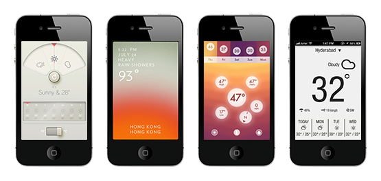
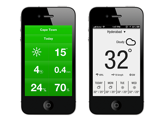
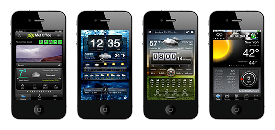
There seems to have been wave after wave of super-slick weather apps appearing over the past few months, but not one of them will replace my shortcut to the BBC Weather web page. Why?
Function
One of the big things that often seems to get forgotten is why people refer to the weather forecast. The giveaway for me is in fact the last the word of that previous sentence: forecast. As in not now, but instead what the weather's going to be. On opening these apps though users are often presented with a simple full-screen display of the current weather conditions - which you'd be able to tell if you put down the phone for a second and used your sense of sight and touch! There are of course situations where this could be useful, for example if you worked on the top floor of a large, sealed office block and wanted to see if you need to take a jacket out to lunch. But for most of us is it really too much effort just to stick our heads out the door and judge for ourselves?
I'd argue that it's more important to see what the weather is going to do; for example if I cycle to work today will I need to pack my waterproof as it's going to rain later? This should be incorporated into the default view of an app, with no need to dig past the home screen to find out this information. The upcoming weather can have a greater impact than right now, so I’d like to see apps make more of a deal about this.
Form
There’s also an argument over how well they communicate weather conditions, in particular the use of colour combined with interface and iconography. Colour is an incredibly important communicator, and we inherently associate it with certain messages – red for example is often seen as a warning, green as nature, and so on. This is no different in the context of weather; combined with a lifetime of growing up seeing skeuomorphic iconography on TV weather forecasts we have learnt to associate yellow with sunshine, blue with rain, and black with dark clouds. With this in mind why would I then want to customise the colours, which could then turn a sunny day green for instance? Or remove colour completely?
That’s not to say that more traditional apps are without their problems - they can often be the complete opposite of minimalism. Their designs seem cluttered, with too much information all vying for the user’s attention at the same time.
BBC Weather
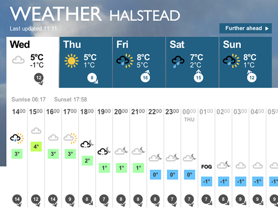
Why is this such a good example? Because of how much it communicates without the user needing to decode what’s in front of them. The information is presented in a clear, crisp layout, not too cramped, but not too minimalist either. Elements are given room to breathe, and your eye is allowed to digest the information piece by piece, not being assaulted by everything at once.
At the top a row of icons, using commonly known symbols and colours, provides a true at-a-glance summary of the week’s weather: just by seeing yellow there I know that Thursday is going to be sunny, and the blue tells me that there’s rain on the way too.
Look below and there’s a breakdown of the current weather and also a forecast of what it’s going to be. There are some great additional touches which further aid communication and reduce the burden on the user, such as the the temperatures which move up and down in relation to their value, giving a visual graph of how it will change throughout the day. Also colour is used to reinforce that message in a way that we understand.
Obviously this is a lot of information to fit on a mobile phone display, and in fact the site does reduce the number of intervals in the weather breakdown to 3 hour blocks on mobile, but I still think there is an opportunity out there to create a truly useful, mobile specific weather service. So next time you decide to make another weather app please ask yourself why people need it, and how you can make that information as easy to understand as possible. An app that truly values form and function.
