Samsung
A sleek visual customization tool for the European market

Samsung's built-in appliance visualiser
As one of the leading Consumer Electronics brands of the world, Samsung makes an astounding variety of products. Most people in Europe know them for their Smartphones and TVs, but fewer know them for their home appliances or their built-in kitchen solutions. Samsung reached out to us as part of a new European market focus. They wanted to create a digital experience to showcase its products and innovative solutions. We teamed up with them to create a useful and immersive tool to explore their built-in kitchen appliances and design. A deeper look at the technical set up can be found here.
At ustwo, we iterate many, many times until we're satisfied with the result. Our first concept involved creating a linear step-by-step guided experience to help users create their own kitchen set. Our decision to do this was based on early market insights, quick field research, and our own personal experiences. As we further developed the concept and added the many, many appliance options that Samsung offer, we quickly realised that there is a lot to consider. How do we guide someone to pick one refrigerator out of over 20 models, for example? We needed to consider how simple to make the experience without sacrificing the overall scope of choices? It was complicated, to say the least.
We worked with Samsung's own lab to test the concept and to learn more from the consumers. We set up interviews to better understand their purchase behaviour and their user journeys. We found that:
- There are many ways to browse and buy kitchen appliances
- The number of appliances affects the end user behaviour
- A simple, linear guided step-by-step isn't for everyone
- It's a desktop first experience
- People want to take their time
- It's complicated
"I think the prototype is kind of an eye opener. Now I'm like: Oh that's Samsung and they have so many appliances." – Test user

The Solution
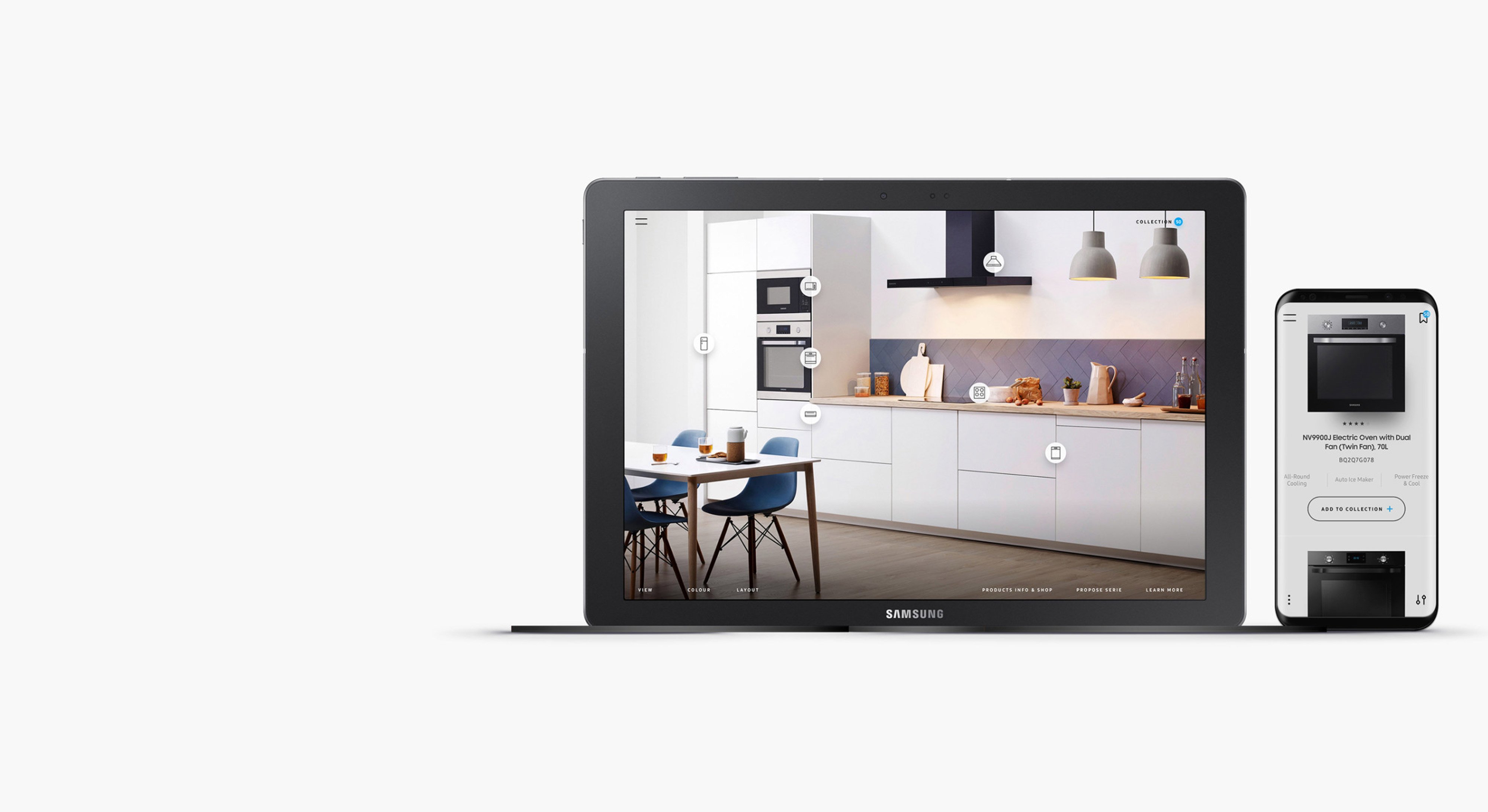
After working with the Samsung team more closely, we went back to the drawing board with our new insights. After trying a few different concepts we reached this conclusion: the more we try to simplify and add guidance, the faster we lose the interest of the more discerning customers. With this in mind, we scrapped the step-by-step guided approach to focus more on the visual experience. The new concept was all about the heart of the task at hand: the actual kitchen.
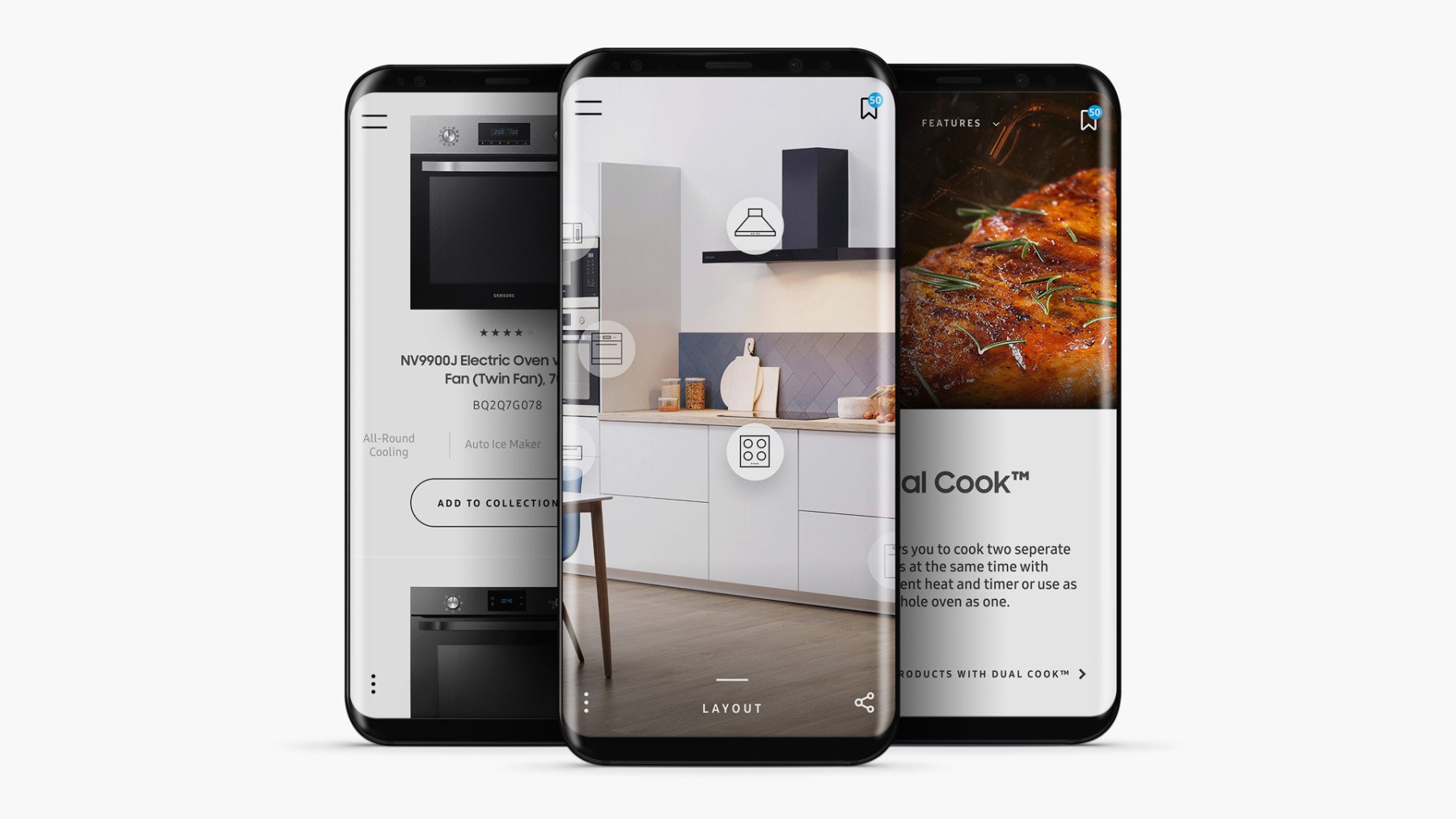
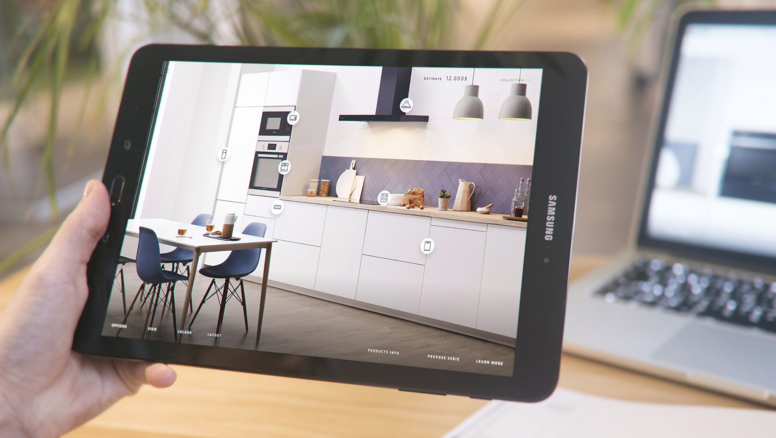
We removed all sorts of starting options and guides. The experience now starts with a clean template of a kitchen, and from there the user decides what type of appliance they would like to explore or learn about. There are areas where each appliance can be placed, and by clicking on the hotspots, the user can select from a number of different appliance options. Then, their selection appears virtually in the kitchen template. Once they have chosen their appliances, they can easily share and print the selection or create a collection where their saved favourite appliances and design can easily be compared.

Future-friendly
We decided to build the experience as a SPA (Single Page Application) to really push the boundaries of modern web technology. There's a fully scalable and customisable component library that uses React, JSON and that's ready to run as a PWA (Progressive Web App) with Push notifications, more about this on our blog. All this is to make sure it's ready for the future. The experience works for most common screen sizes and devices. As a PWA it can be installed on Android devices, and soon on iOS devices as well.
The SAMSUNG Built-In Appliance Visualiser is live, you can try it here.
Are you interested in how ustwo can support your organisation with a similar solution, don't hesitate to get in touch with us.