Together with Danish mental wellness company PauseAble, we created PAUSE, out now on iOS and on Google Play.
Our first meeting with Peng Cheng was during a lunchtime talk in the ustwo Malmö studio. These are an open forum where we invite interesting people from the digital community to come and inspire our team – Cheng joined us to present his progressive research on mental well-being and modern technology.
For years, Cheng struggled with overwhelming stress and anxiety, to the point where it was affecting his work. Deciding to take matters into his own hands, quite literally, he began practicing ancient Tai Chi and mindfulness to change his destructive patterns. With a background in interaction design, he subsequently saw the opportunity of combining these techniques with modern technology. Using the slow, continuous movements of Tai Chi to anchor attention onto our phone and away from our negative thoughts – making our portable devices a tool for relaxation.
Teaching himself to program for iOS, he came back to us with a simple prototype – using a black screen and audio feedback – and we were immediately excited to try using our digital product capabilities and turn it into a great digital product. Partnering with Cheng and PauseAble, we wanted to create an engaging user experience for his research and a product that could actually help people to relax and reduce stress.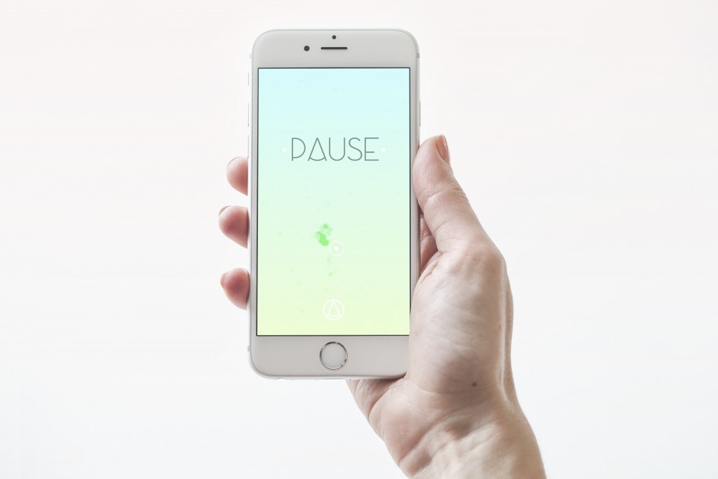
Capturing a philosophy
Setting up a hybrid team with UX and visual design and Unity 3D development, we were inspired and intrigued by the simplicity of the initial product idea and prototype as well as the challenge – capturing the essence of a whole philosophy into a single digital experience. We knew the focus should lie in the slow, continuous movement of one’s fingertip on the mobile screen. A simple – yet powerful – exchange which triggers the body’s ‘rest and digest’ response, allowing a user to regain focus and release stress in minutes.
We needed to create something that just about anyone could pick up and experience themselves, with little or no instruction. We allowed quite fluid role definitions in our team, to take advantage of the hybrid skill-set. Having the client on site also helped a lot. Working on PAUSE became a process of constantly trying things out through open exploration, rapid prototyping and rigorous testing. Using Unity, we were able to constantly test our designs – making live changes and prototyping our different approaches in real-time.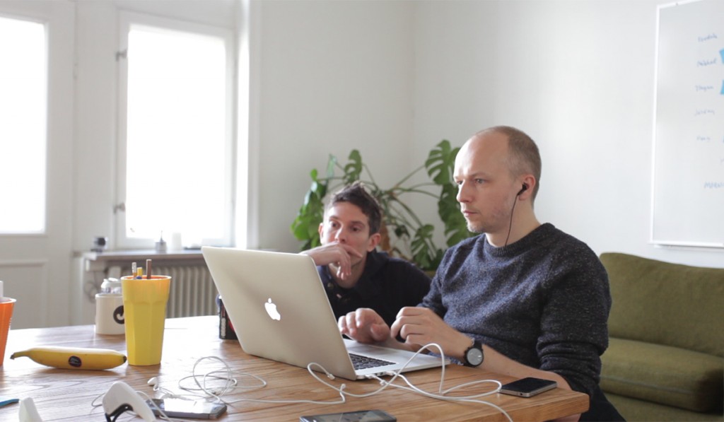
Iterating the concepts
For the service definition phase, it came down to defining what could bring the philosophy to life. We wanted to create an experience that continuously draws the attention of the user, without seeking to occupy it fully. We realised we needed something beautiful and fascinating that would trigger the interaction, but also something that you didn't need to see 100% of the time – allowing focus on the relaxing effect of repetitive movements and audio.
We started out with a 'realistic' design approach using a fishing float as the trigger, diving deeper into the ocean in accordance with the user’s movements. Although engaging and beautiful, there were some pieces that didn’t fit. It felt heavy where it should have been light and made of subtle nuances, bringing the mystery that usually surrounds meditation. On top of this, the initial colours were garish – we needed them to be soft and silky.
Keeping with the idea of a sinking object, we focused on experimenting with a more colourful but softer contemporary illustration style. We turned the ocean into colour gradients and the float into different shapes such as an iceberg, crystals or Escher’s impossible shapes – thinking about the soothing experience of Monument Valley. During this process, we naturally deviated from the concept of sinking to a floating feeling as it was conveying a more positive image, and more in line with people’s expectations of a meditative and relaxing experience. Last, but not least, we wanted to analyse how much of a difference it would make to users’ concentration level not to darken the screen.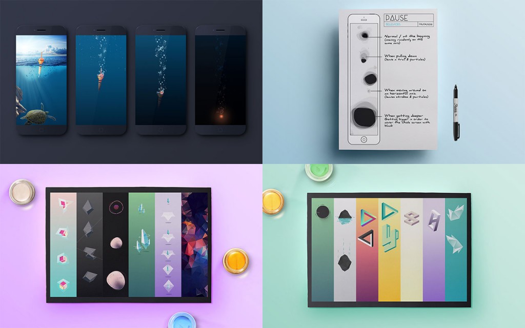
Tweaking the atmosphere
Satisfied with the results, we decided to push those concepts even further to fully benefit from the geometric, low-poly abstract figures. At this stage, we also tucked in more playfulness to test other hypotheses. We thought that instead of darkening the screen we could give users additional objectives such as re-assemble a cube, playing with masks, Russian dolls or playing with a kaleidoscope type effect.
After a few talks with our devoted testers, it became clear that we needed something light and a tad poetic, something that would provide users with a seamless but new experience each session. We found that in a spirit level. The bubble of air floating in water combined with our randomly displayed gradients provided the right atmosphere for PAUSE.
We drafted up various versions, making sure they were overlaying properly with our coloured backgrounds. We also produced some pieces of motion to get the right feeling for our shape, as we wanted something organic, random, floating around and dancing along with your finger. We finally ended with the UI in PAUSE, keeping it as minimalistic and airy as possible not to overwhelm users.
The sound for PAUSE were also made through several iterations. The first draft of the final version was not made until the graphics and motions were in place. It was not until then it was possible to get the sounds right, to get it to fit. We tested to add different natural sounds during the user testing sessions and ended up using waves and birds. One of the testers came up with the brilliant idea to have different sounds depending on where your finger are on the screen. The first version contained small subtle rhythms, but we realized pretty early on that a sweeping sound around one chord would work better. A repeating, soothing loop that let you drift away.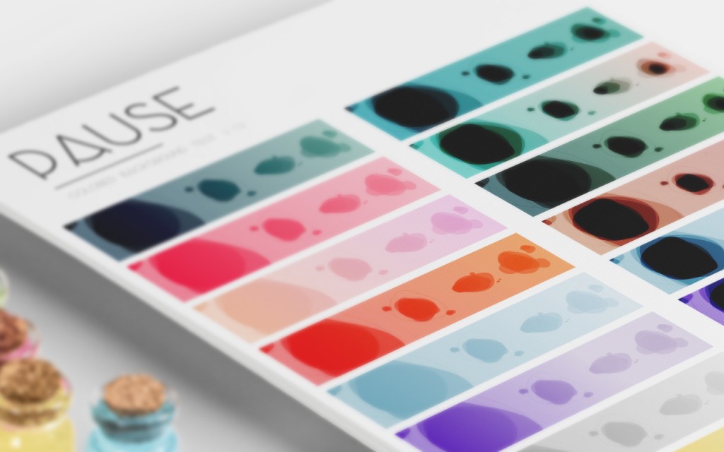
Validating PAUSE
Validating the scientific and physiological benefits of using PAUSE was very important during production of the project. Venturing into the unknown and creating something never seen before, it became very important to stay critical while interpreting the different data types. Not only did we want create a simple and engaging solution, we wanted to make sure it actually worked – looking at both qualitative and quantitative data throughout the different phases.
The initial tests were conducted with participants wearing a Muse brain sensor headband to sense brain activity while trying out different concepts for 10 minutes, and following this up with interviews. Testing the final concept, which is now released in PAUSE, the brain signals clearly showed the participants’ minds changed from an active state to a calmer state when using the app. They also sustained the calmness throughout the session.
To further evaluate PAUSE’s ability to calm the active mind, we set out to conduct a scientific study using an Emotiv wireless headset to measure EEG-signals. To validate the data from these sessions, we collaborated with Dr. Chi Thanh Vi, Human-Computer Interaction researcher at the University of Sussex. Chi Thanh Vi is an expert in using brain sensing methods to understand the neural basis of different user states when using interactive products. With his analysis, we could interpret the data and show that PAUSE helps to produce a calmer state of mind and a lower mental workload.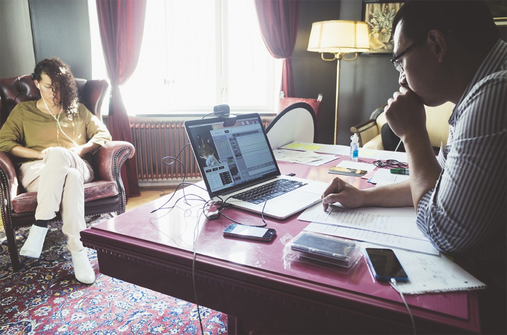
Being able to confirm that we as a product studio can take on these kind of projects has been very rewarding. We have taken something as intangible as a philosophy and turned it into something concrete that basically anyone can interact with.
With PAUSE we’re happy to have created a tool where people can experience the benefits of Tai Chi and mindfulness in a few minutes rather than months or years of dedicated training. We’re very proud to release a product that hopefully can make a positive difference in people’s lives.
PAUSE – Relaxation at your fingertip is out now. Download on the App Store. Available on Google Play.
Selected press:
[Tech Insider](http://www.techinsider.io/pause-meditation-app-by-ustwo-2015-10http://uk.businessinsider.com/pause-meditation-app-by-ustwo-2015-10)
